Transforming an Invisible Nonprofit into a Fundable, Recognizable Brand
Brand Strategy • Visual Identity • Marketing • Digital • Fundraising
The Challenge
EPRA was an underfunded nonprofit with an important mission but virtually no recognizable brand presence. When I began working with the organization, it had no discernible visual identity, limited public visibility, and no cohesive marketing system that could effectively communicate its mission, programs, or impact.
The challenge was bigger than designing a logo. EPRA needed to look, communicate, and operate like an organization capable of attracting donors, partners, participants, and institutional funding.
The organization had the mission and the social impact. What it lacked was the brand infrastructure to make that value visible.
My goal was to build a brand that could create credibility, communicate purpose, increase engagement, and ultimately support the organization's financial sustainability.
The Strategic Opportunity
EPRA was both a brand transformation and business development opportunity.
Rather than treating the project as a traditional nonprofit rebrand, I developed a visual and communications system designed to position EPRA as a credible, modern organization with a clear story and a compelling reason for people to support it.
The strategy focused on three key questions:
How do we make EPRA recognizable?
Create a memorable identity and consistent visual language that could work across digital, print, presentations, campaigns, fundraising, and community outreach.
Create a memorable identity and consistent visual language that could work across digital, print, presentations, campaigns, fundraising, and community outreach.
How do we make people care?
Translate the organization's mission into human-centered storytelling and communications that demonstrated the real-world value of its work.
Translate the organization's mission into human-centered storytelling and communications that demonstrated the real-world value of its work.
How do we make the organization fundable?
Build a professional brand presence capable of supporting donor acquisition, fundraising campaigns, partnerships, grant opportunities, and broader institutional visibility.
Build a professional brand presence capable of supporting donor acquisition, fundraising campaigns, partnerships, grant opportunities, and broader institutional visibility.




The Brand Transformation
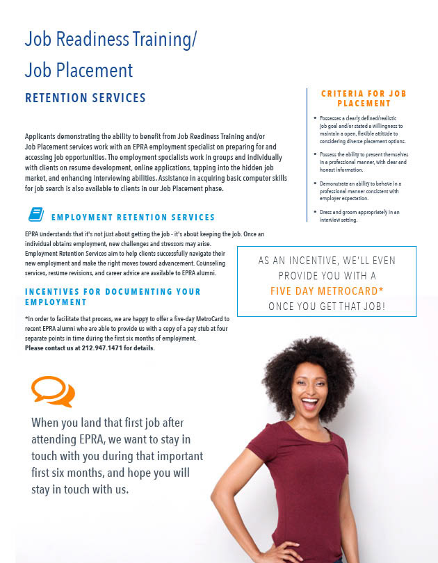
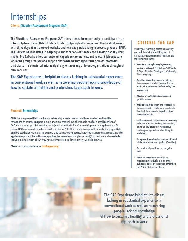
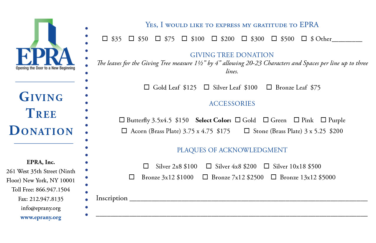
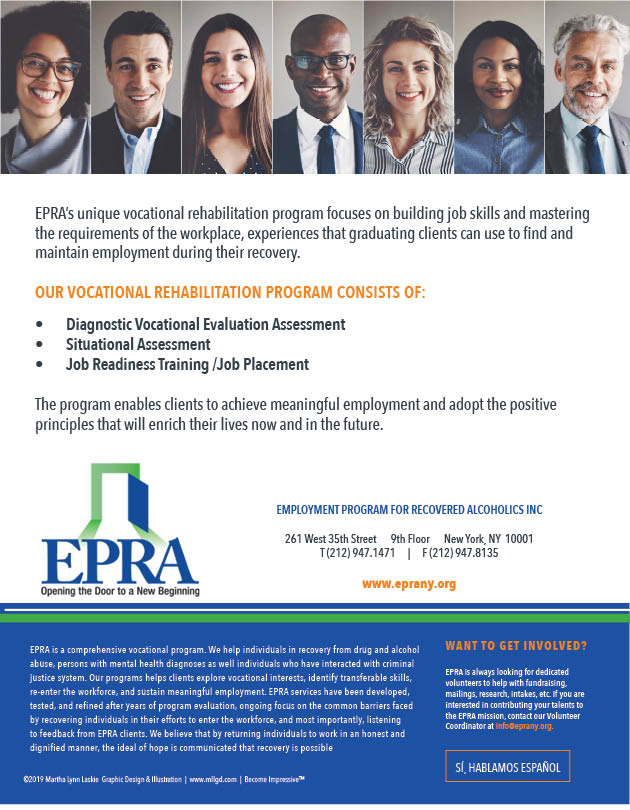
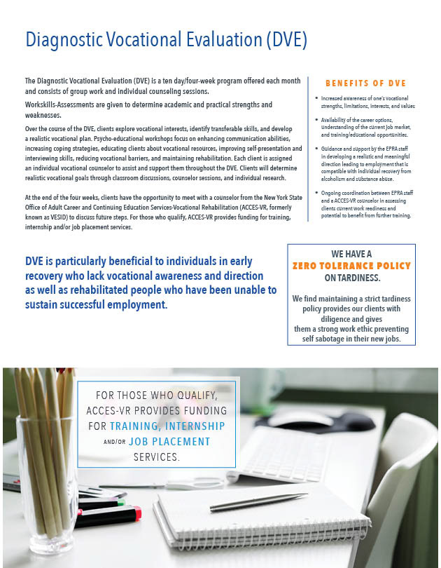
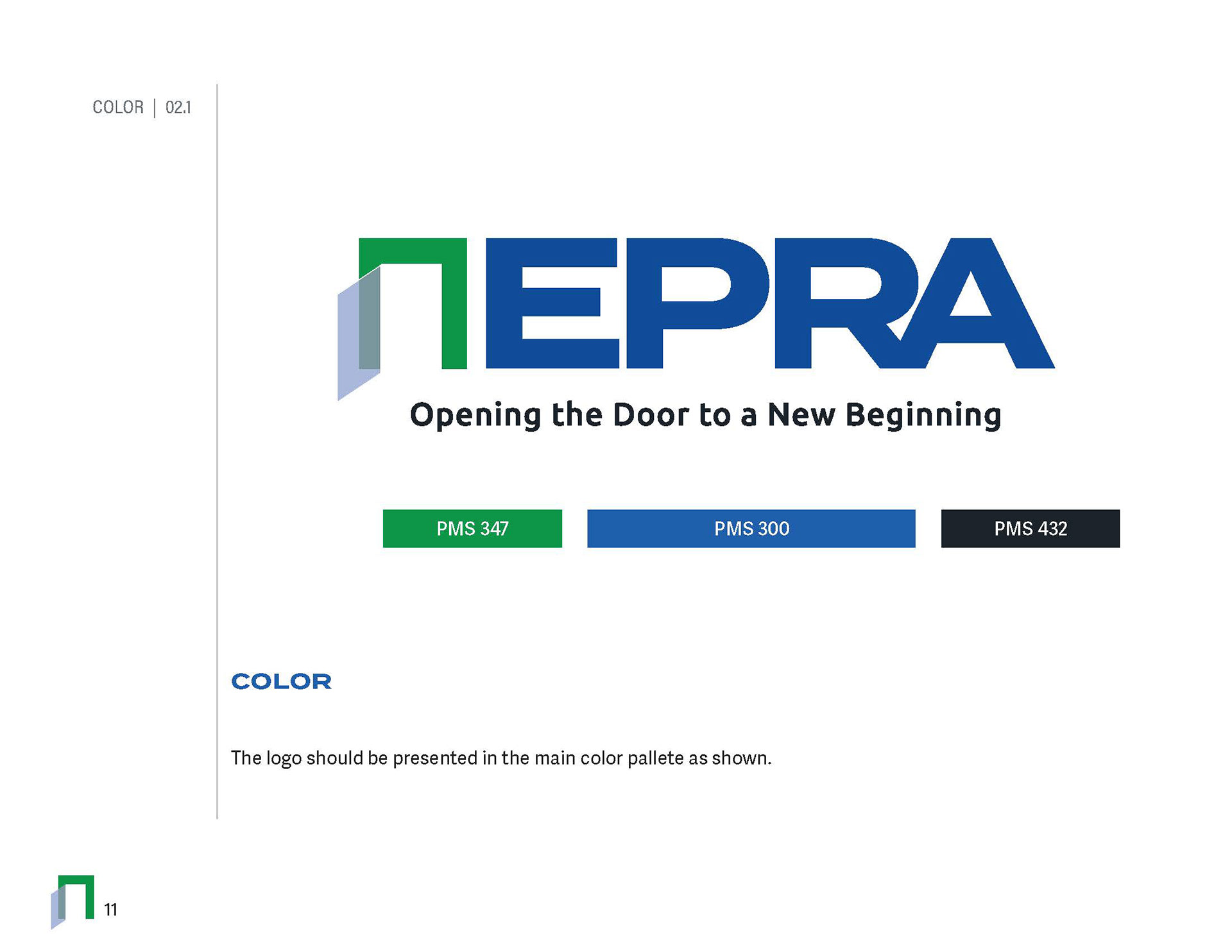
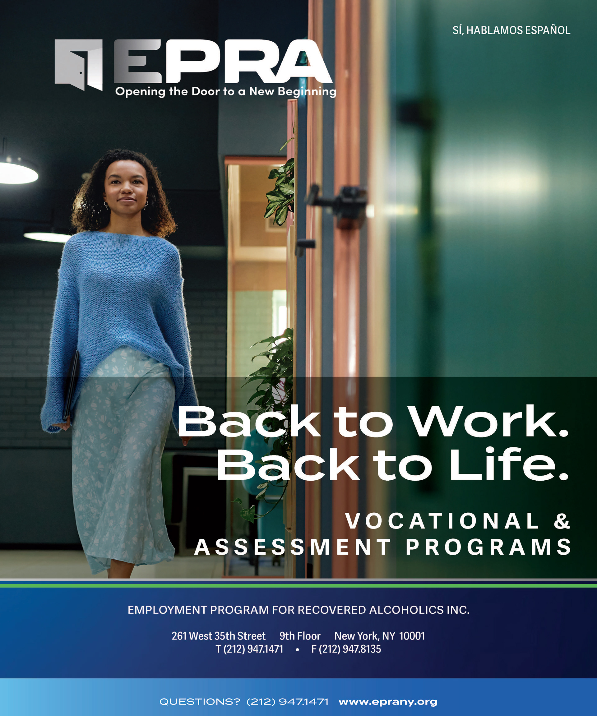
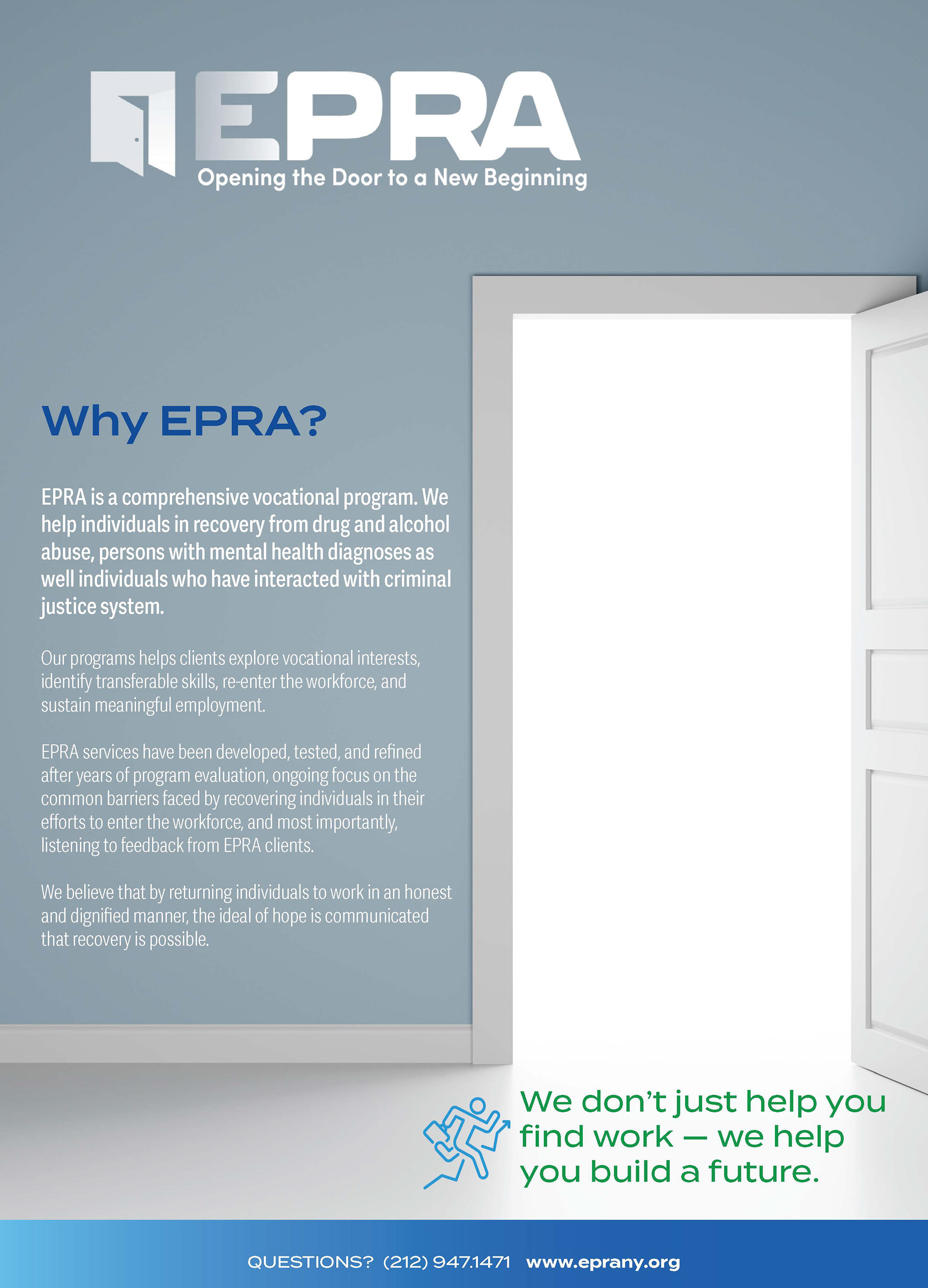
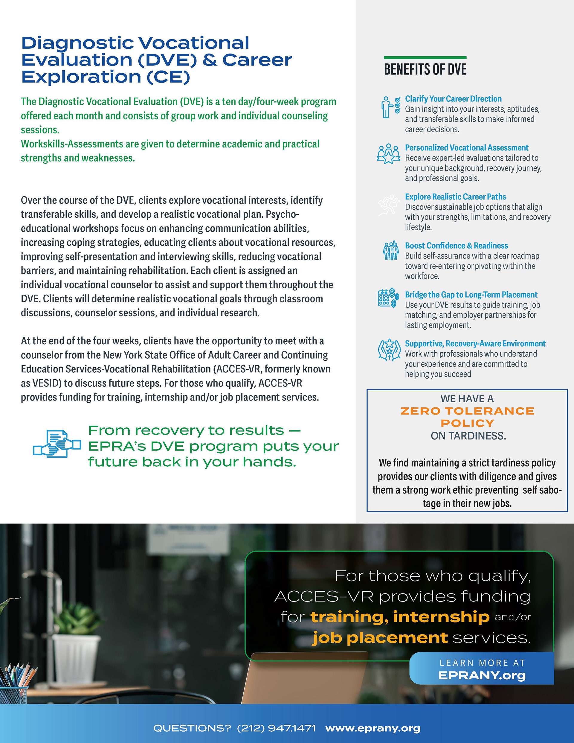
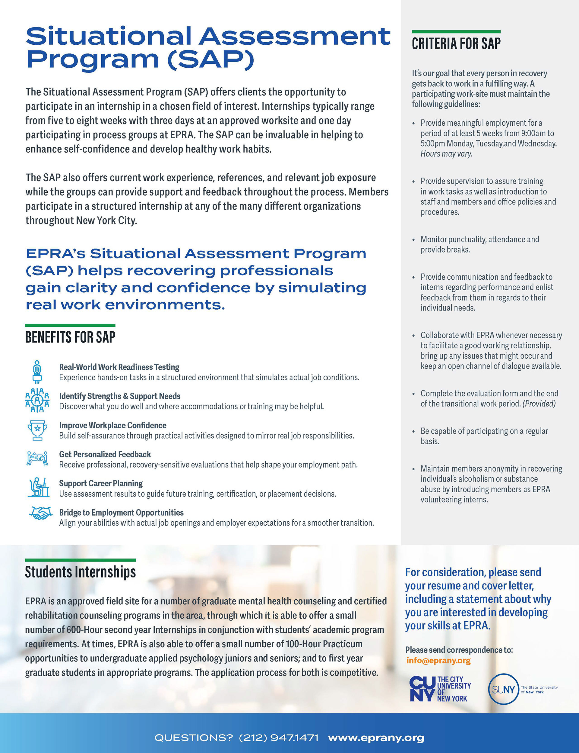
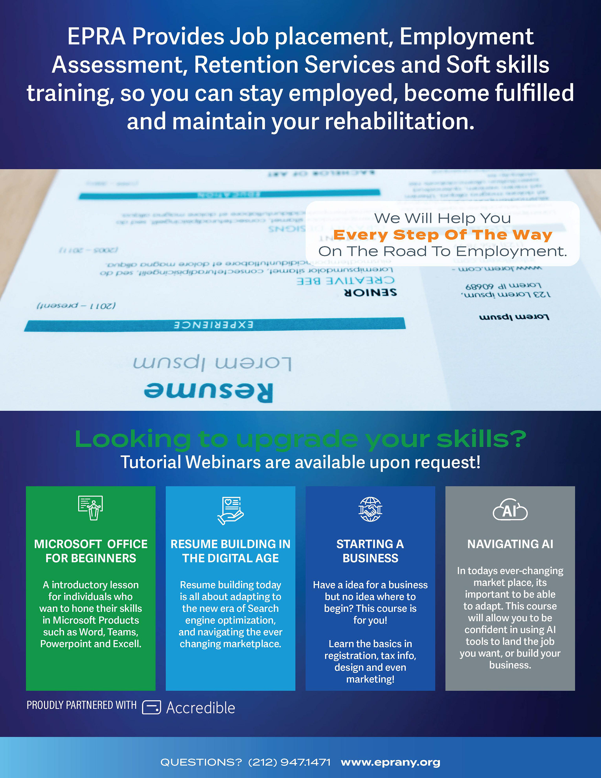
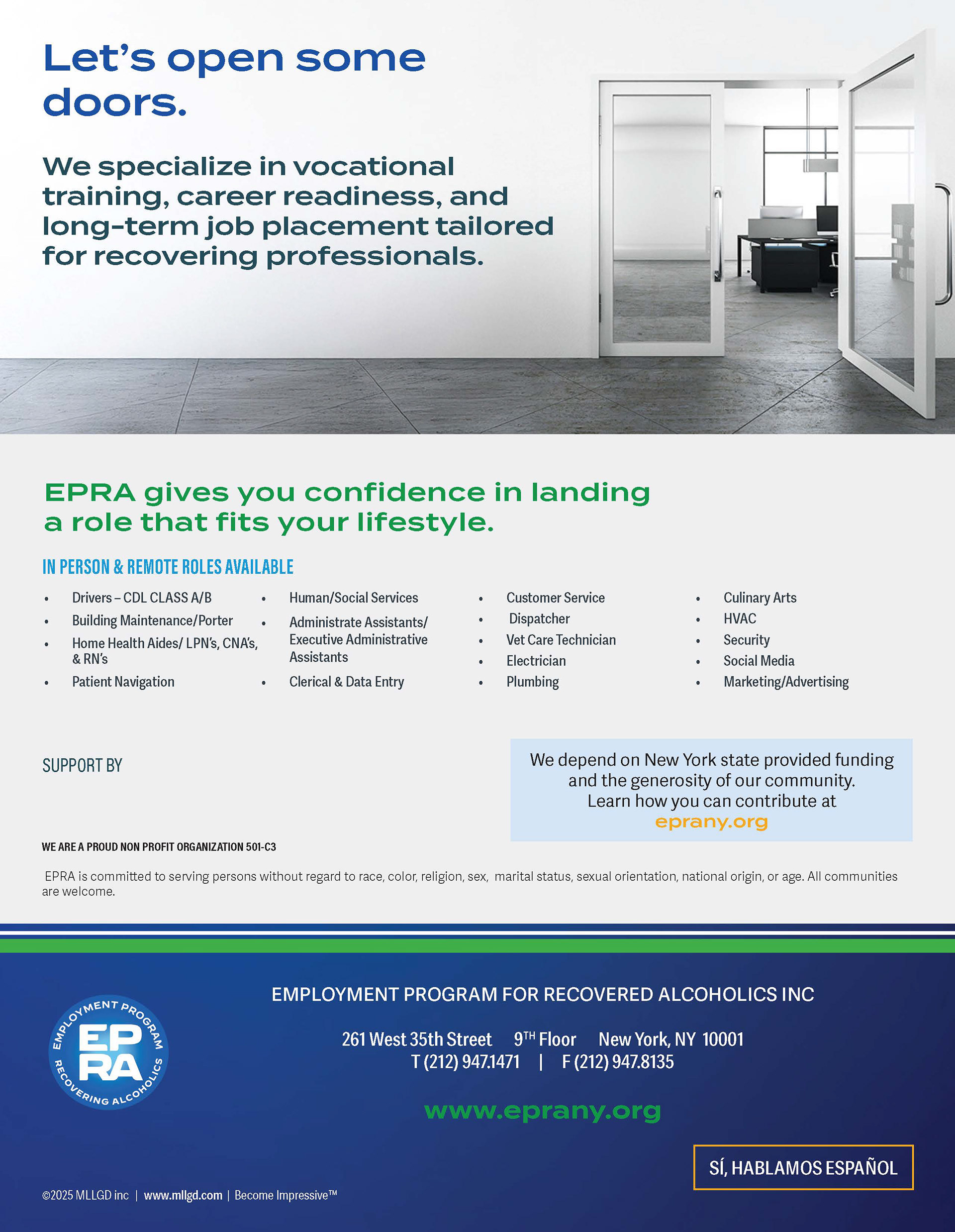
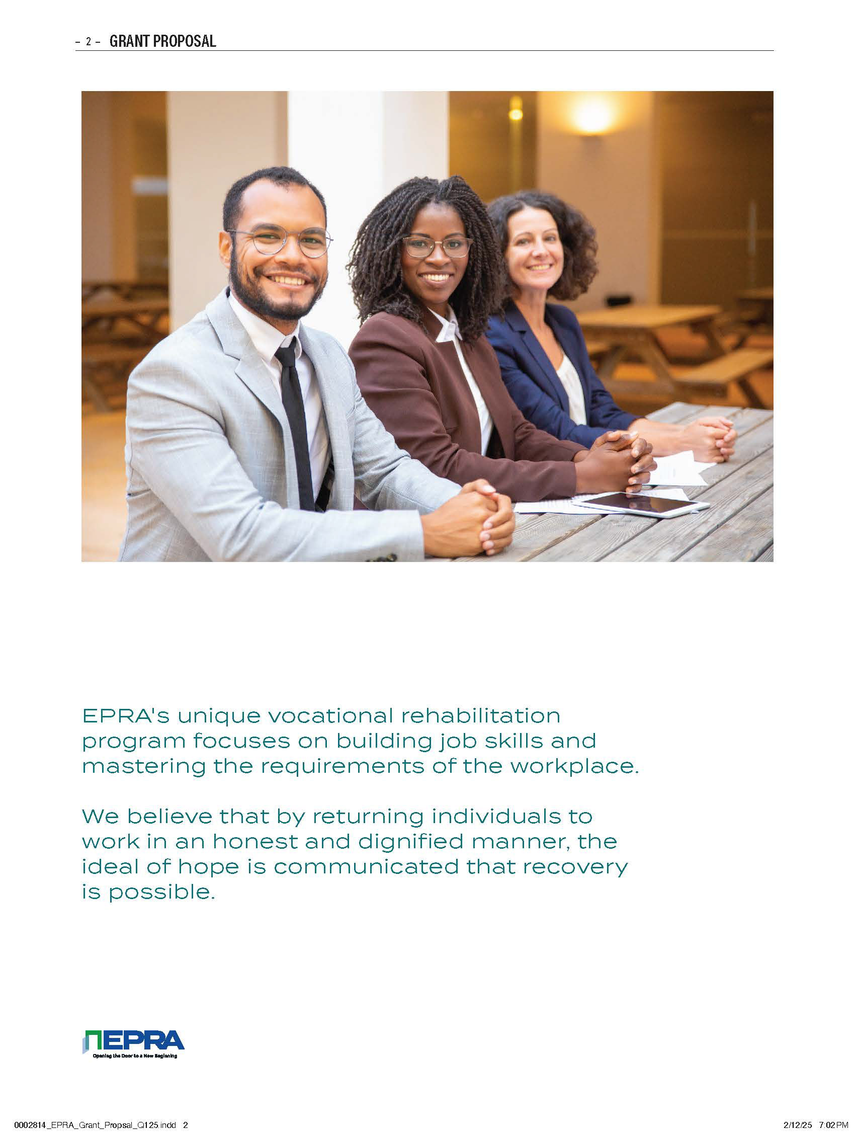
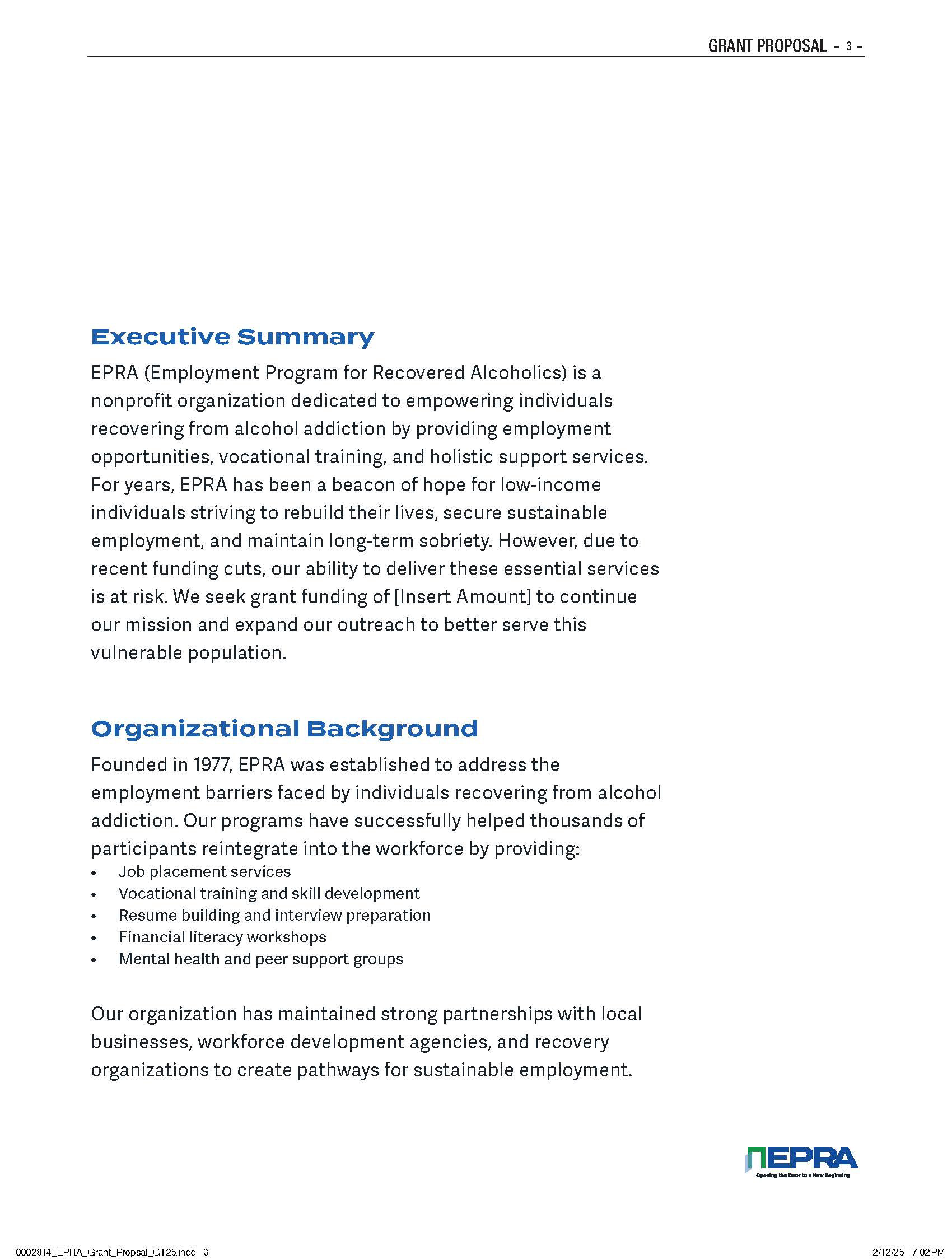
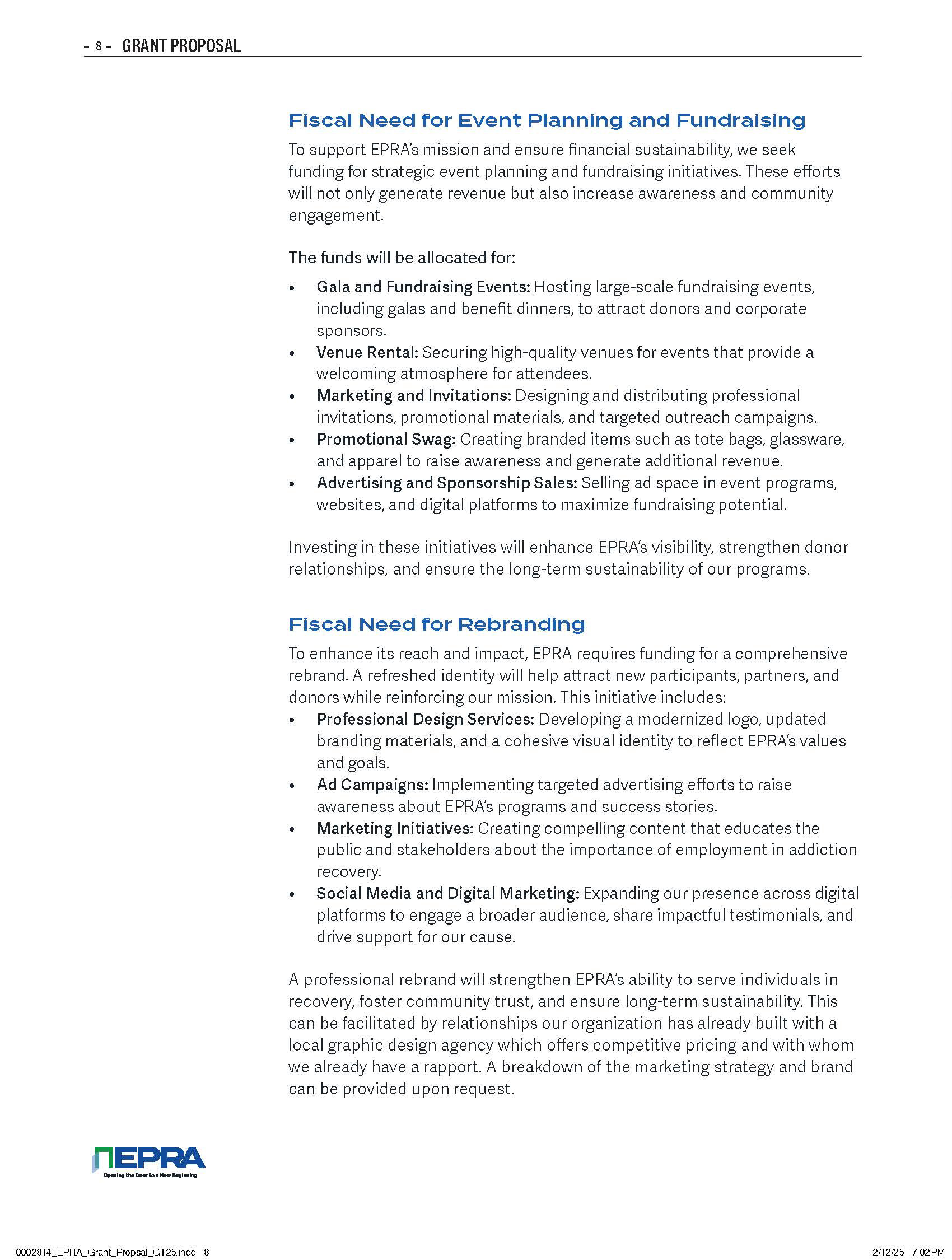
I developed a comprehensive visual identity for EPRA, including the logo, typography, color system, graphic language, marketing materials, advertising concepts, fundraising communications, and digital presence.
The identity was designed to be approachable, credible, optimistic, and purpose-driven—moving EPRA away from the visual language of an under-resourced nonprofit and toward the appearance of an organization with a clear future.
The resulting system created consistency across touchpoints while giving EPRA the flexibility to communicate with multiple audiences: participants, families, donors, corporate partners, government agencies, and community organizations.
The work was documented as a full brand identity and marketing project, encompassing brand, visual identity, logo design, advertising, fundraising, marketing, and design.
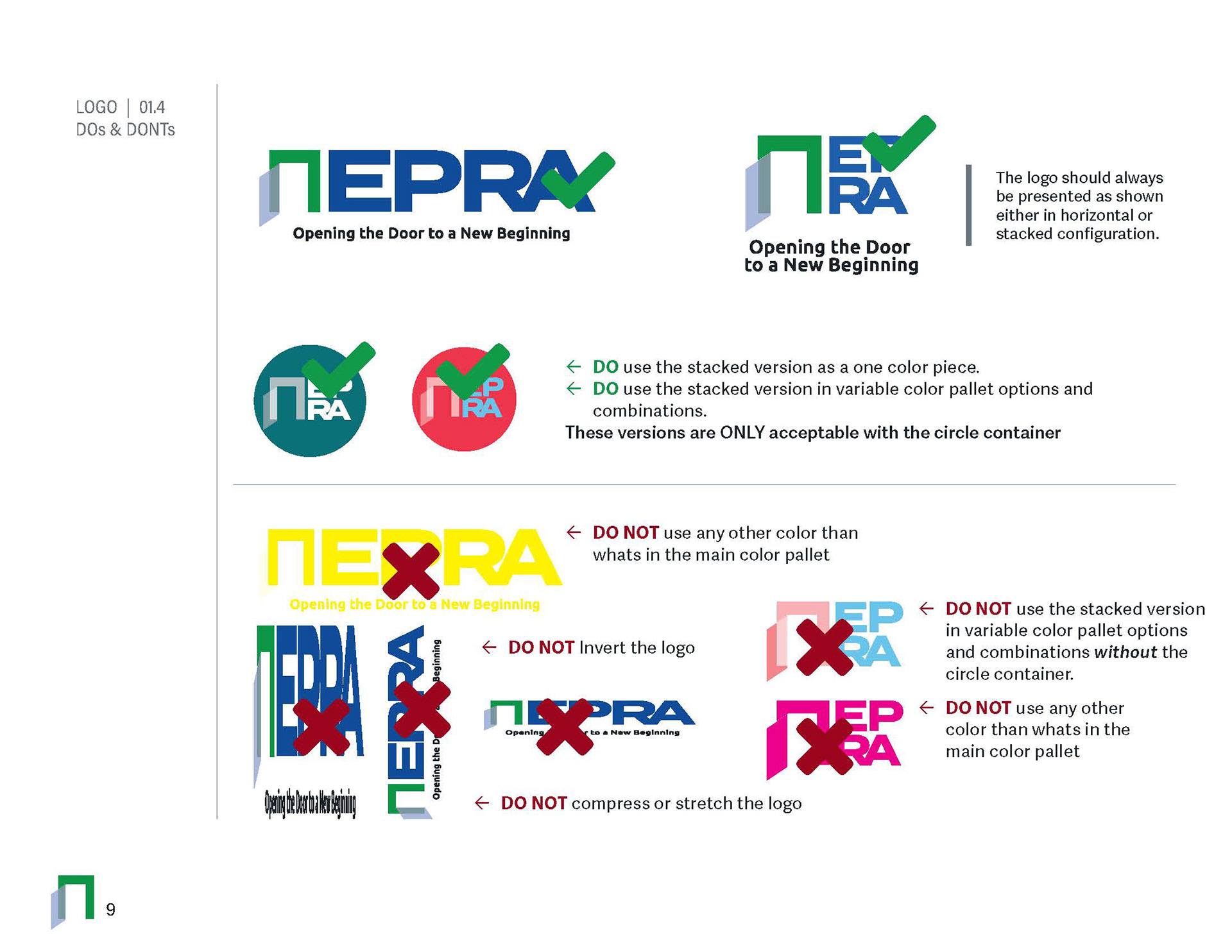
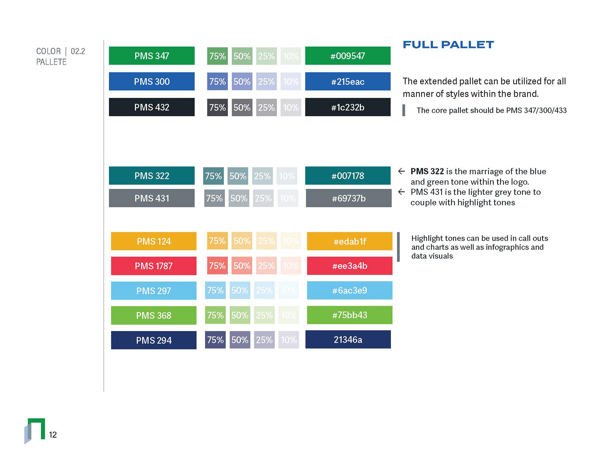
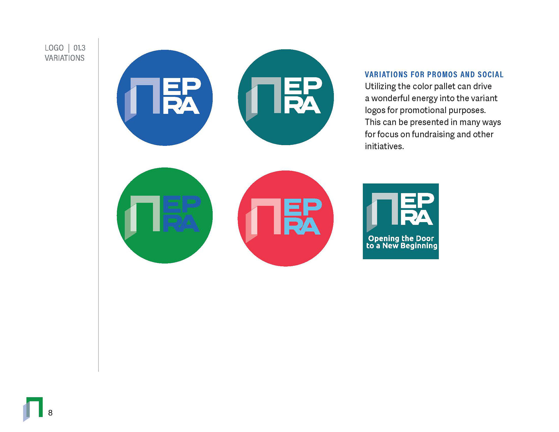
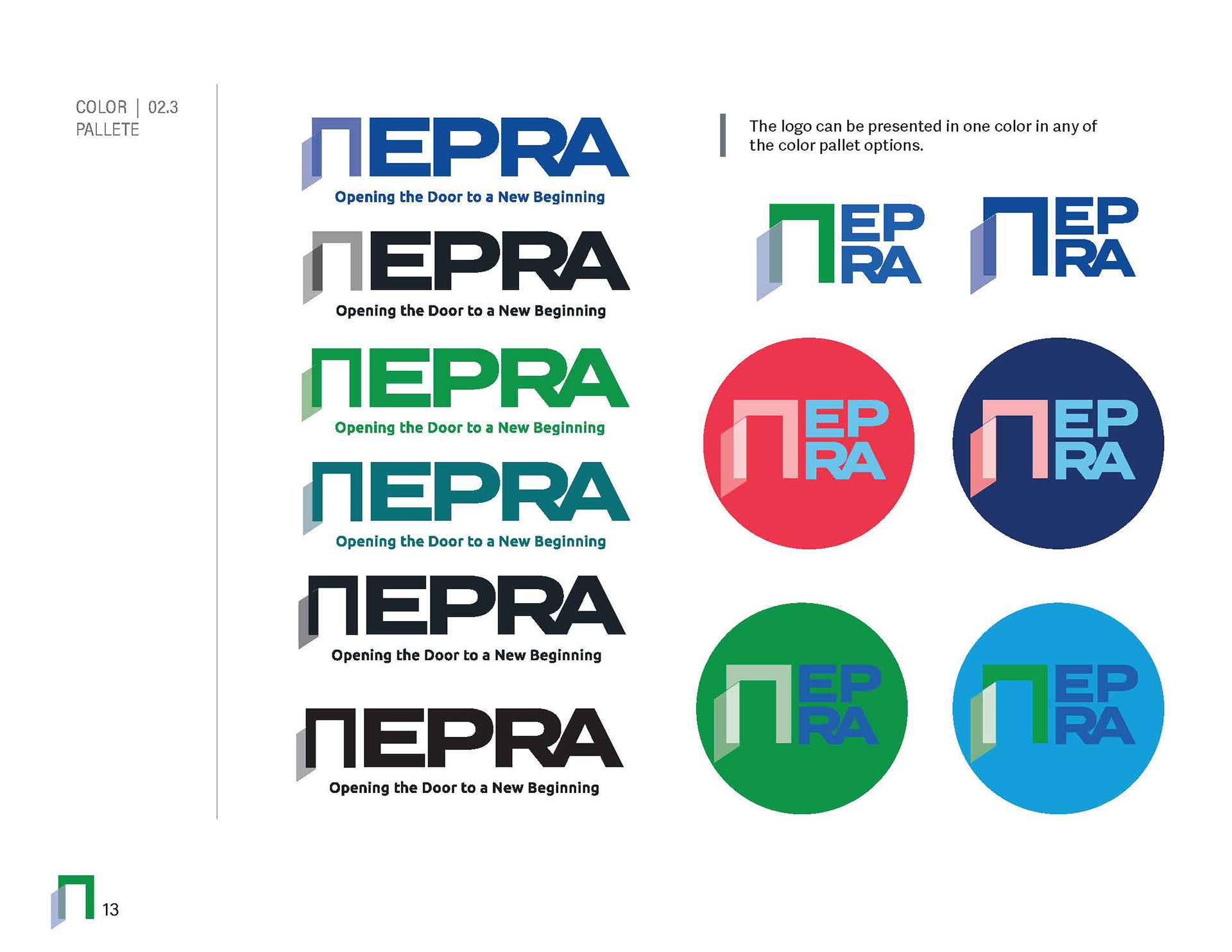
Customizing the logo Brough a simplistic color coding system for the individual products, utilizing the blue and green and marring them tighter into a teal representing a clear, calming environment with pops of color in warmer yellows and reds for emphasis use.
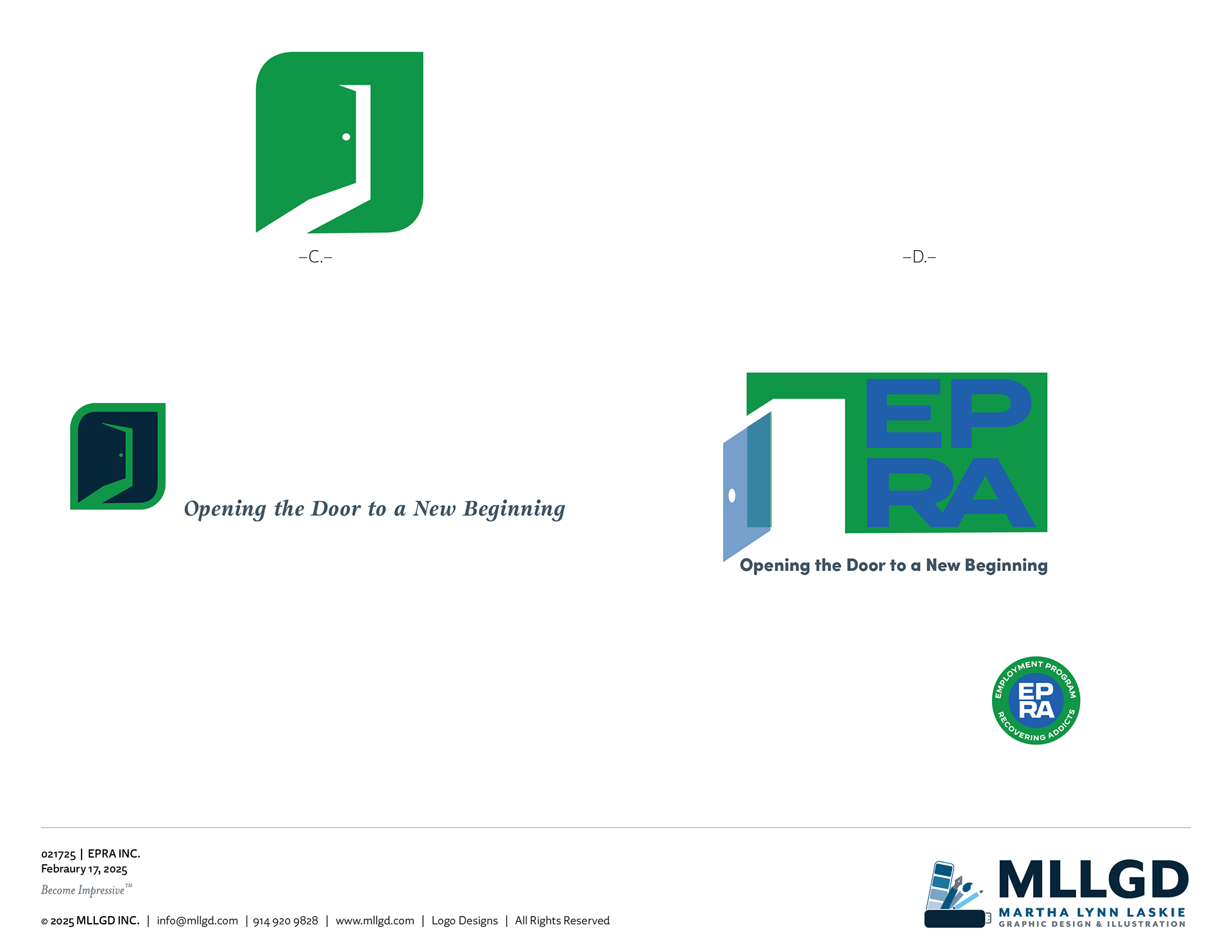
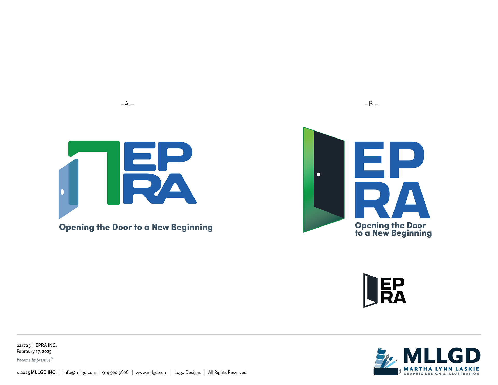
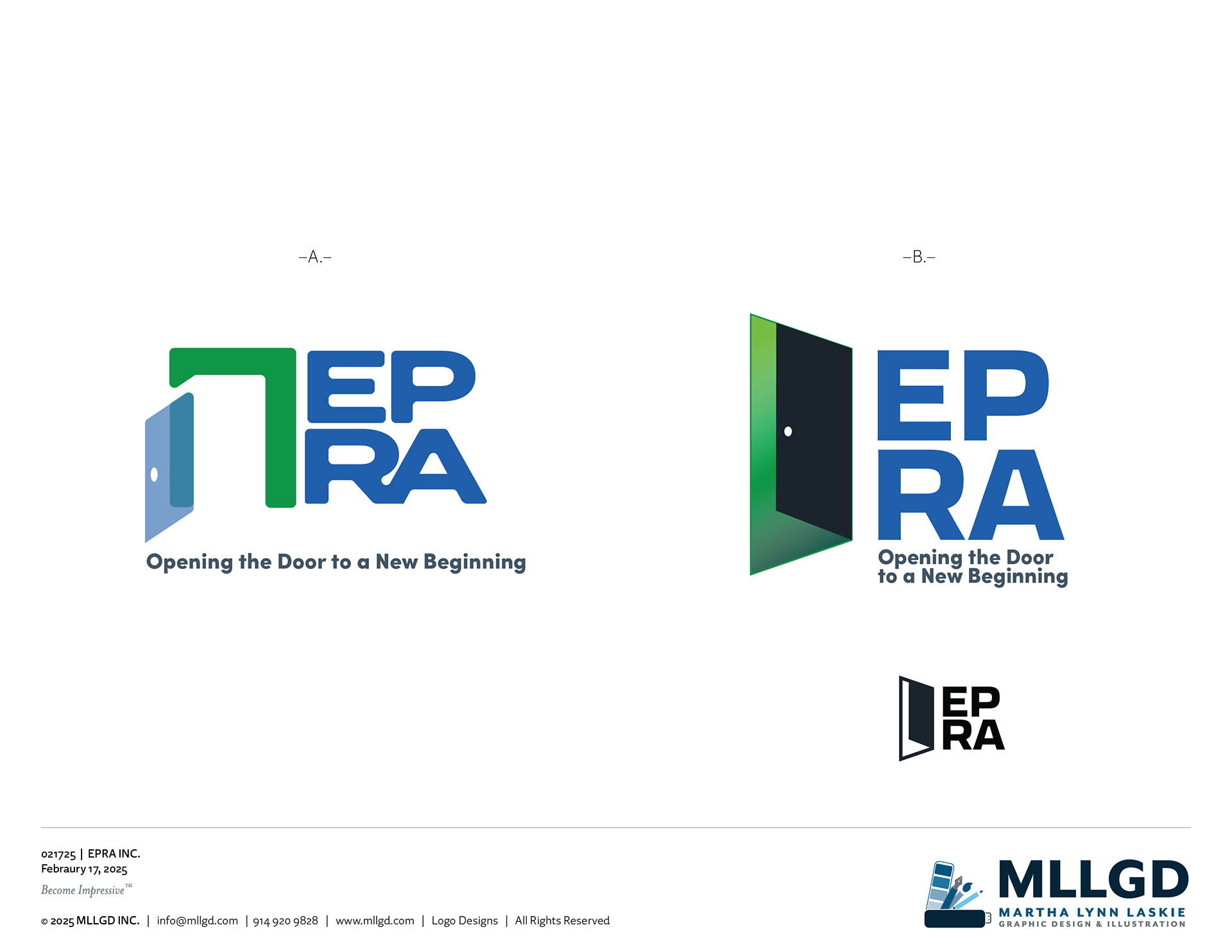
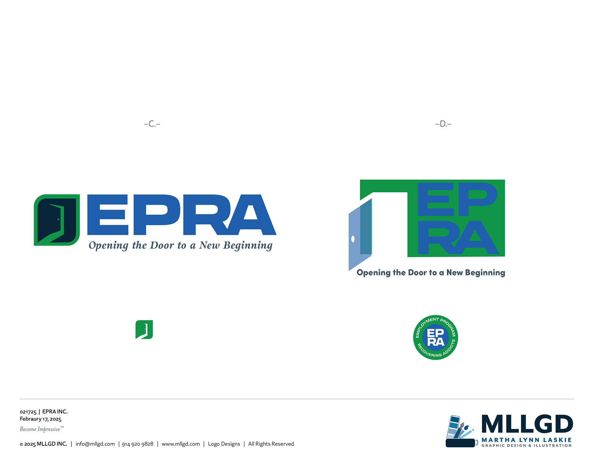
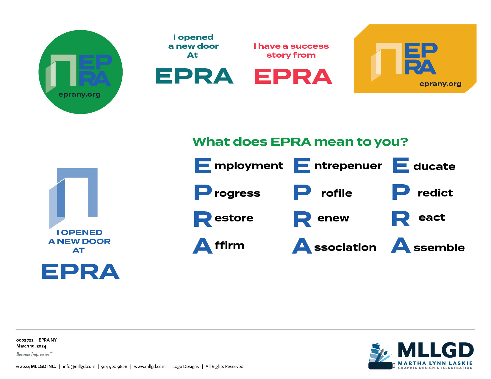
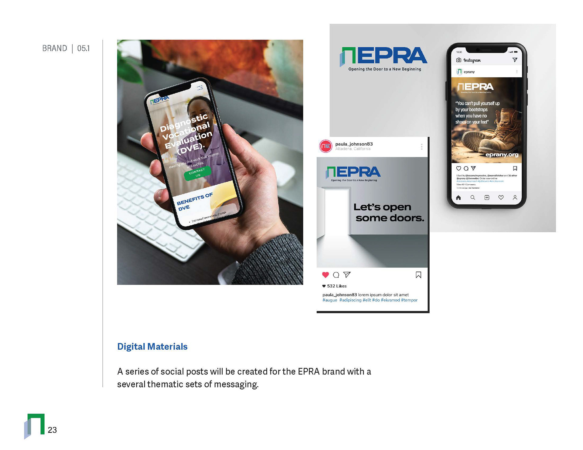
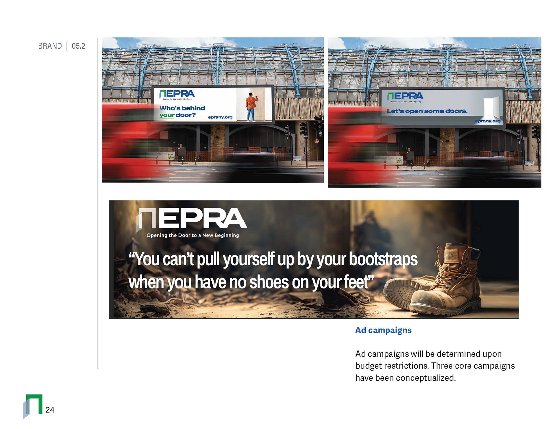
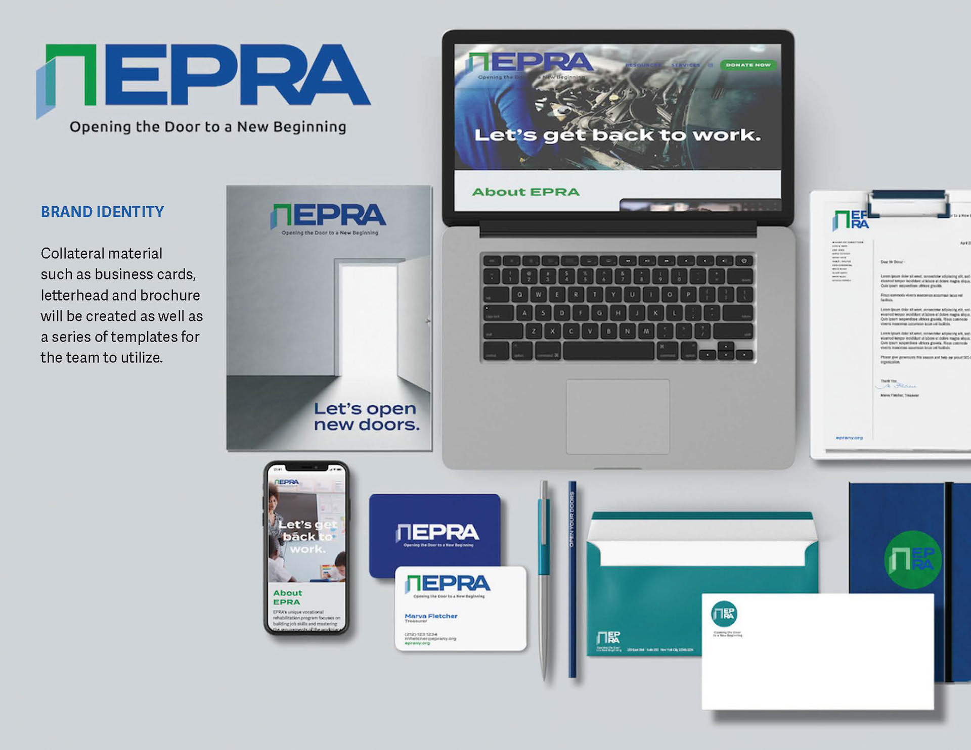
The “Open New Doors” campaign is a particularly strong piece of the EPRA story because it connects the brand concept directly to the organization’s mission: employment is not simply about finding a job—it is about opening the door to stability, independence, confidence, and a new beginning. EPRA itself uses the “open new doors” language in its current corporate sponsorship messaging.
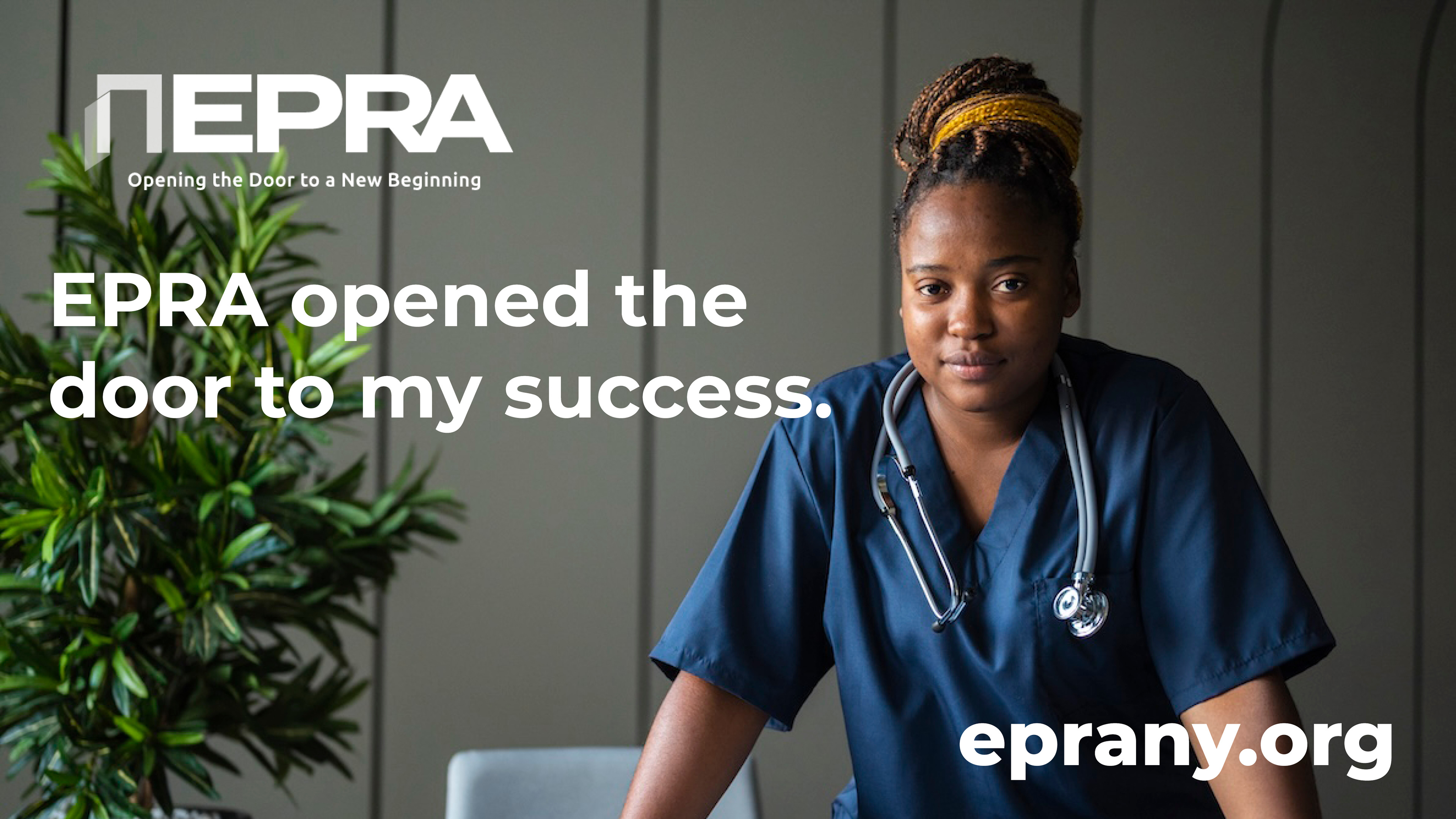
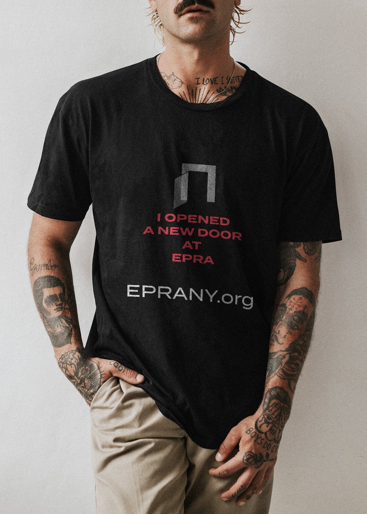
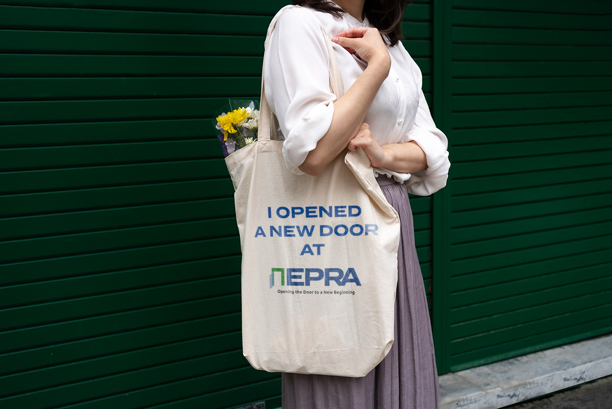




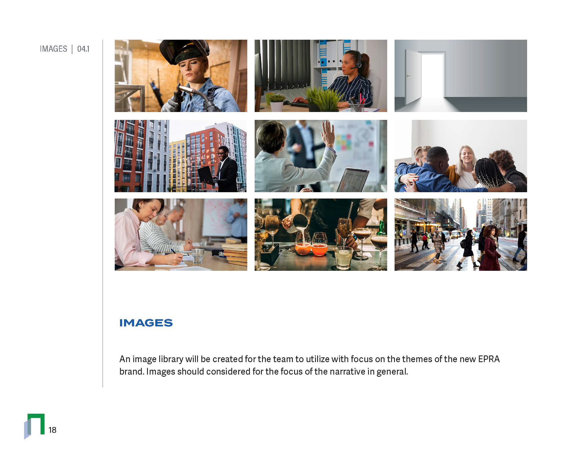
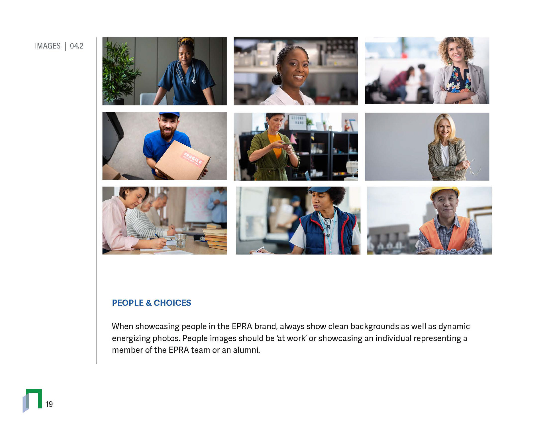
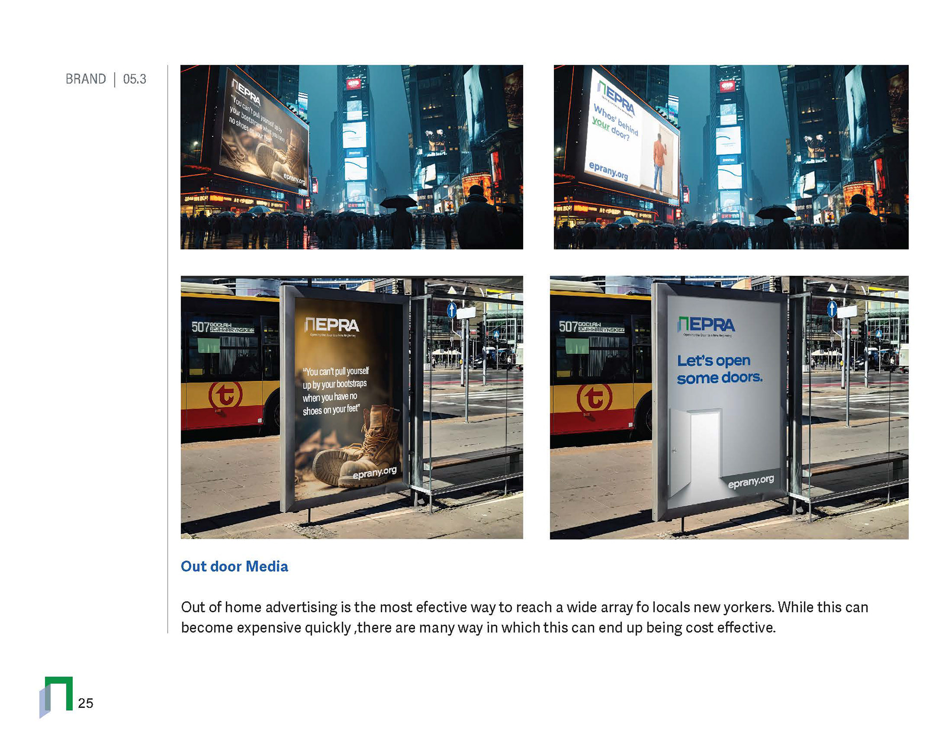
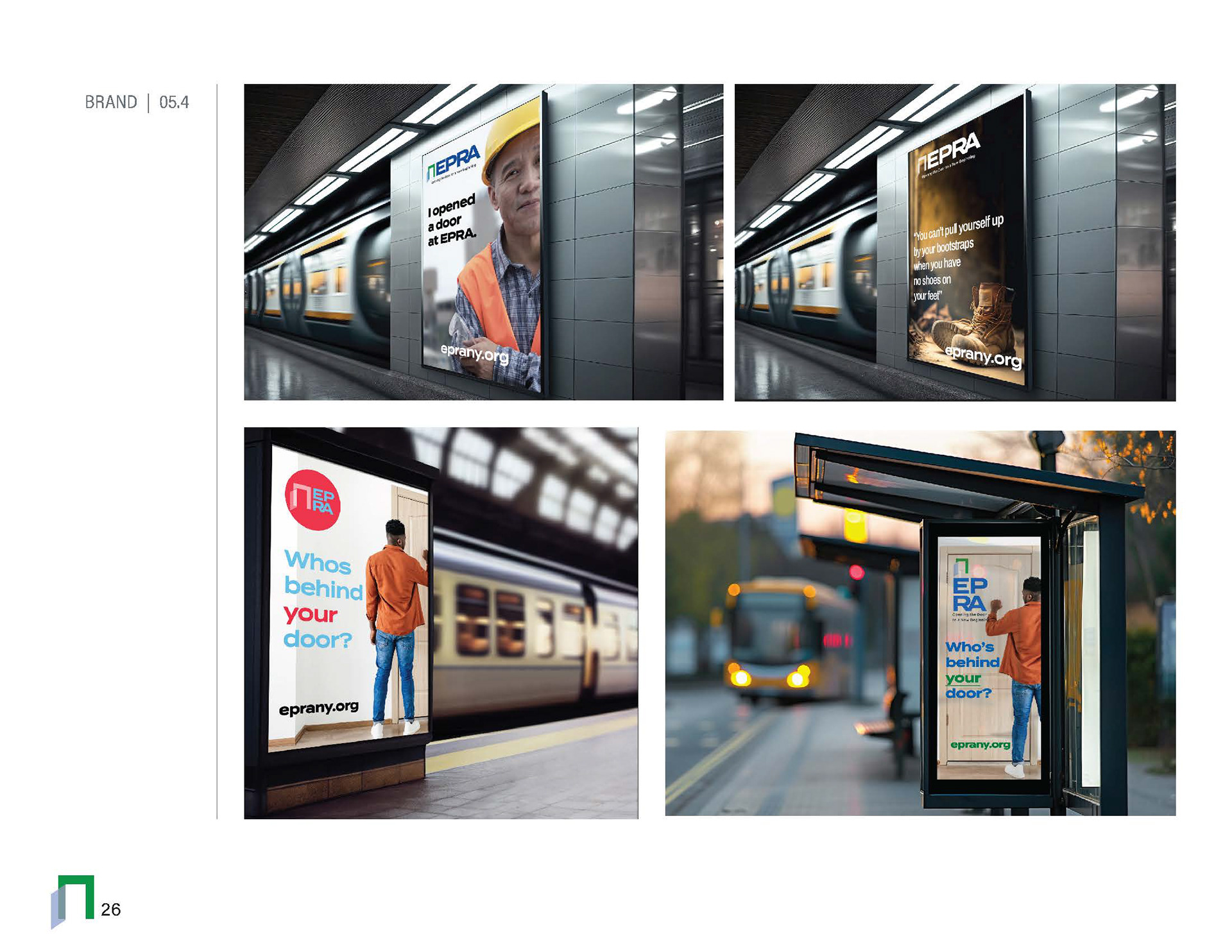
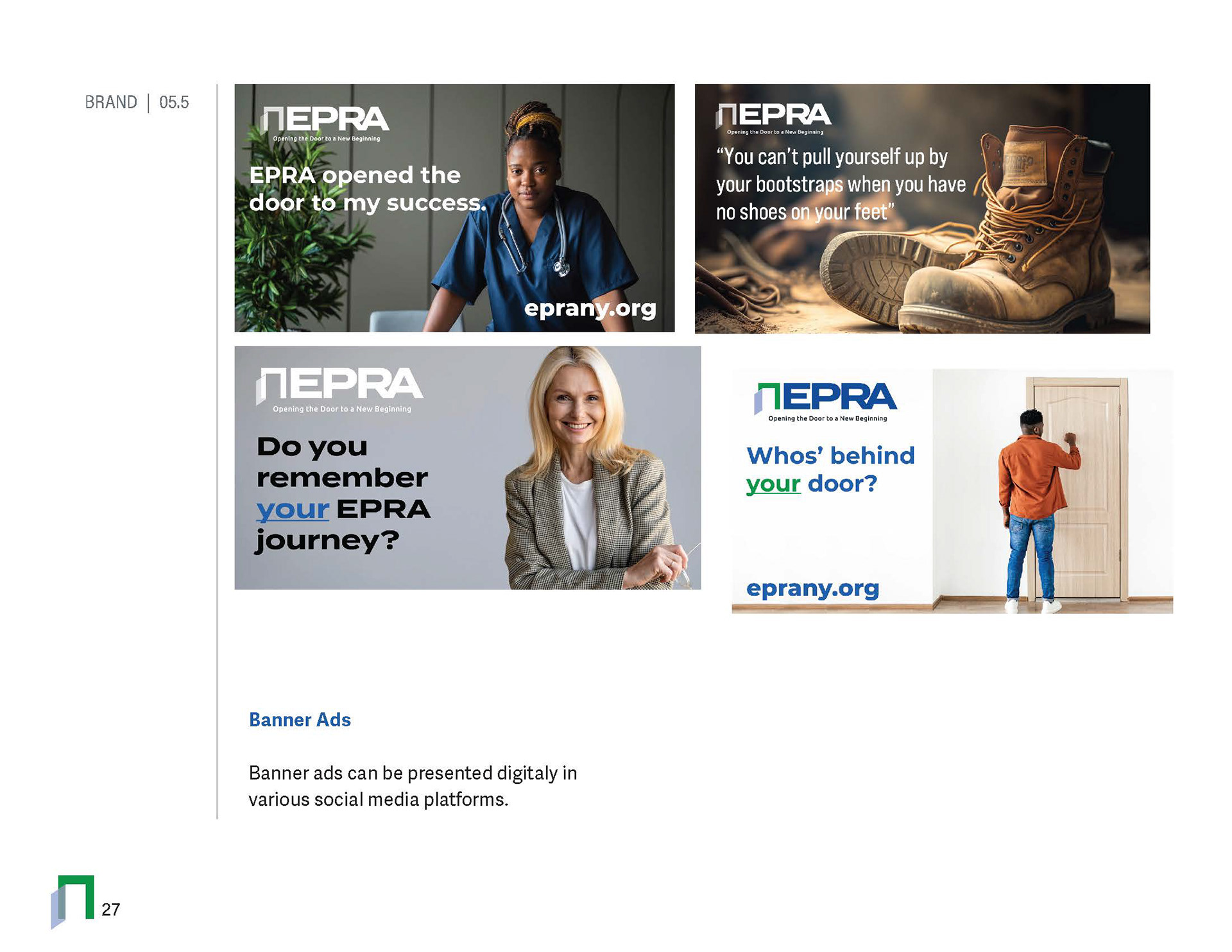
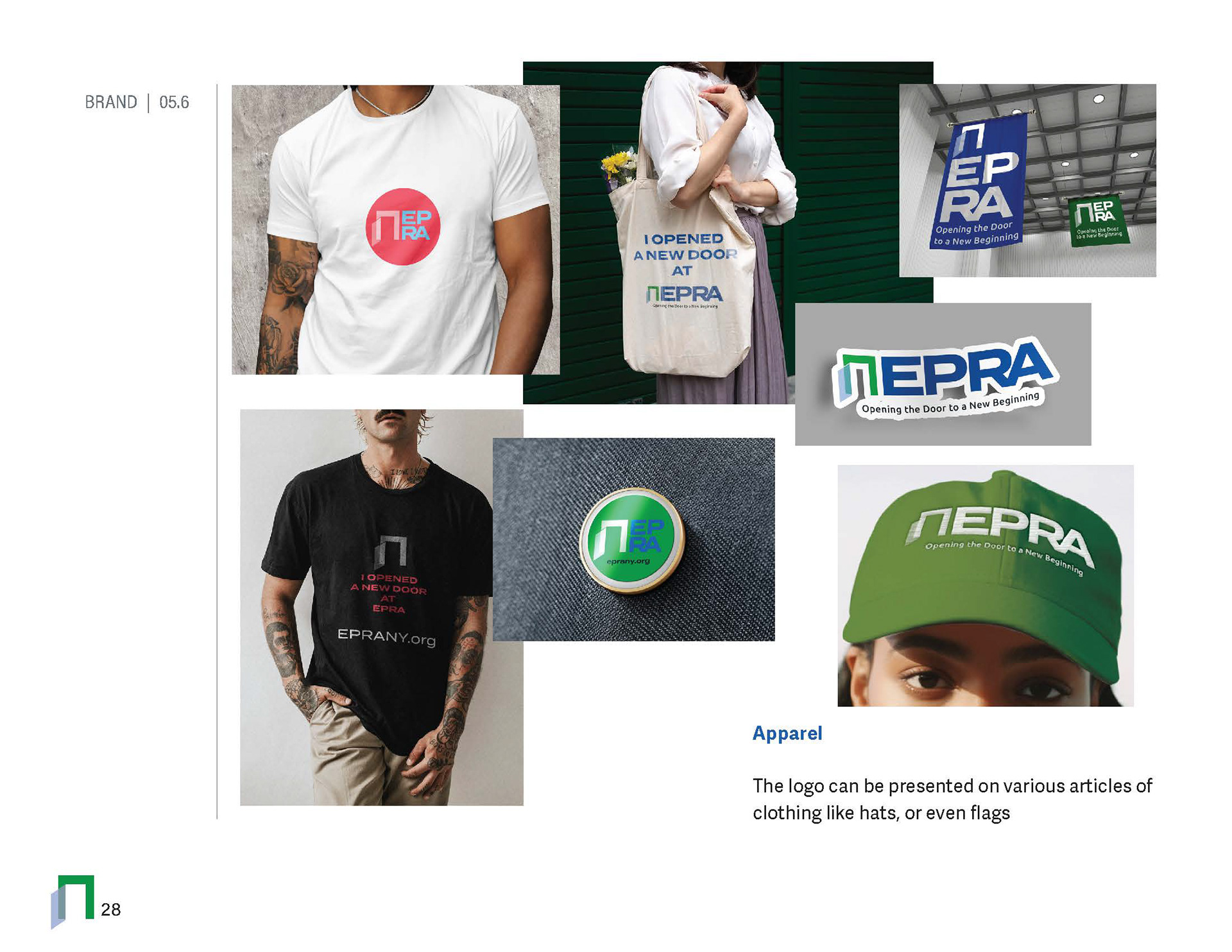
Utilizing AI tools, A simple but effective little promo video gave a nice brand awareness introduction to the public as we slowly rolled out the new brand.
From Brand Design to Brand Infrastructure
The most important part of the engagement was recognizing that EPRA didn't simply need new graphics—it needed a communications ecosystem.
This included:
• Brand identity and visual standards
• Logo and supporting brand elements
• Marketing and advertising materials
• Fundraising campaign concepts
• Digital and website direction
• Presentation and communication materials
• Donor-facing messaging
• Community outreach materials
• Campaign concepts designed to increase awareness and participation
The second phase expanded the work into a broader organizational and marketing strategy, creating a more comprehensive brand presence and digital experience.
The Result
The transformation gave EPRA something it previously did not have: a recognizable public-facing brand with the credibility to support growth.
The new identity helped shift the conversation from “Who is EPRA?” to “What can EPRA accomplish?”
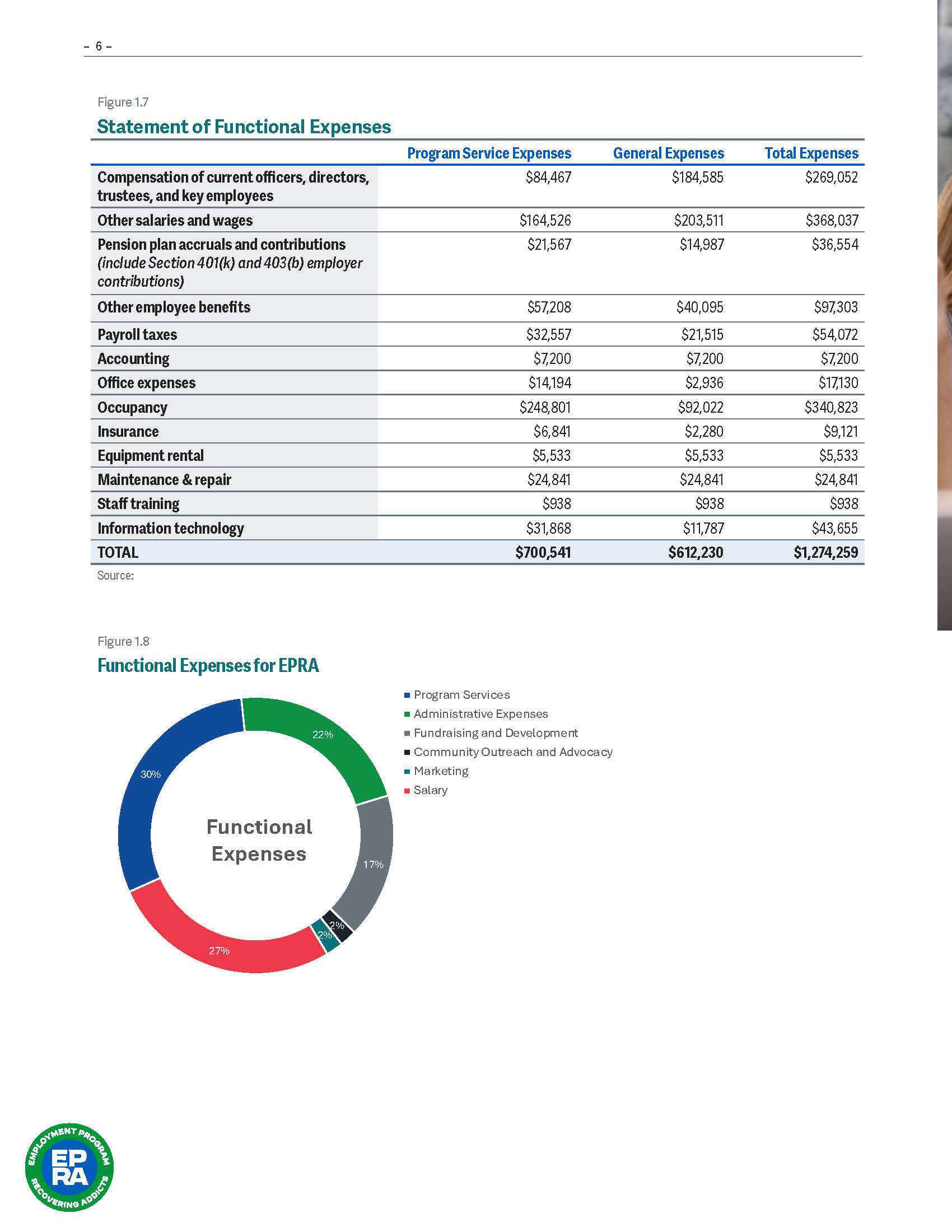
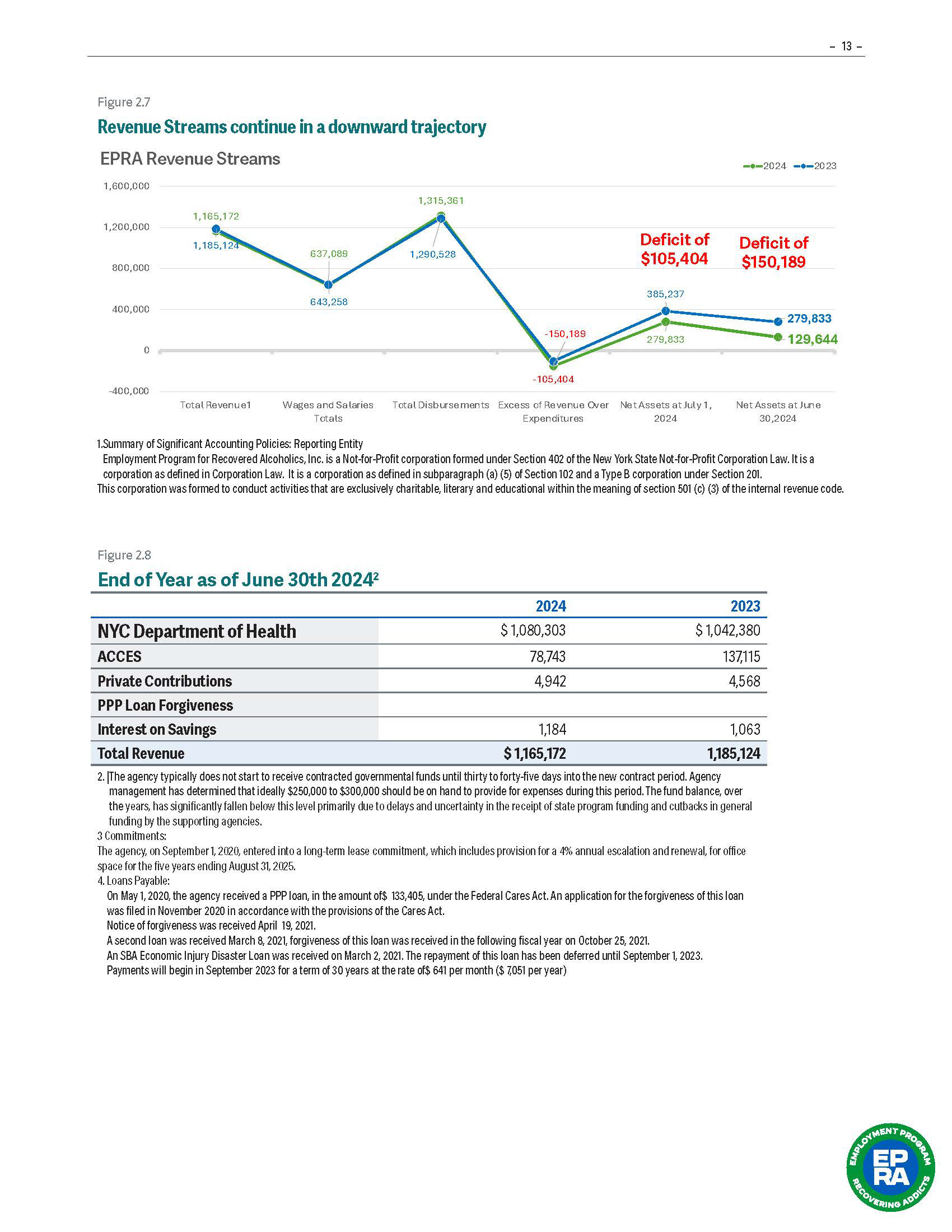
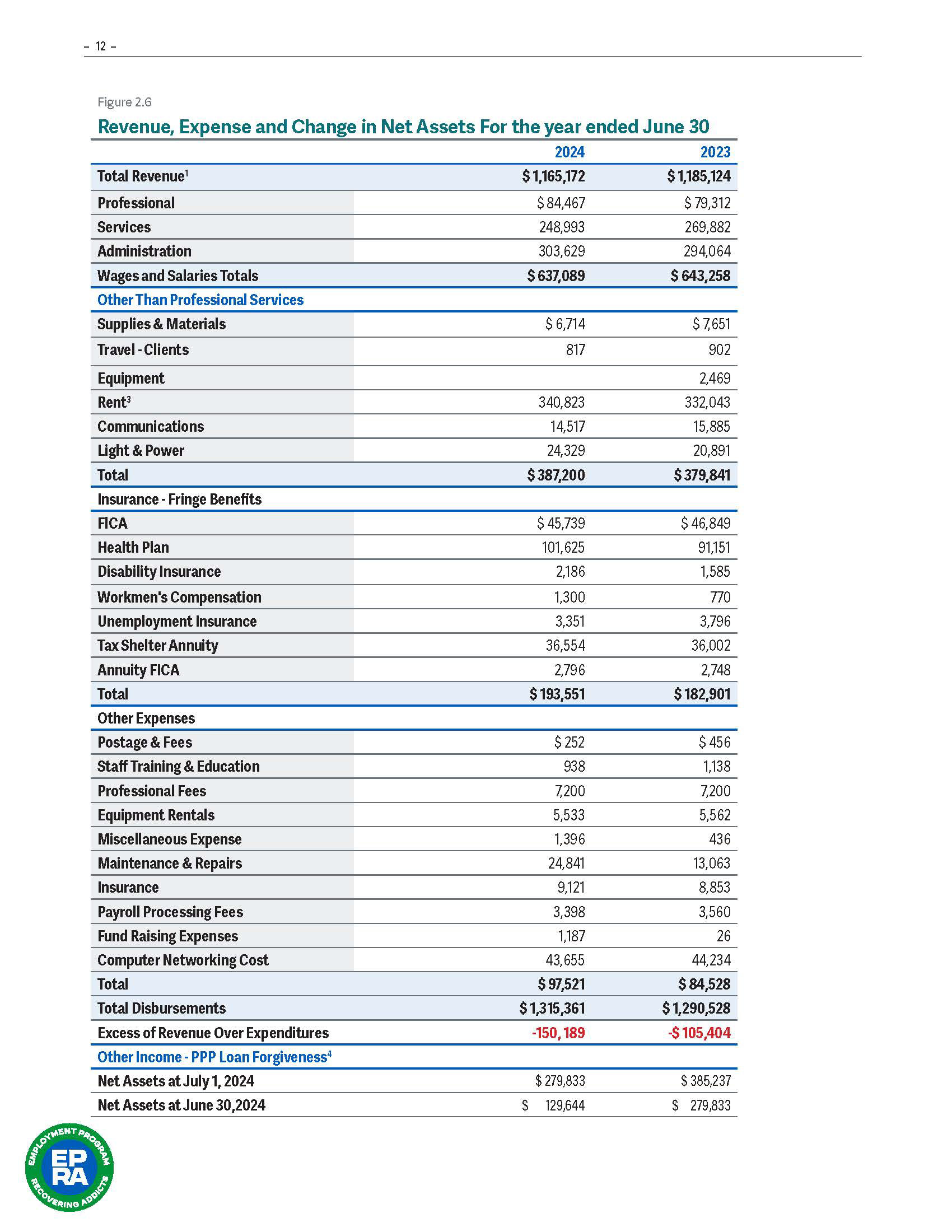
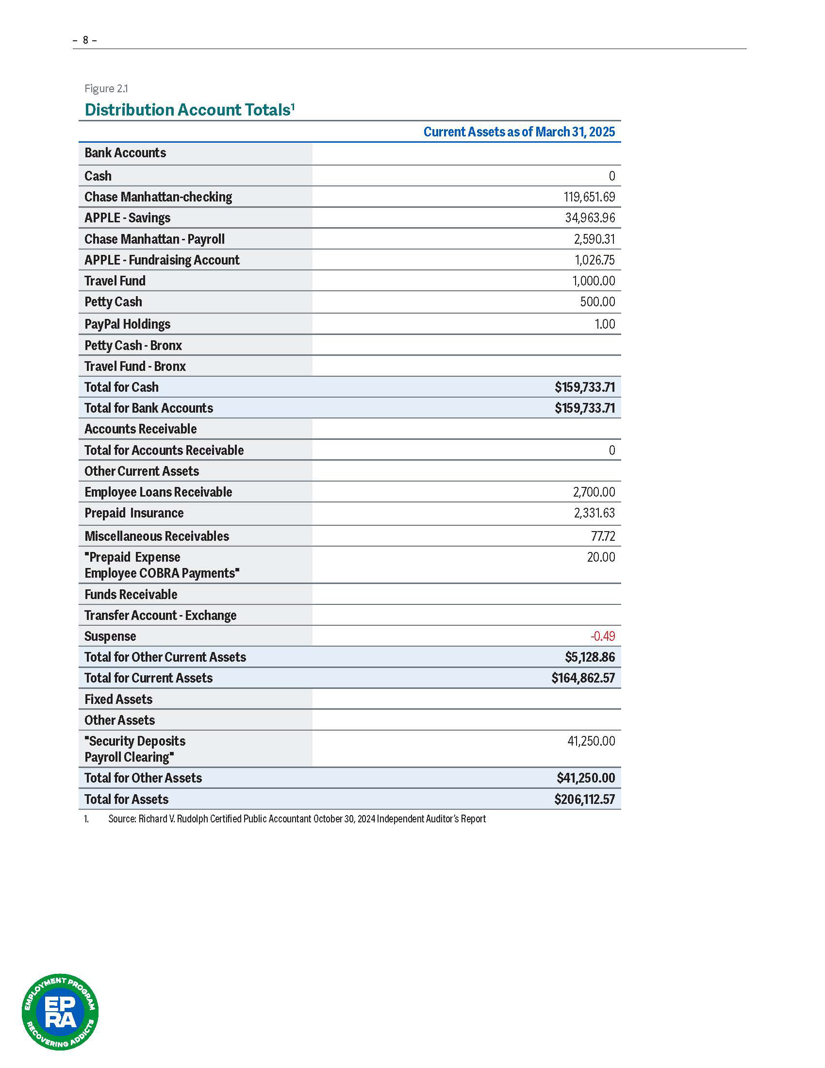
More importantly, the creative strategy connected design directly to measurable organizational outcomes.
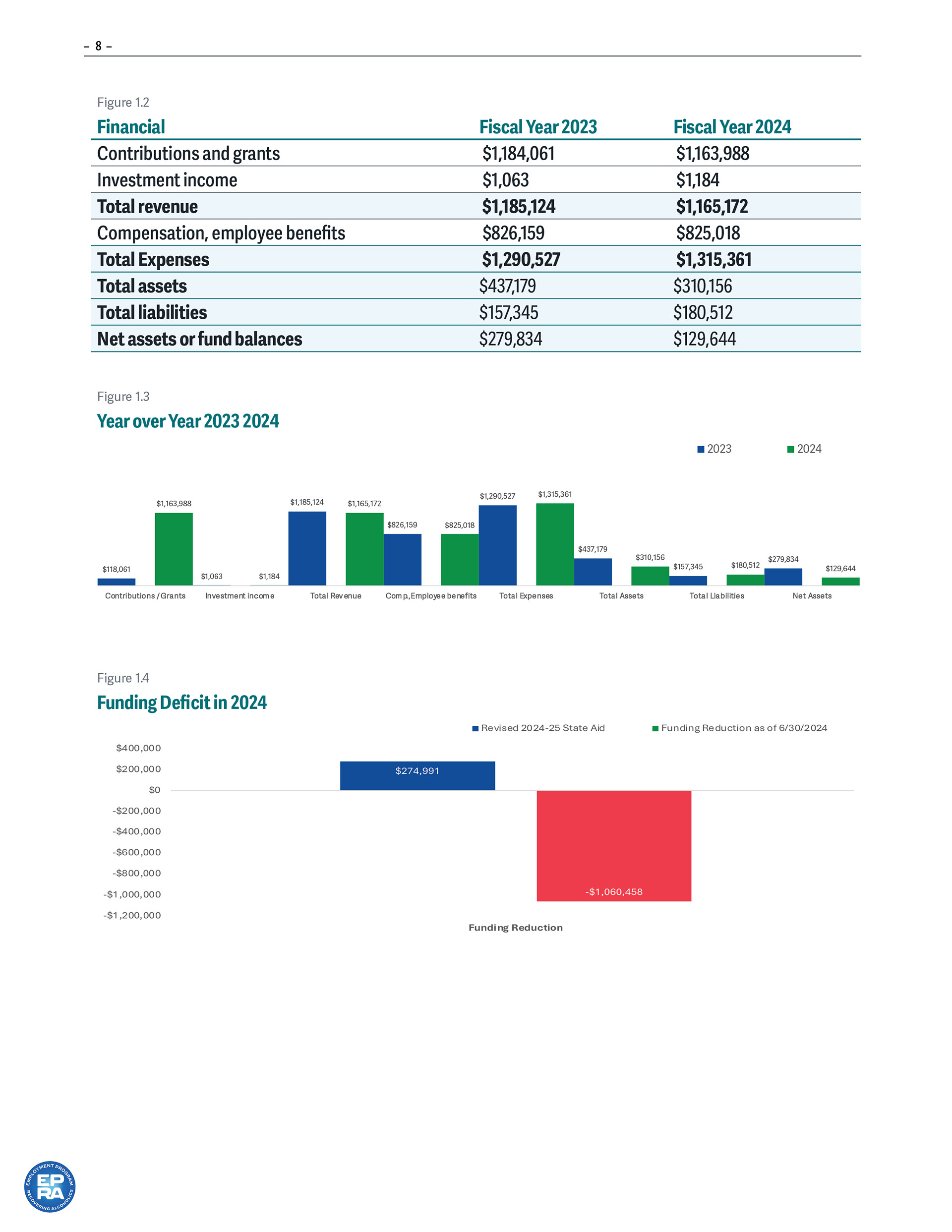
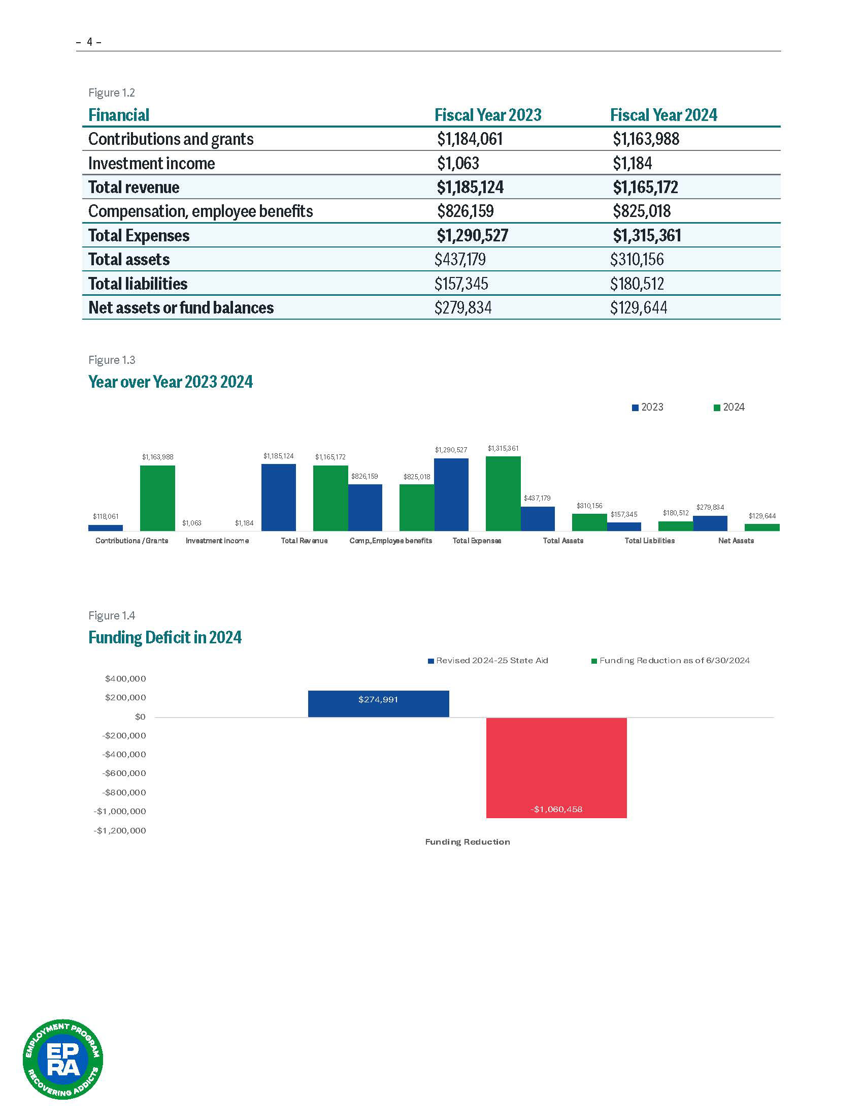
35% Increase in Donations
Through the development of a stronger brand presence, fundraising communications, and more compelling donor-facing marketing, EPRA achieved a 35% increase in donations.
The brand became an active fundraising tool rather than simply an aesthetic exercise.
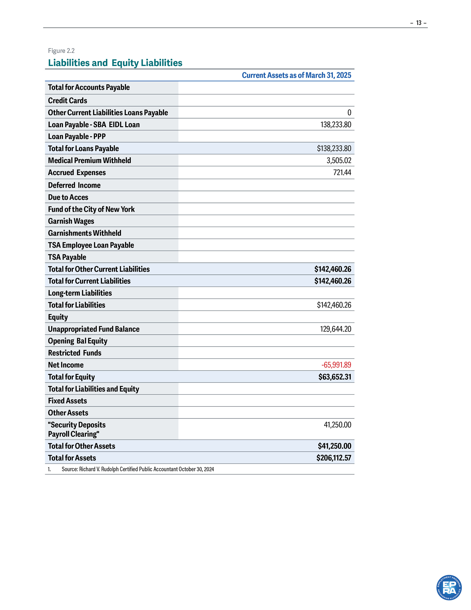
$1.5M New York State Funding Opportunity
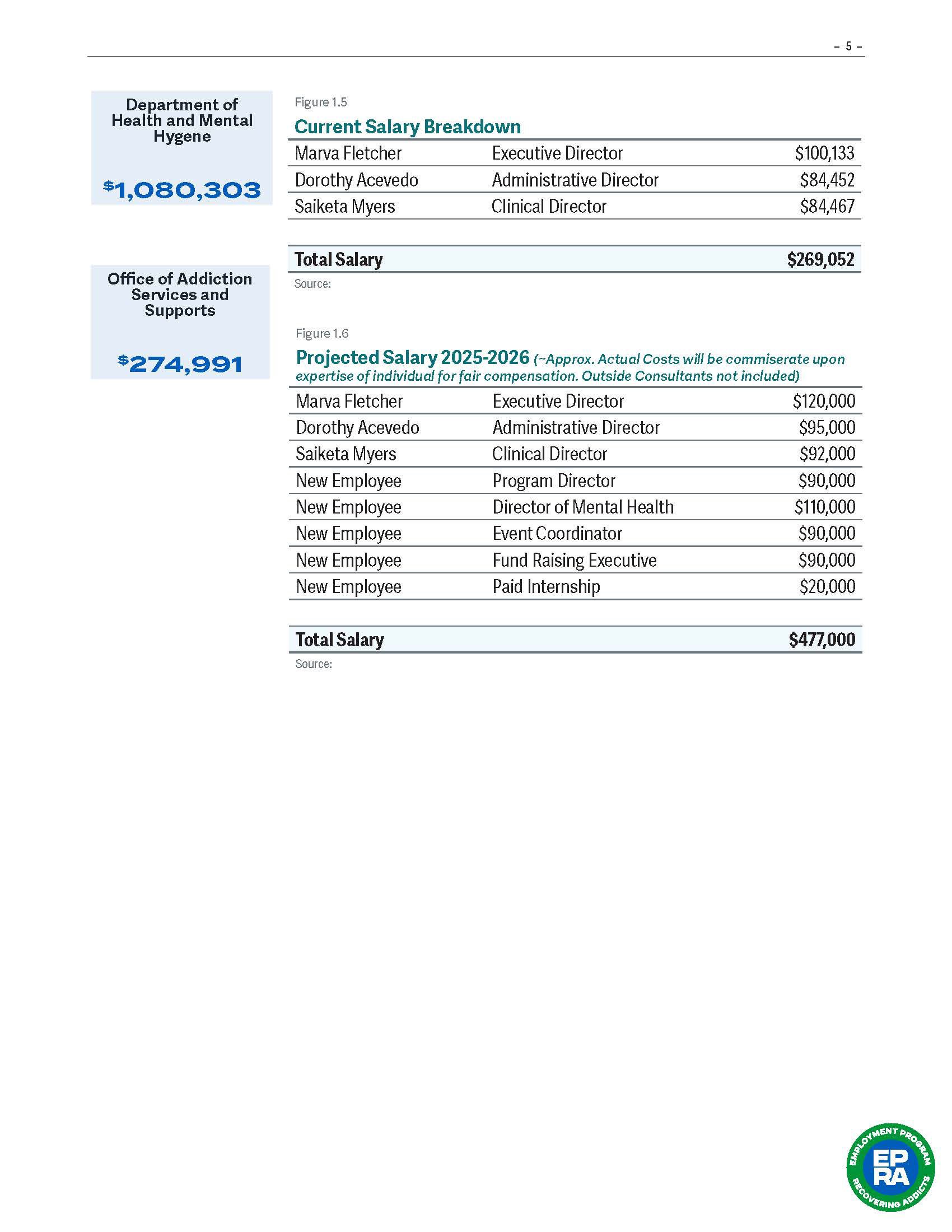
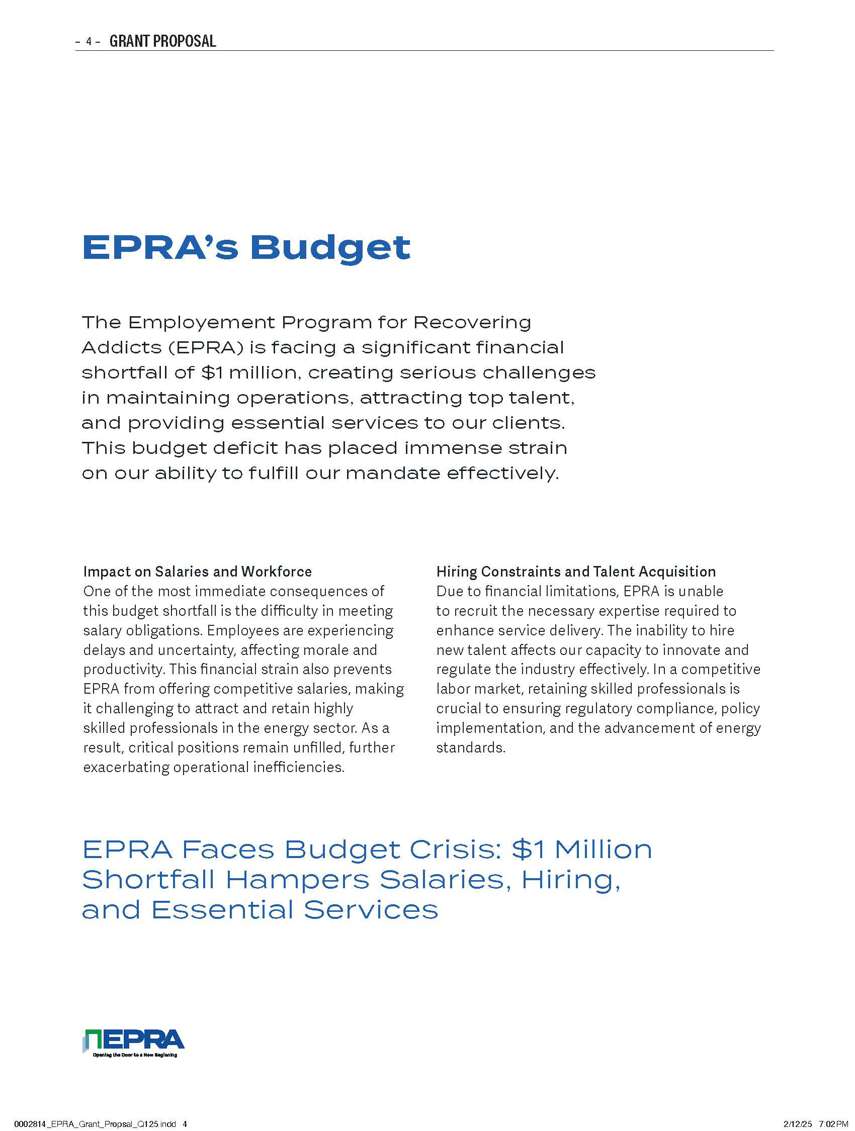
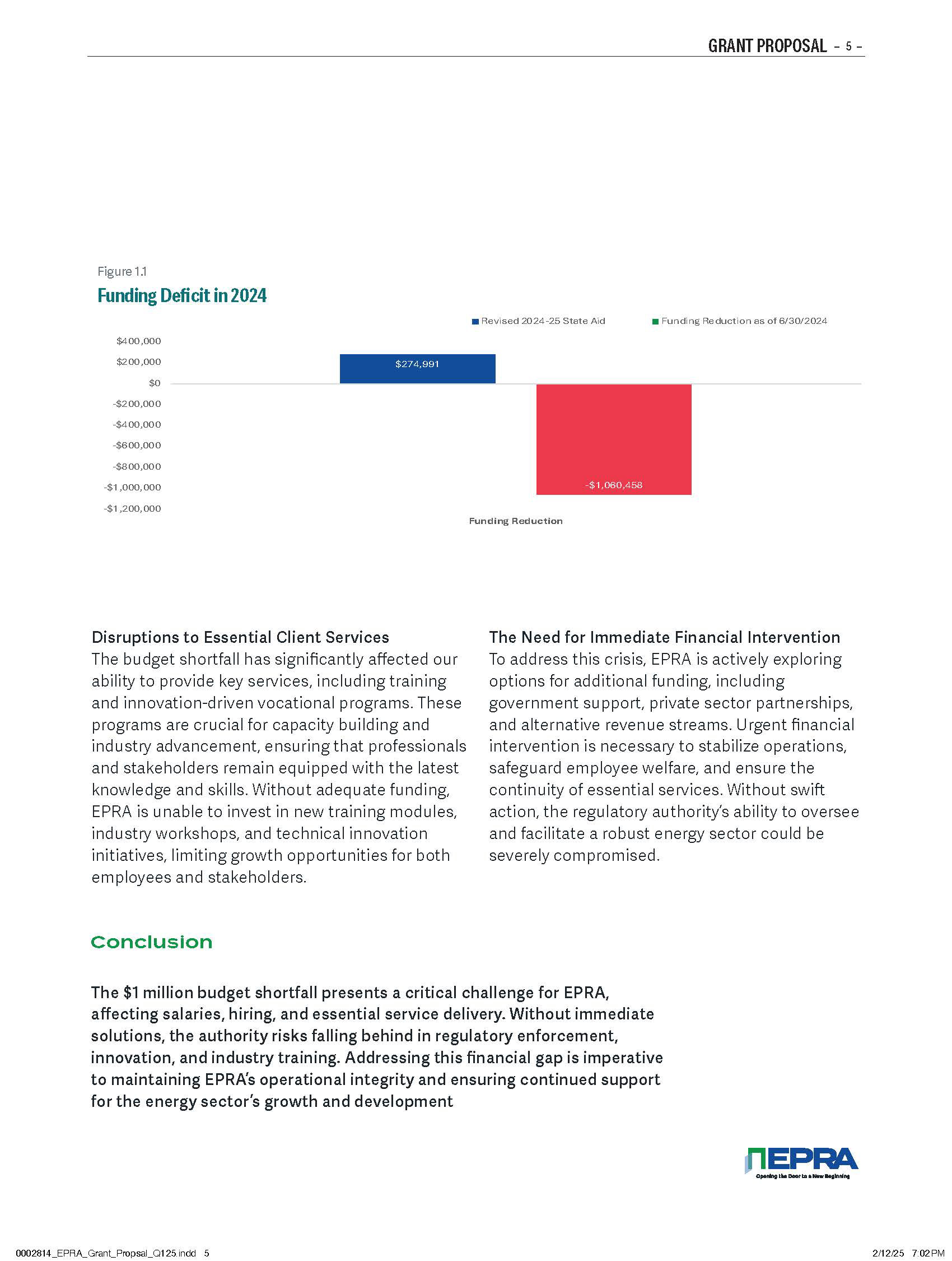
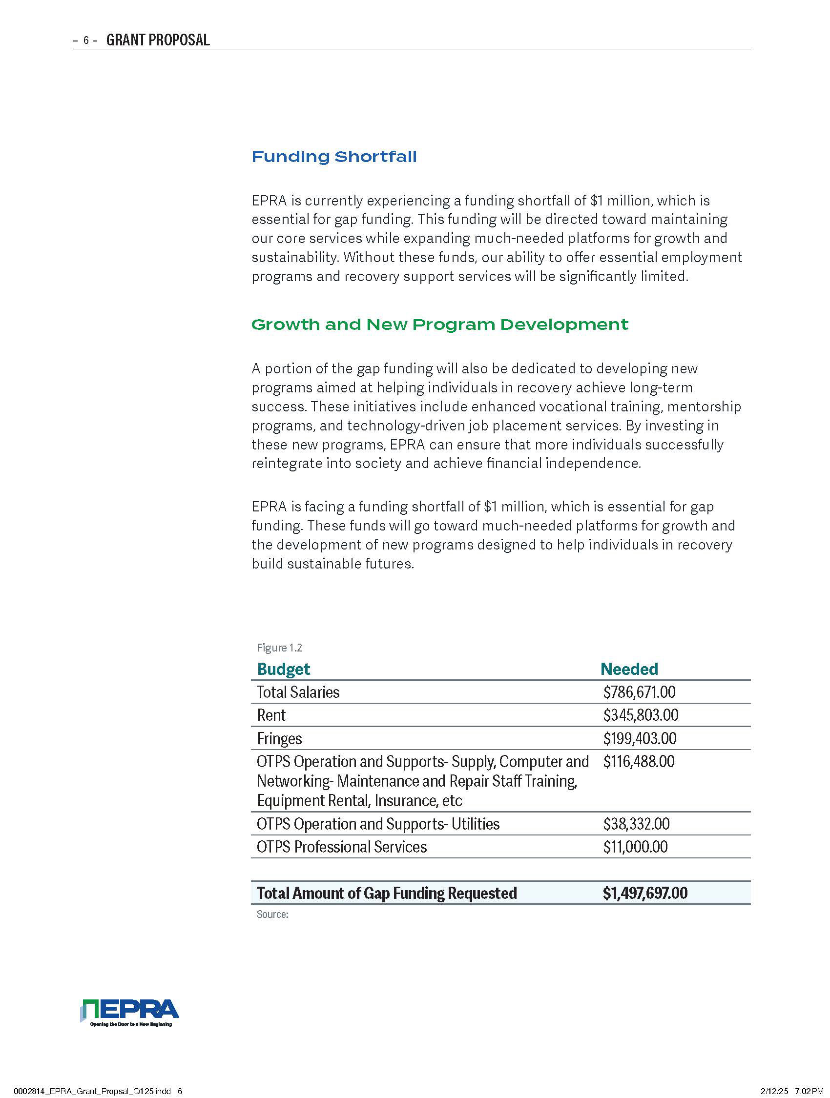
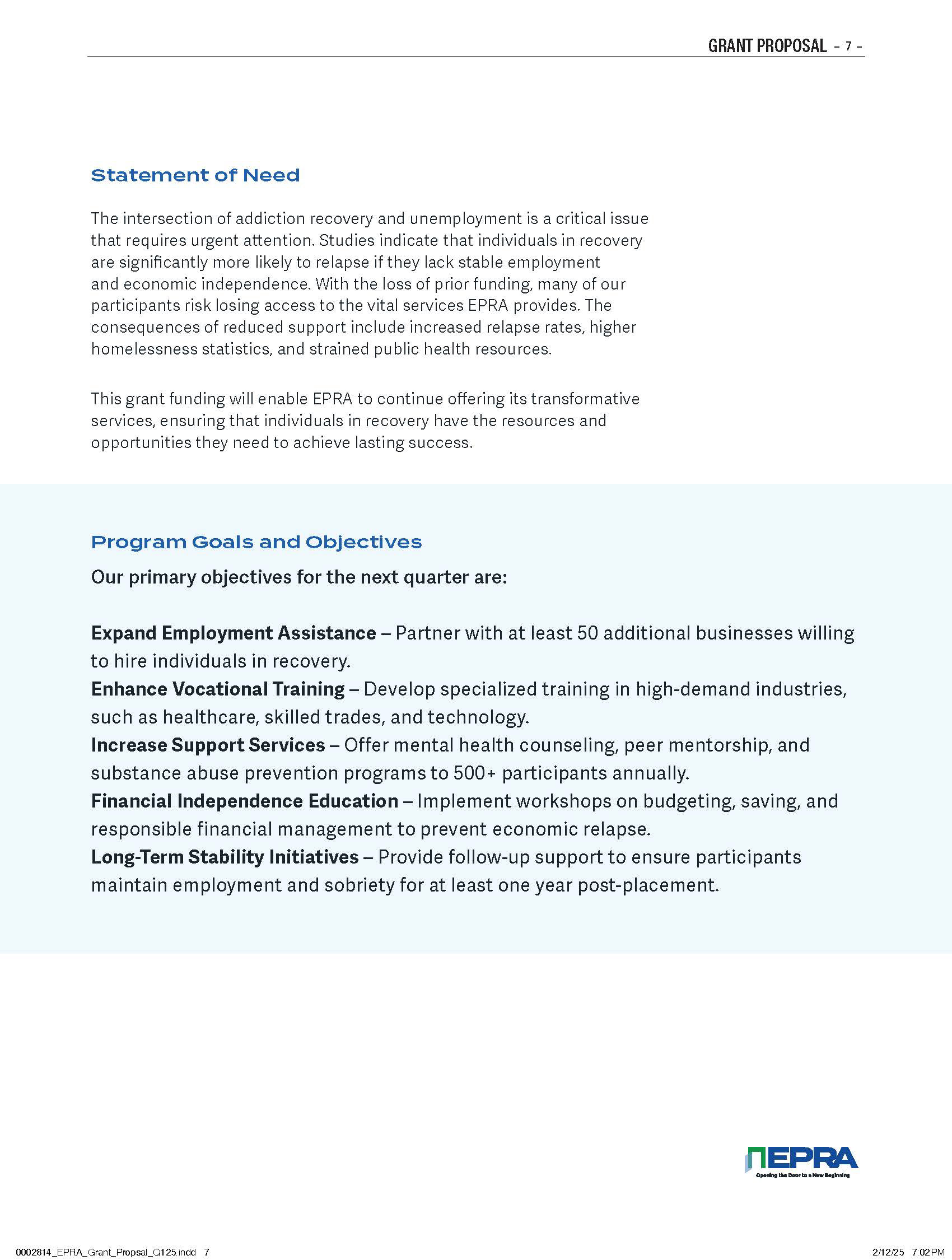
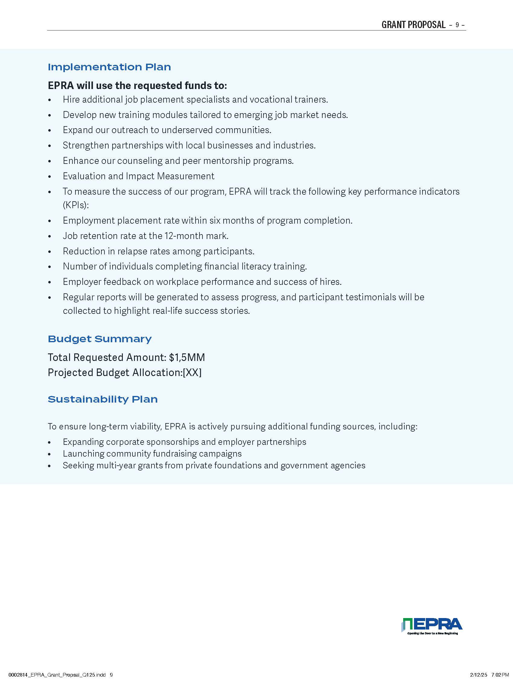
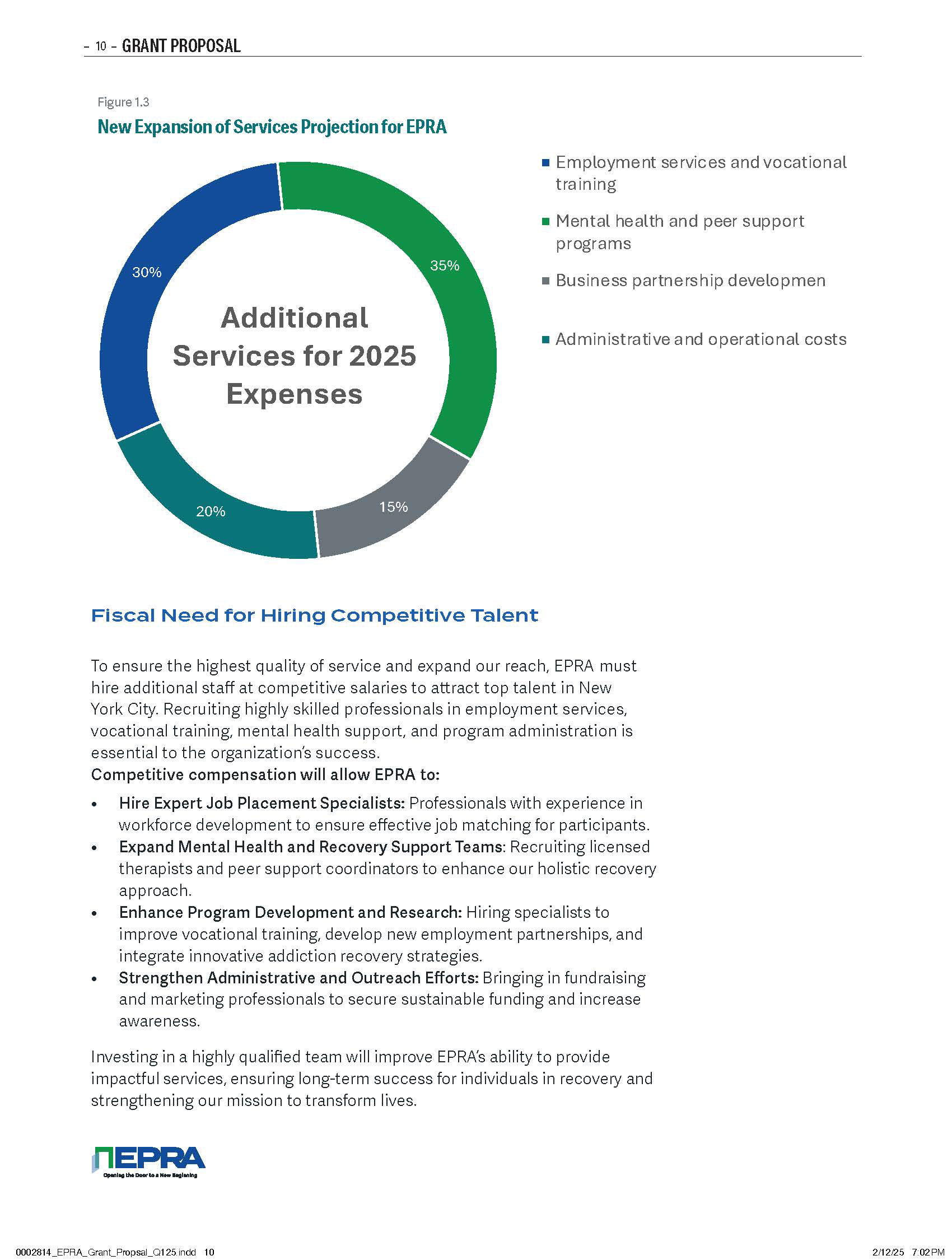
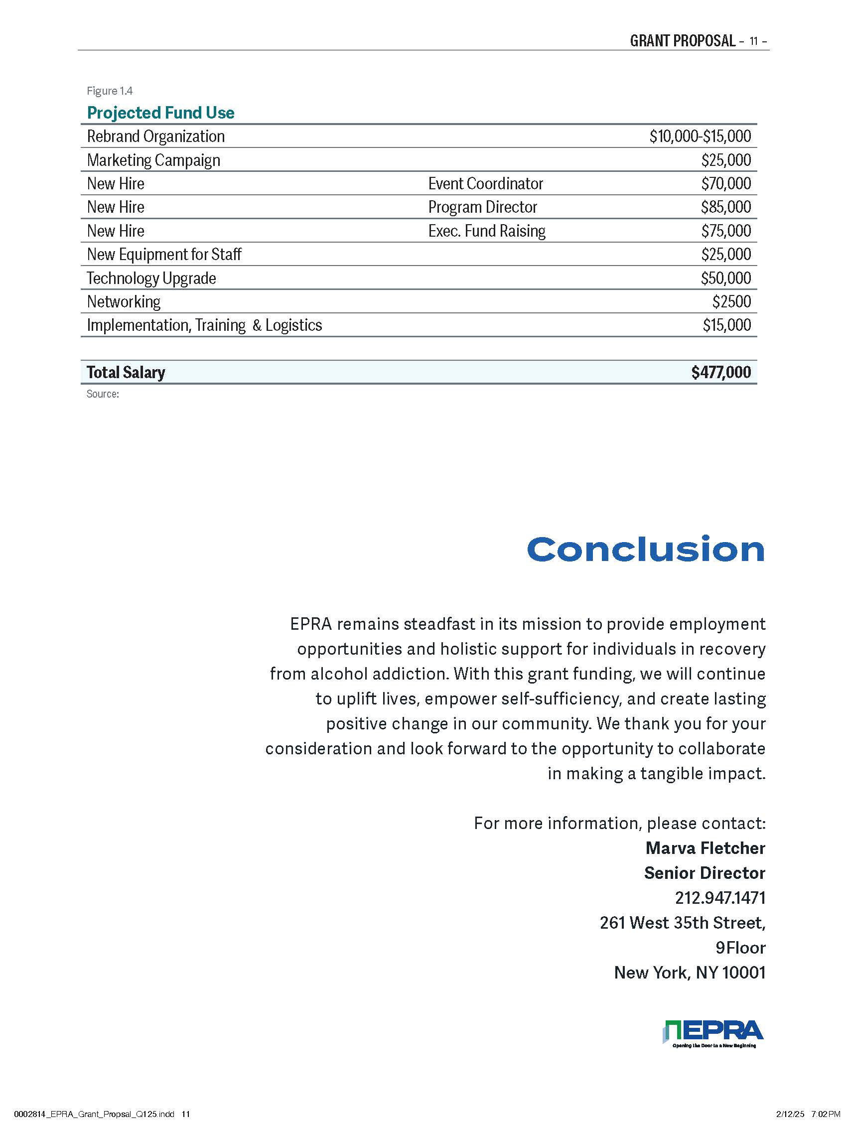
The strengthened positioning and professionalized communications also helped create an opportunity for EPRA to pursue a $1.5 million New York State funding opportunity.
This represented a major shift in the organization's ability to present itself as a credible, scalable organization worthy of significant institutional investment.
The Bigger Impact
EPRA is an example of why brand strategy matters—particularly for organizations operating with limited resources.
A strong brand doesn't just make an organization look better.
It can make the organization more visible, more credible, more understandable, and ultimately more fundable.
What began as a nonprofit with little recognizable brand presence became an organization equipped with the visual language, marketing infrastructure, and strategic positioning needed to pursue larger audiences, increased donations, partnerships, and government funding.
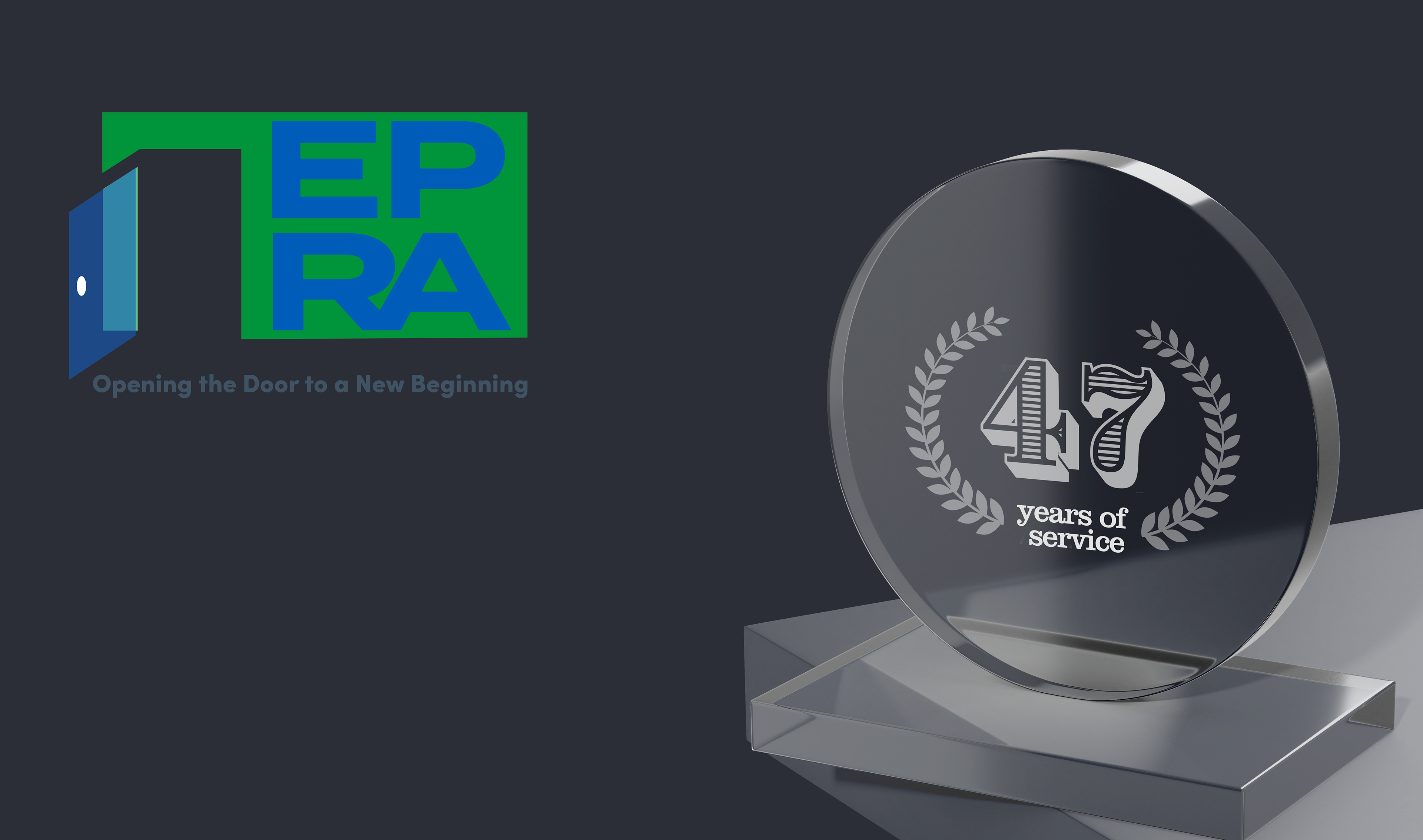
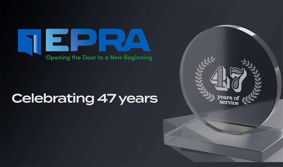





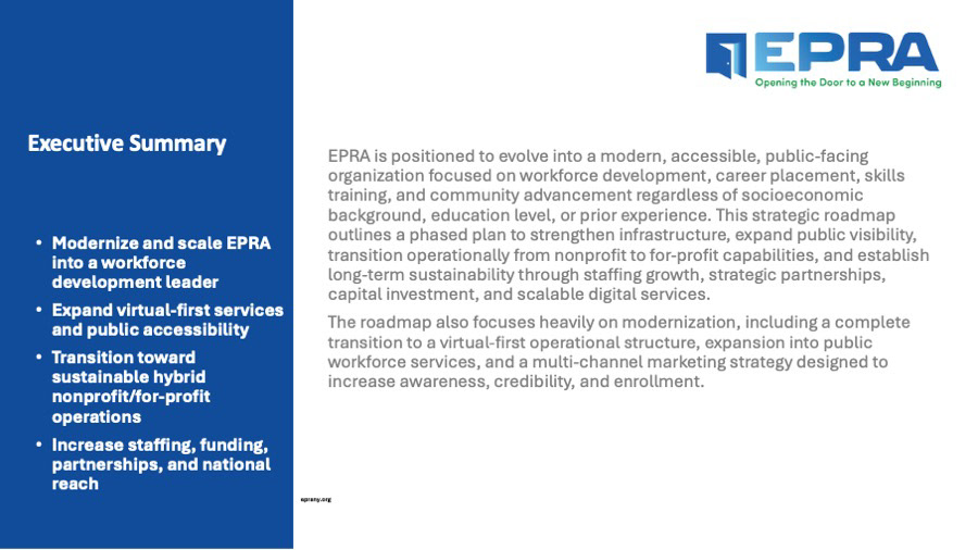
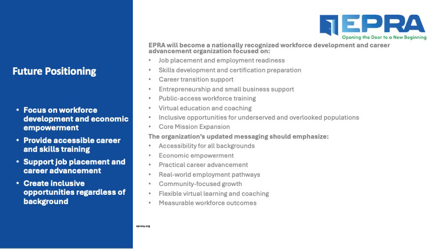
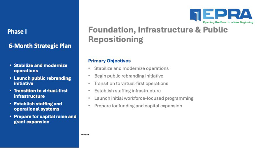
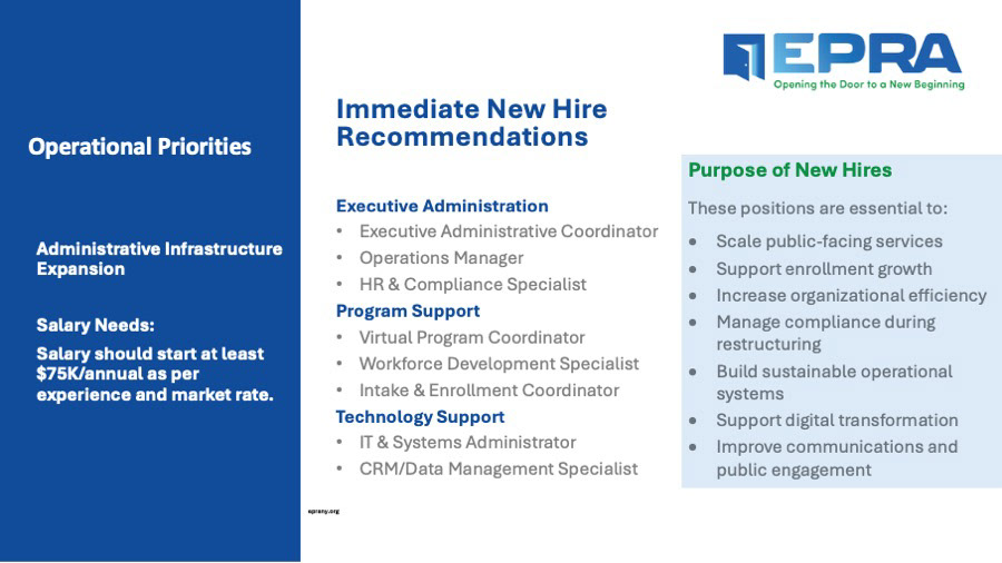
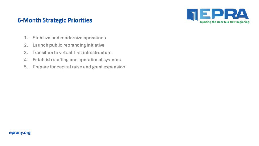
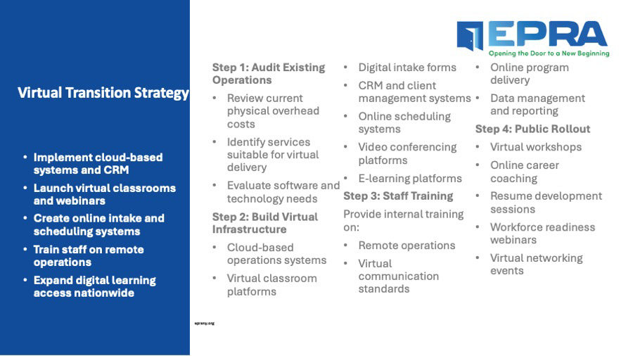
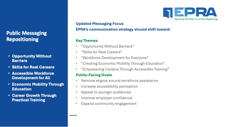
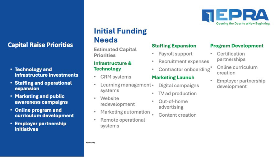
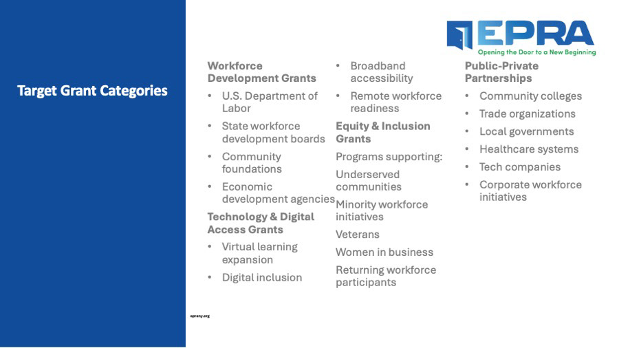
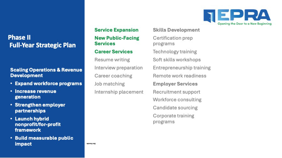
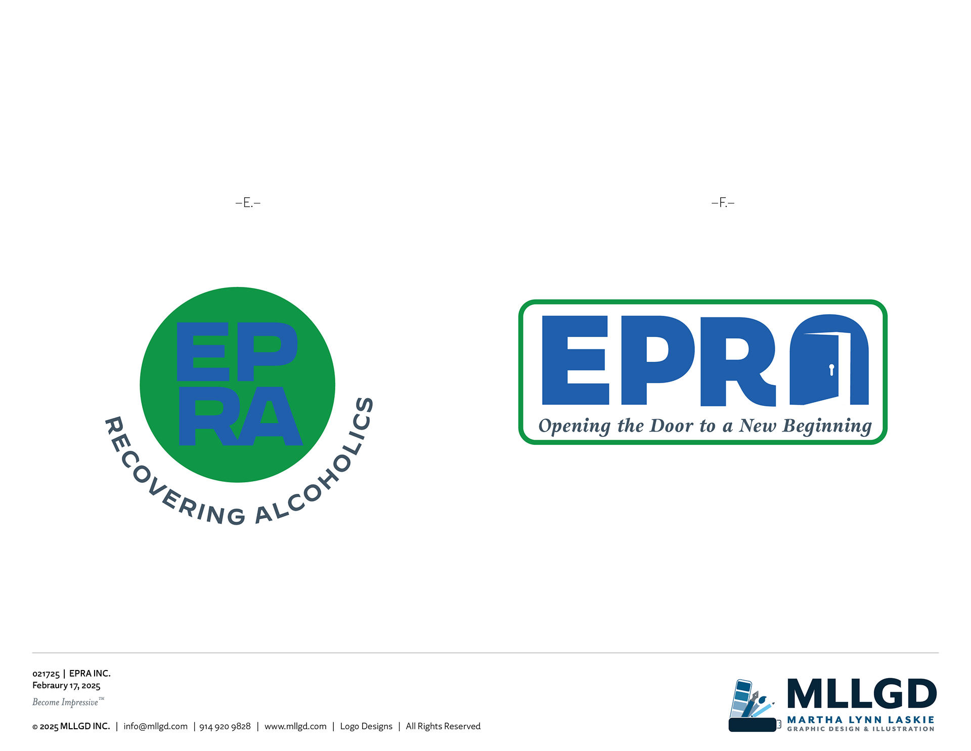
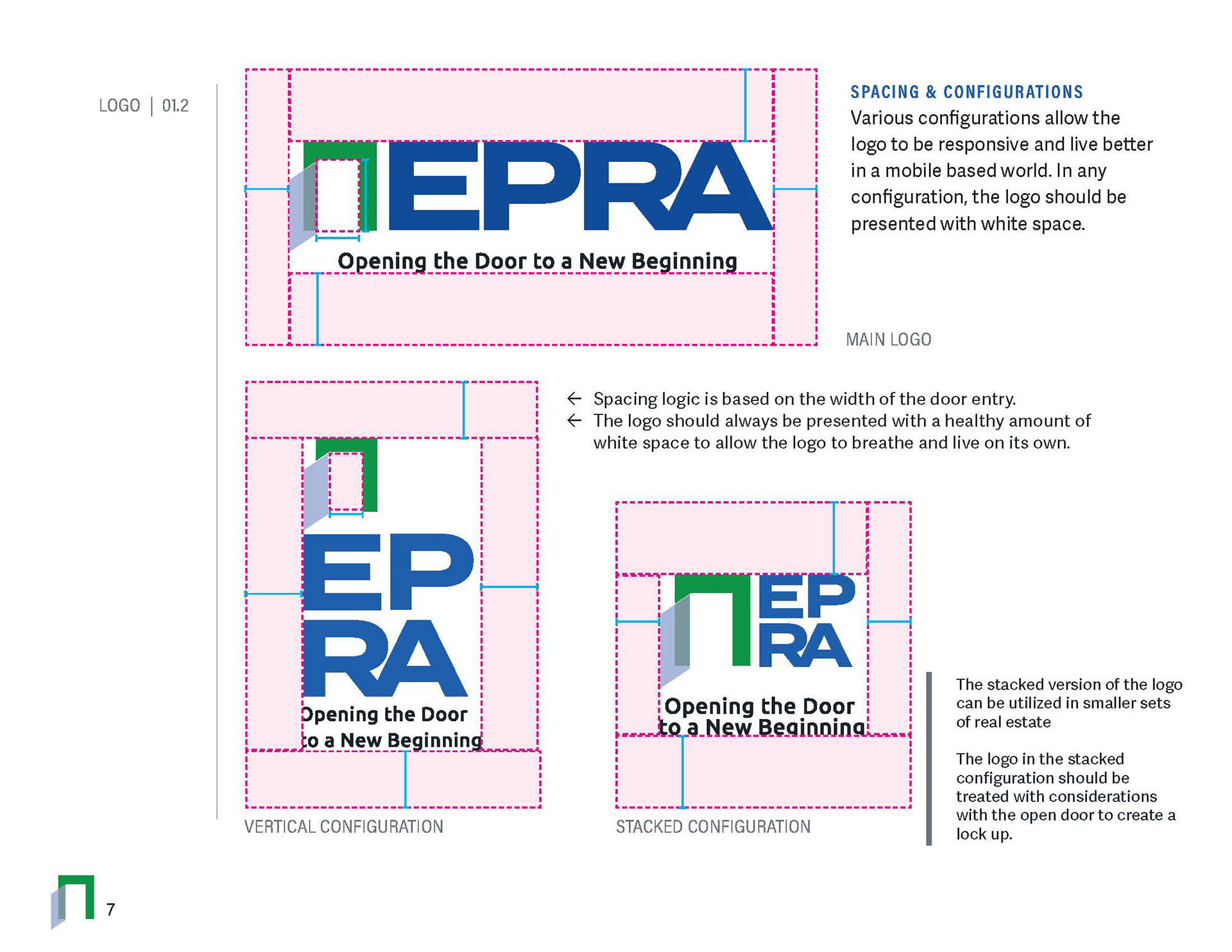
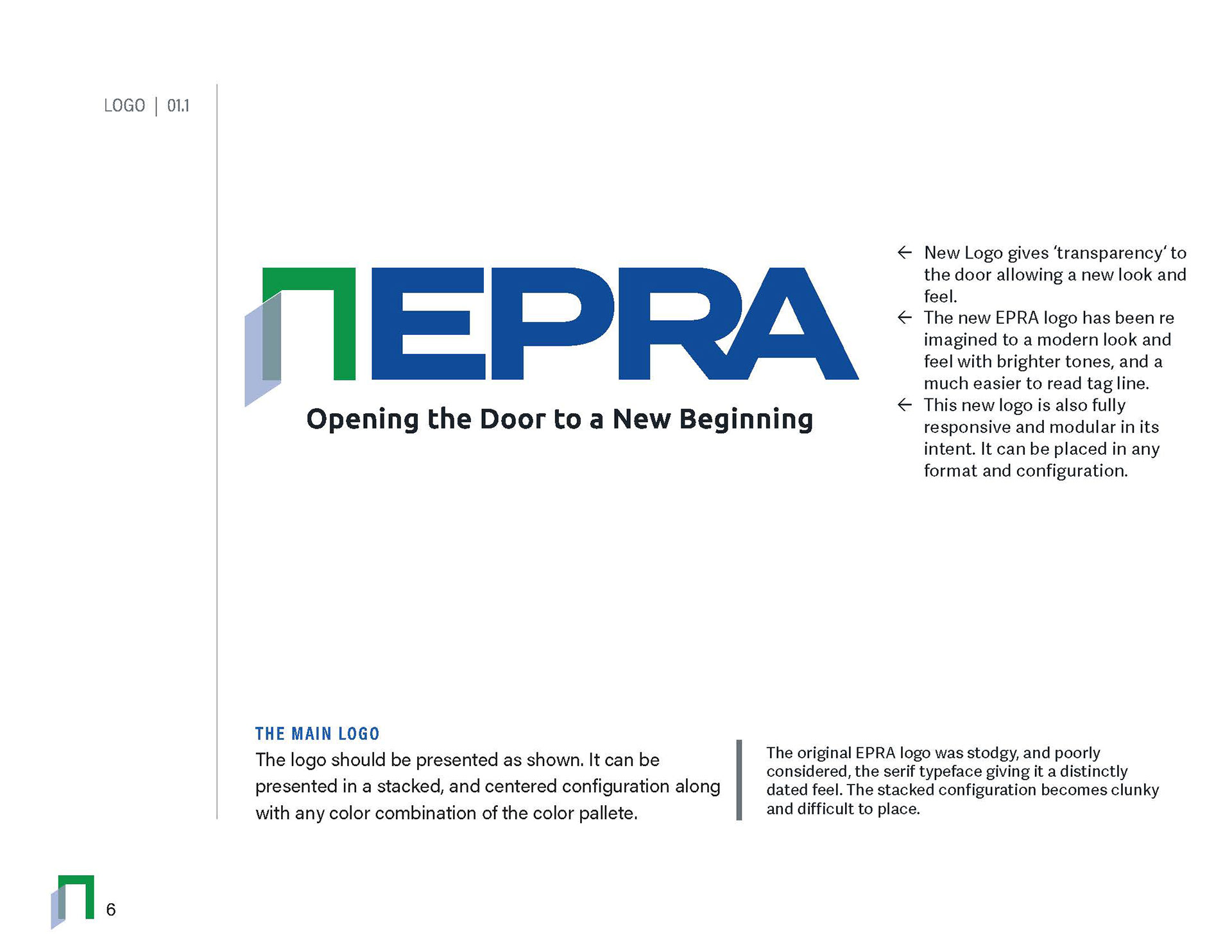
Additional iteration produced the final Logo with rounded corners, and an update to th door concept with a Light concept getting the final approval. This acts as a guidance system through the doors and giving an optimistic approach to the job search initiative plan that was developed. The simplified logo was built for multiple platform applications, online, print and for social. The Seal option was created as an element to create legitmacy in documentation and to differentiate the brand form the many scams in the marketplace when it came to employment platforms.



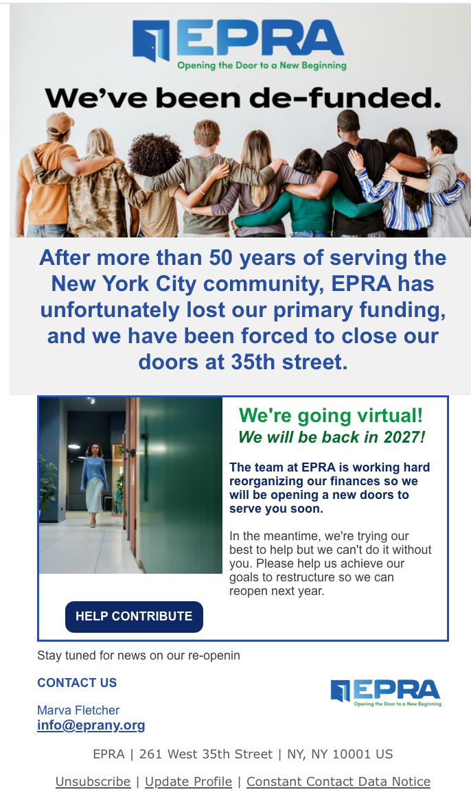
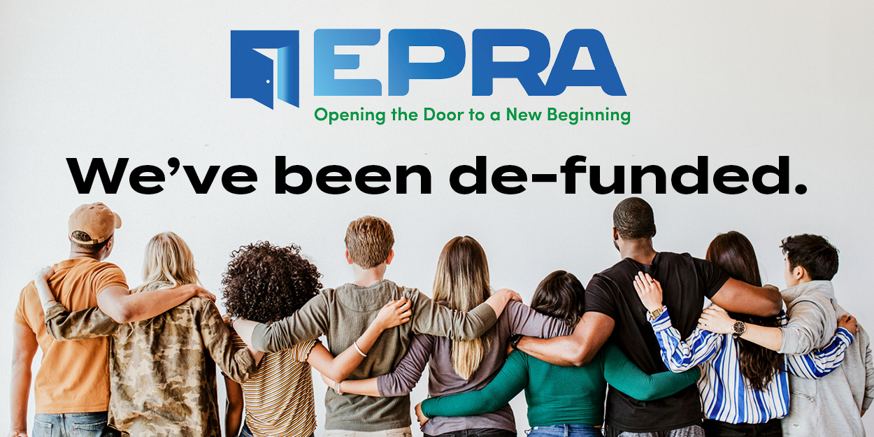
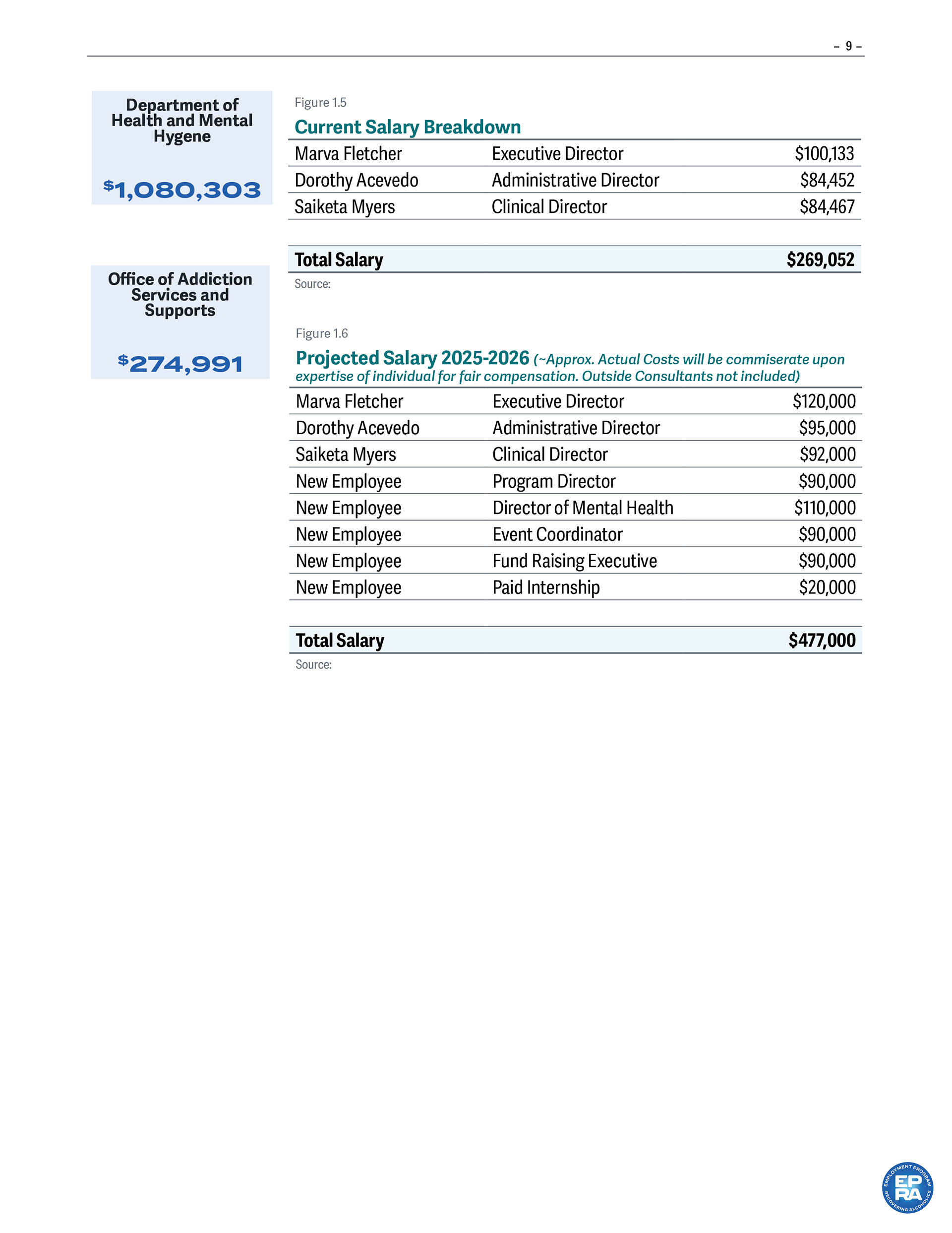
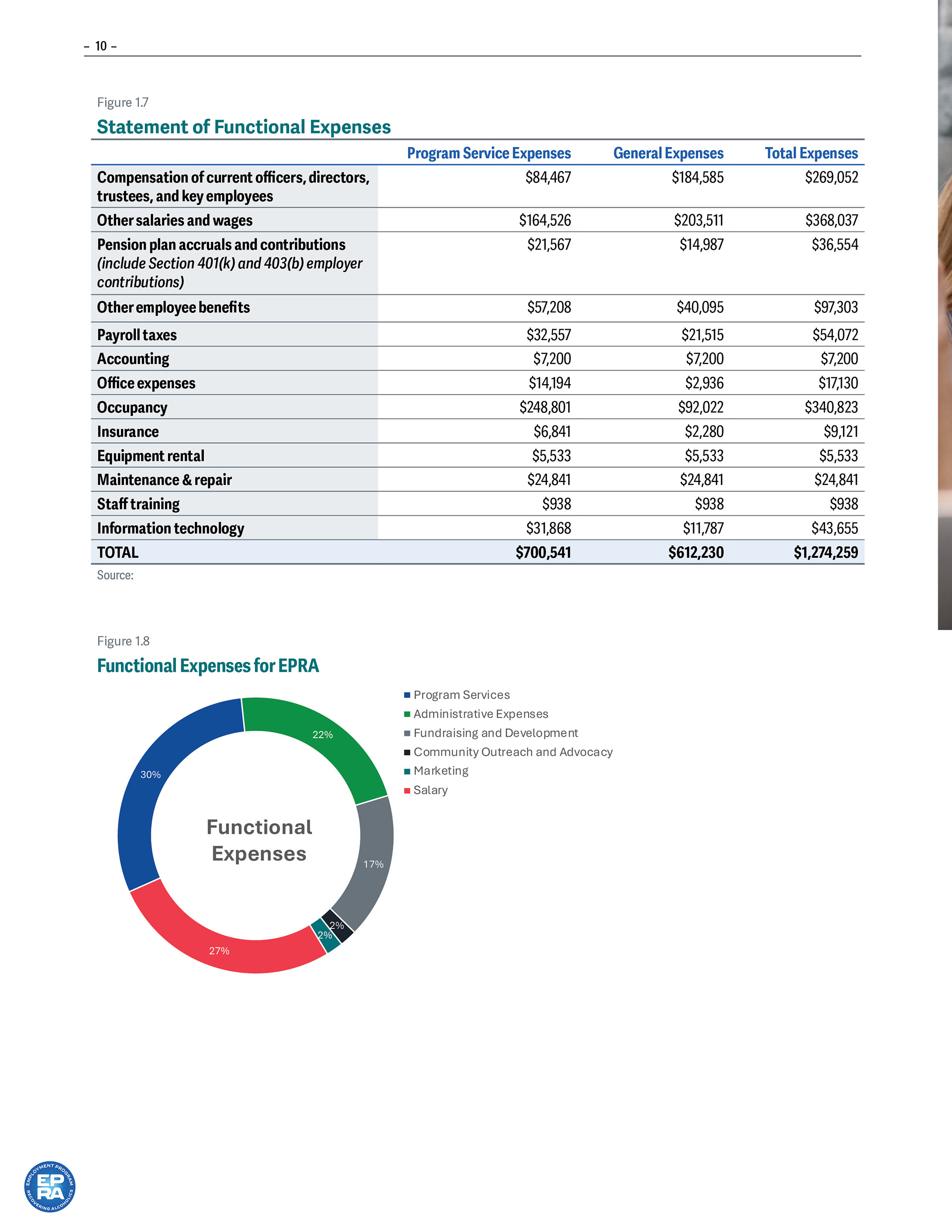
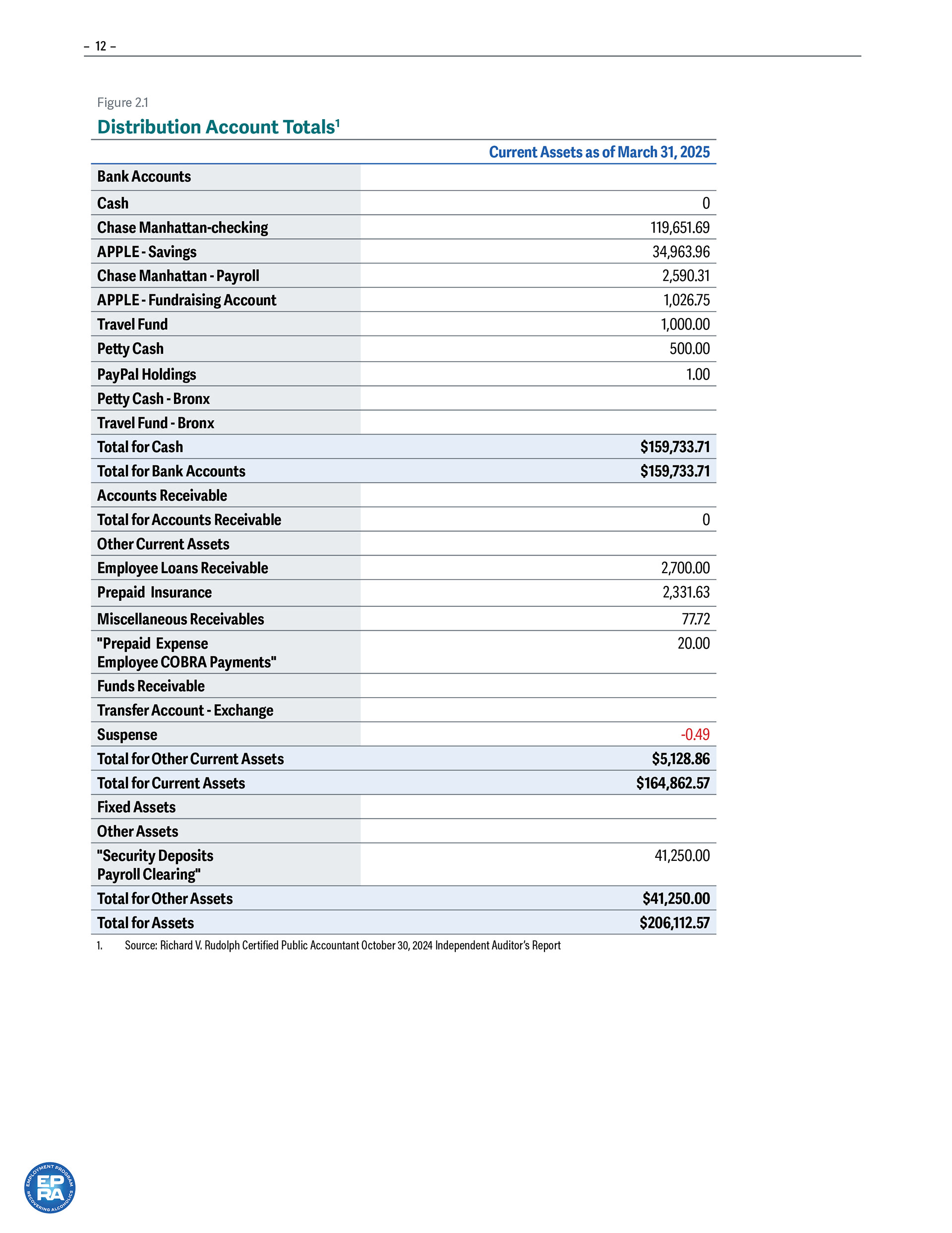
Unfortunately, even though we did everything we could to keep the organization afloat, the state did not end up renewing the funding in 2026, and we regrettably had to close the doors to the community. Plans for restructuring are in place for 2027 and beyond.