
A CASE STUDY
FLORA PACKAGING
Think outside the box—literally.
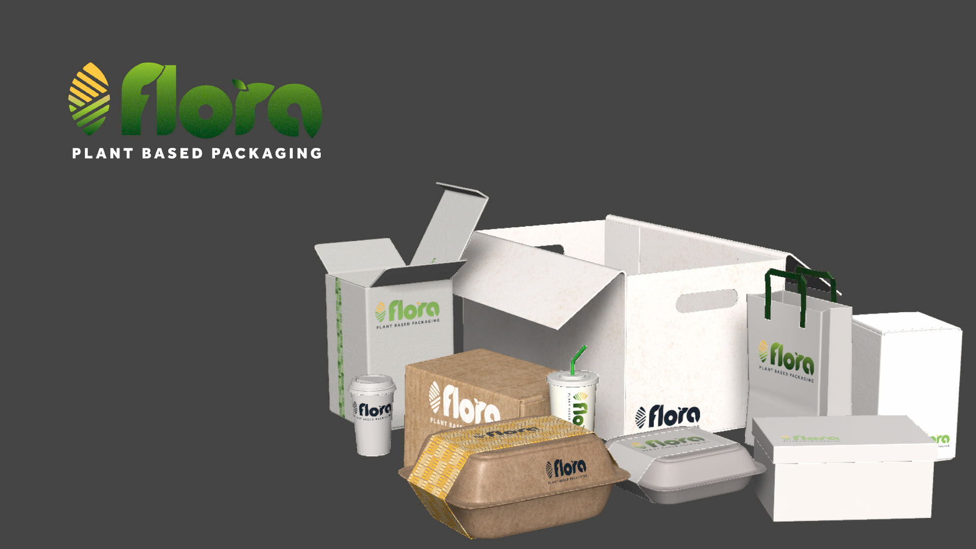
Rather than relying solely on traditional environmental imagery, the system combines agriculture, plant life, packaging and playful communication.
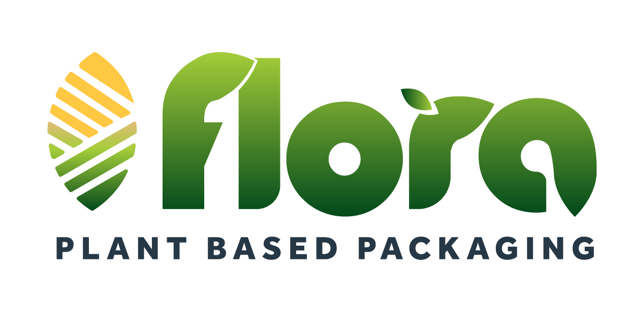
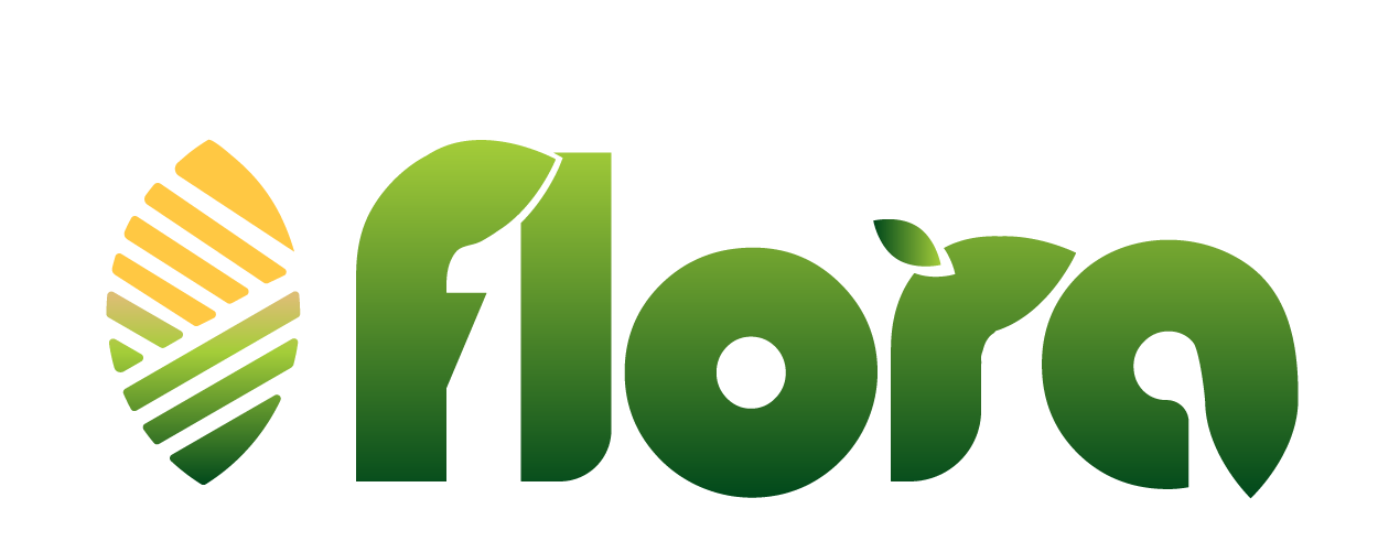
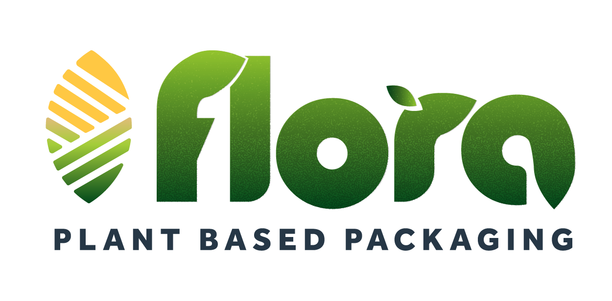
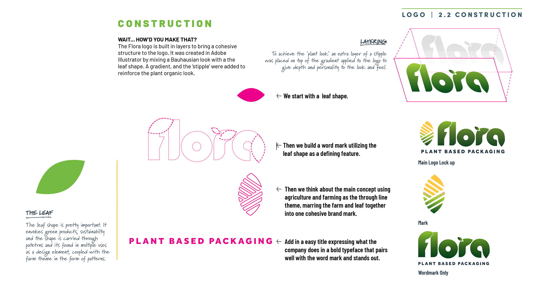
The logo begins with a leaf form and develops it into a distinctive wordmark, incorporating agricultural and farming references into the overall mark. The construction uses layered forms, a gradient and stippling to create an organic, dimensional quality.
The result is a brand that can feel professional enough for B2B conversations while still being energetic enough for consumer-facing campaigns.
The Challenge
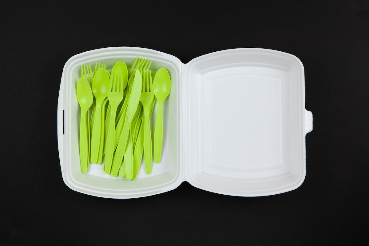
Flora Plant Based Packaging was developed as a sustainability-focused packaging brand built around renewable, plant-based materials. The brand needed to communicate an environmentally responsible product without falling into the predictable visual language of “green” companies.
The creative opportunity was to make sustainability feel optimistic, approachable, intelligent and energetic—while establishing a visual system flexible enough to work across packaging, digital experiences, advertising, social media, corporate communications and sales materials.
The brand guidelines define Flora around the concepts of growth, nature, renewal and sustainability, with a personality that is intentionally light-hearted and accessible.

Reimagining Corn: From Consumption to Utility
Flora Packaging is built around a larger idea than simply replacing plastic.
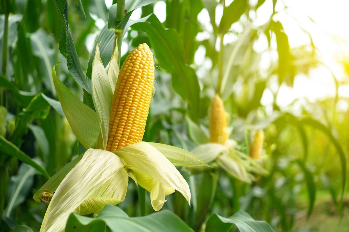
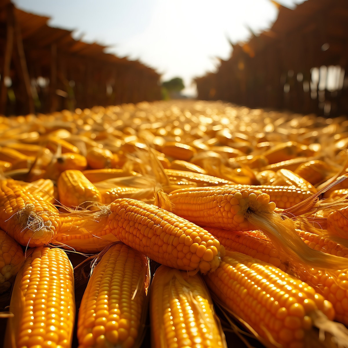
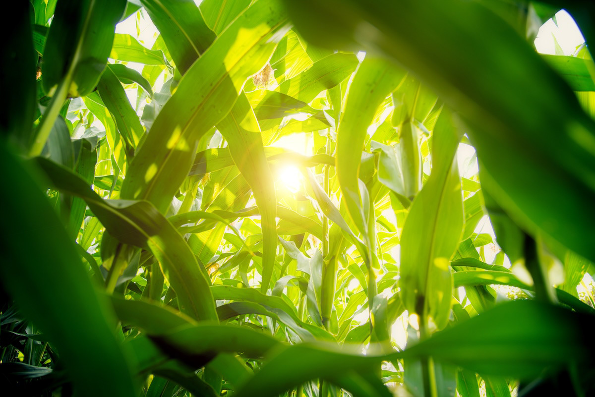
It is about reimagining one of America's most abundant agricultural resources—corn—and expanding the way we think about its value.
The United States is the world's largest producer, consumer and exporter of corn, with farmers planting roughly 90 million acres each year. While corn is predominantly used for animal feed and fuel ethanol, it is also processed into starch, sweeteners, oils and a wide range of industrial products.
Flora sees an opportunity within that agricultural ecosystem: move more of the conversation from what we consume corn as, to what we can create from it.
Establish the Brand Foundation
The first step was defining what Flora needed to communicate before designing individual pieces.
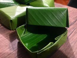
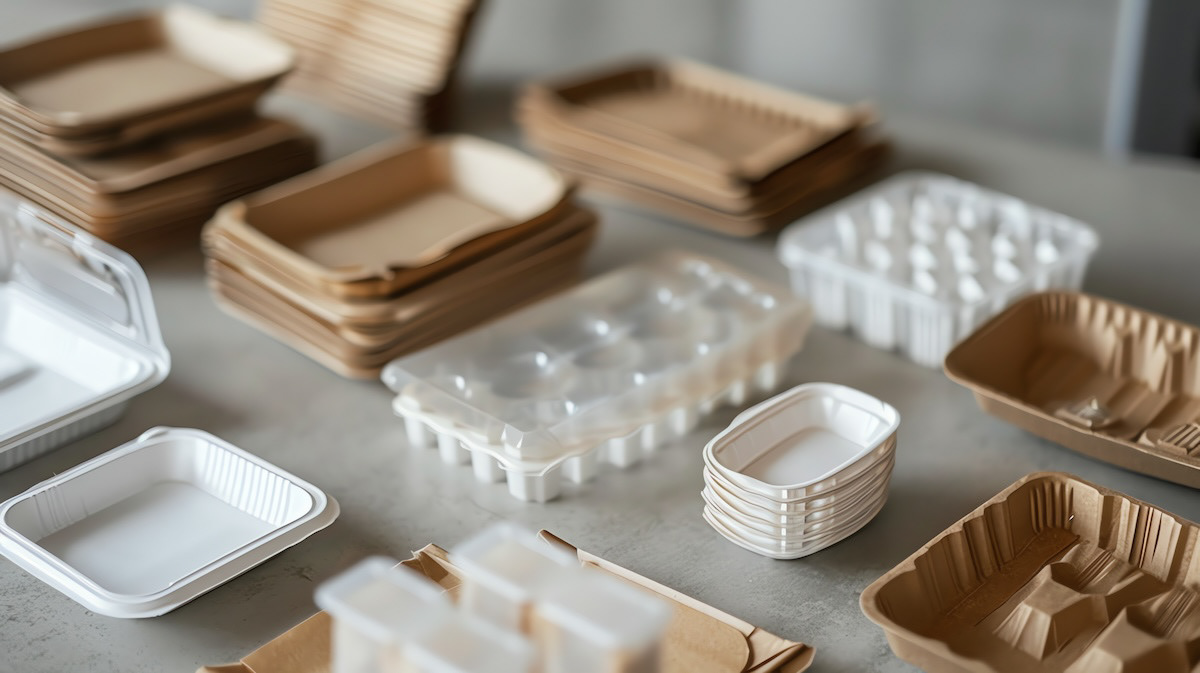
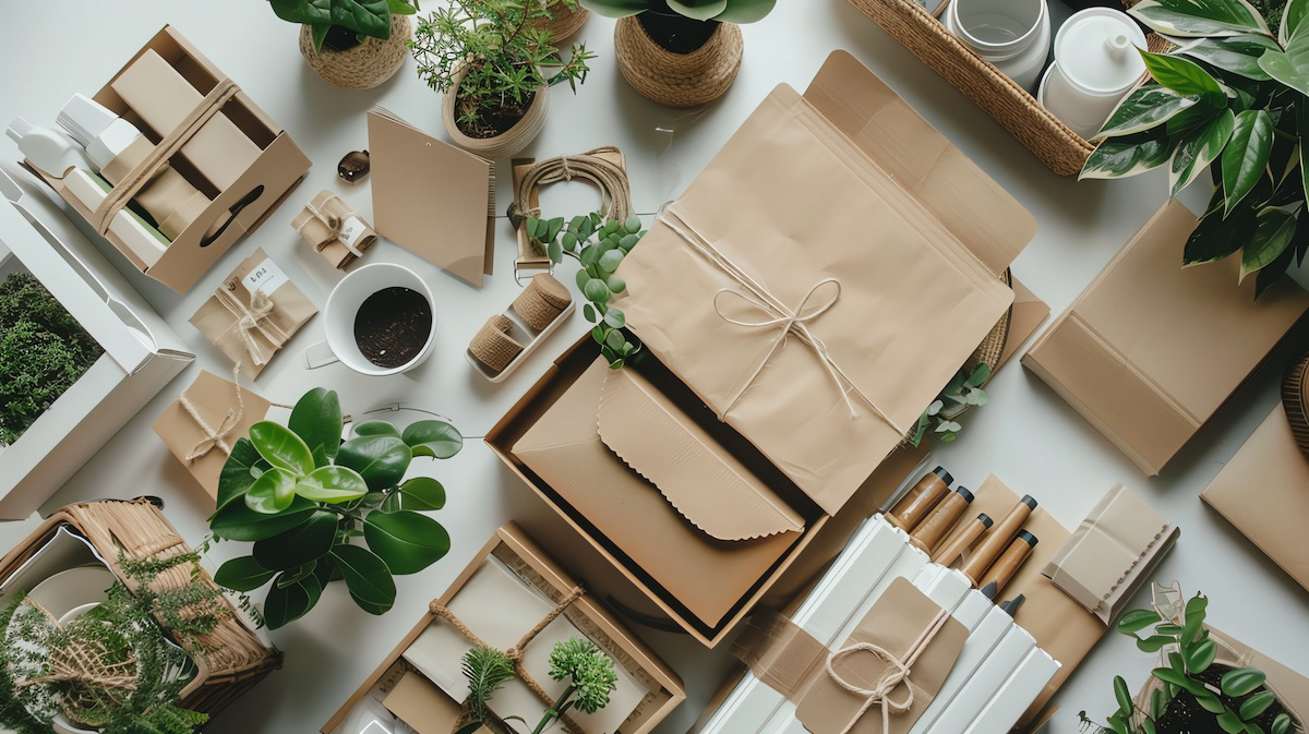
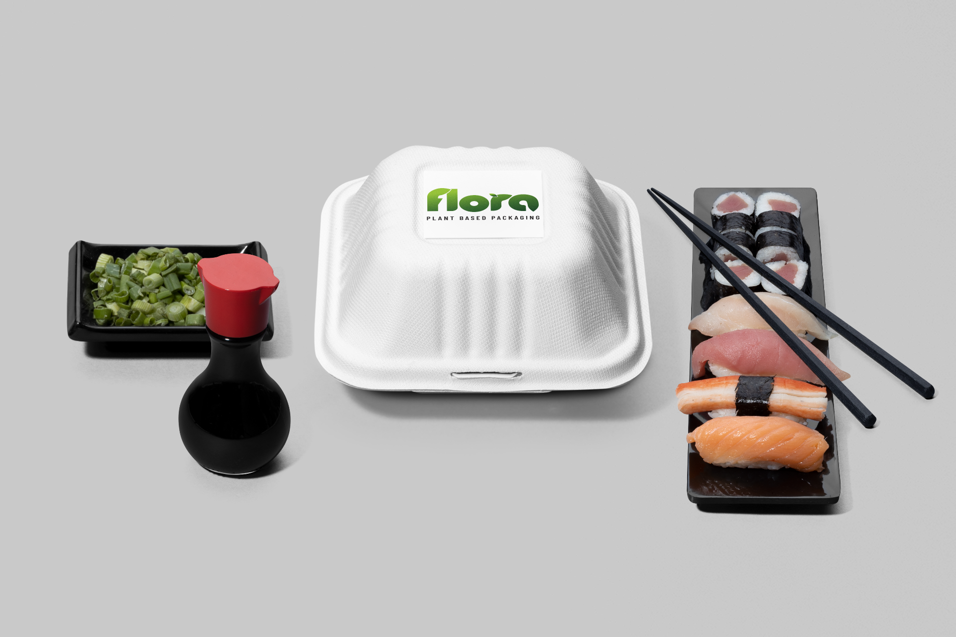
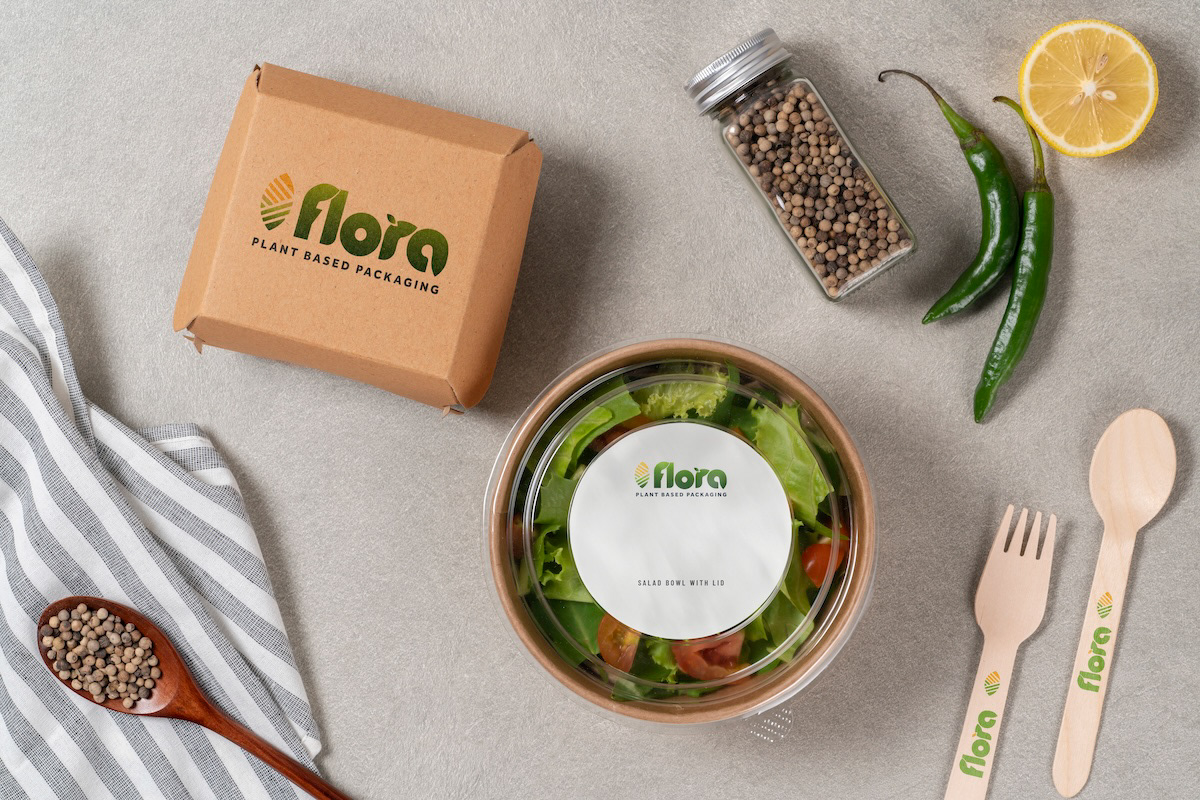
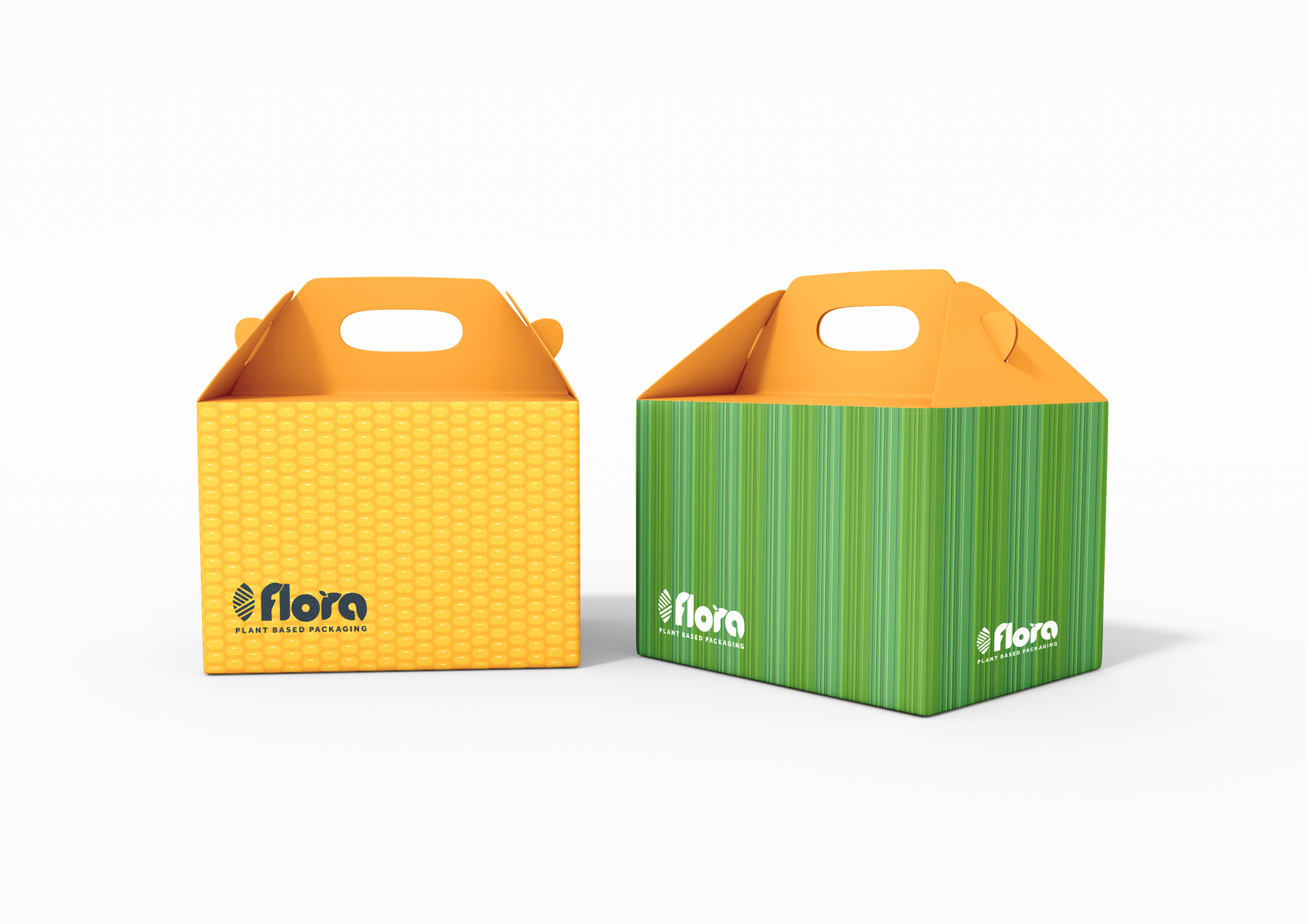
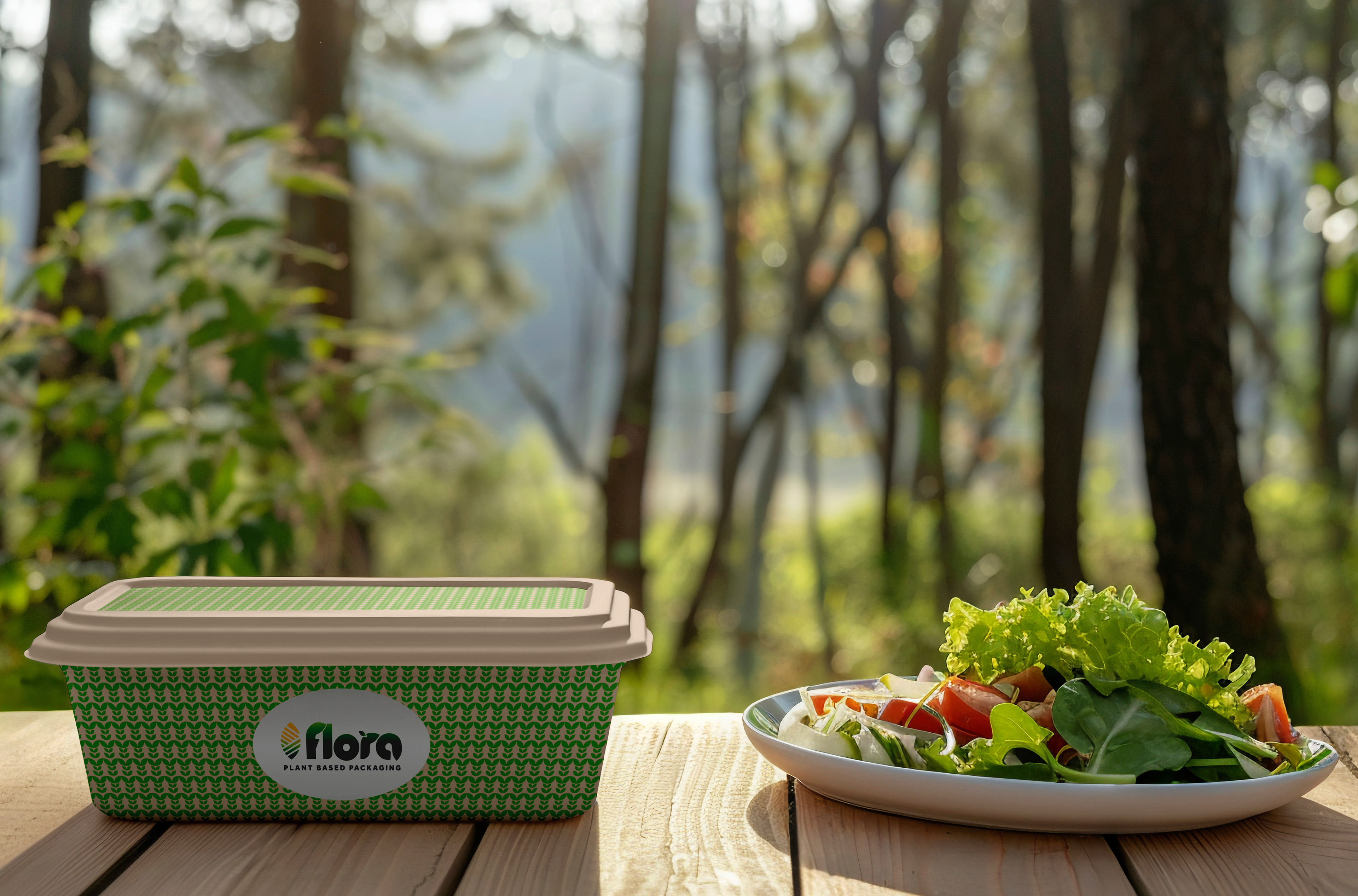
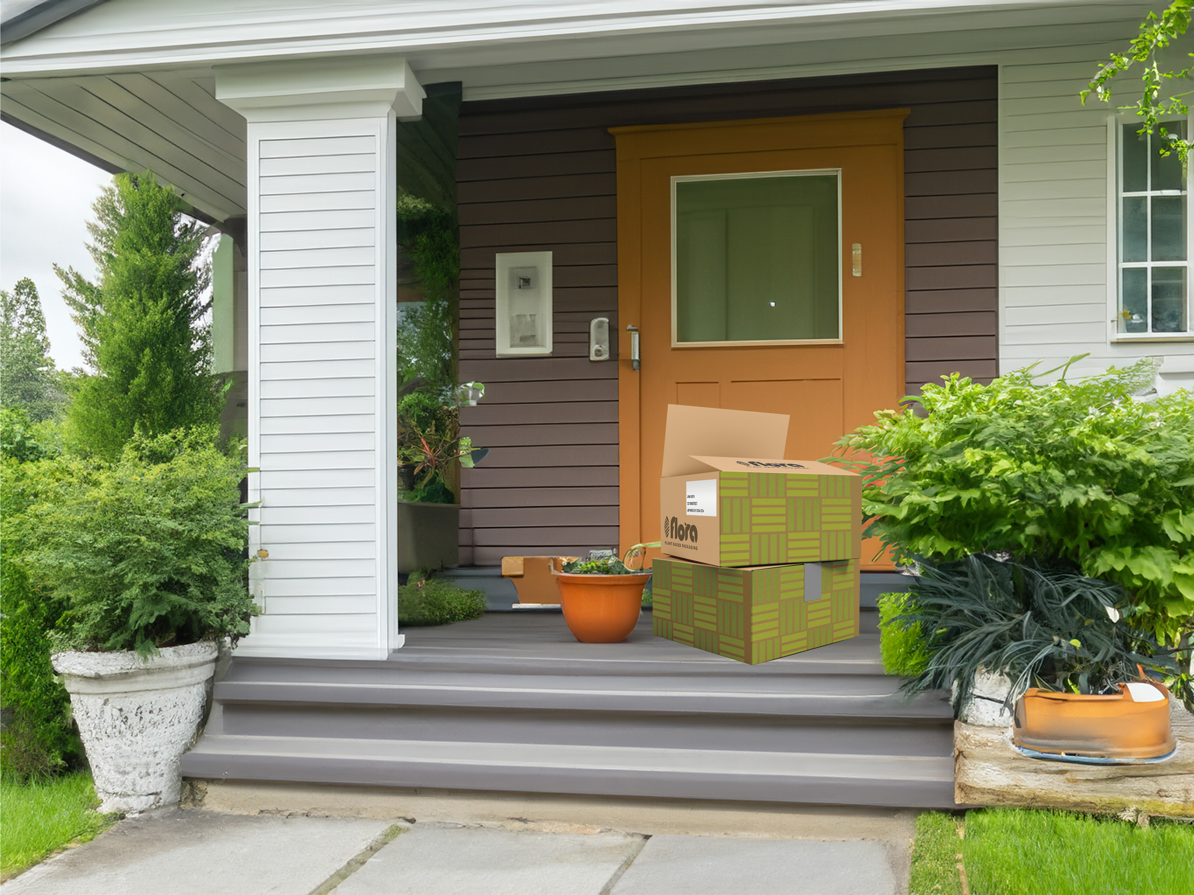
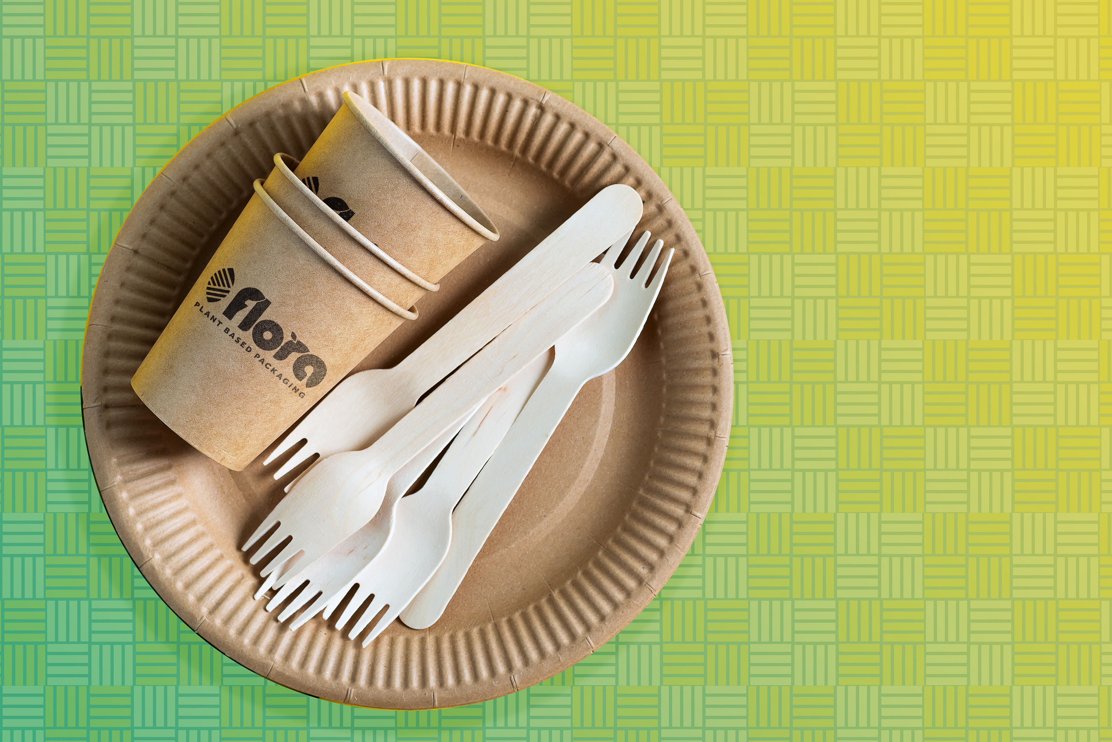
The product story was translated into a visual language that could communicate plant-based packaging solutions across biodegradable boxes and bags, compostable food containers and packaging films.
This foundation became the filter for every subsequent design decision.




Build the Brand System Across Touchpoints
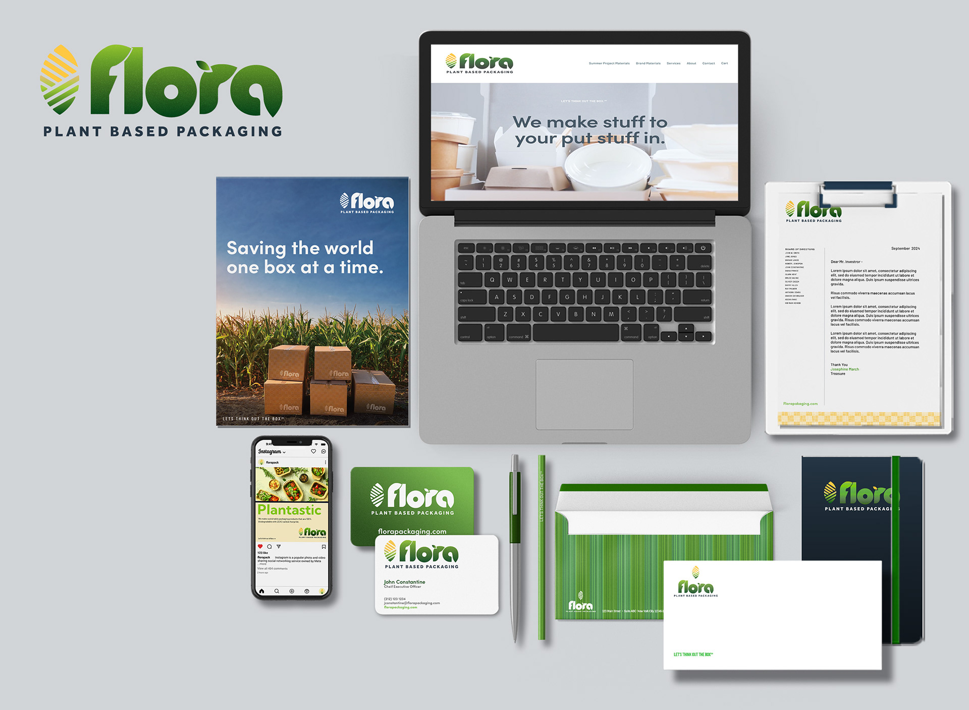
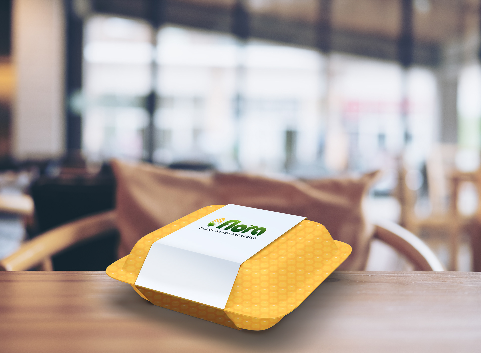
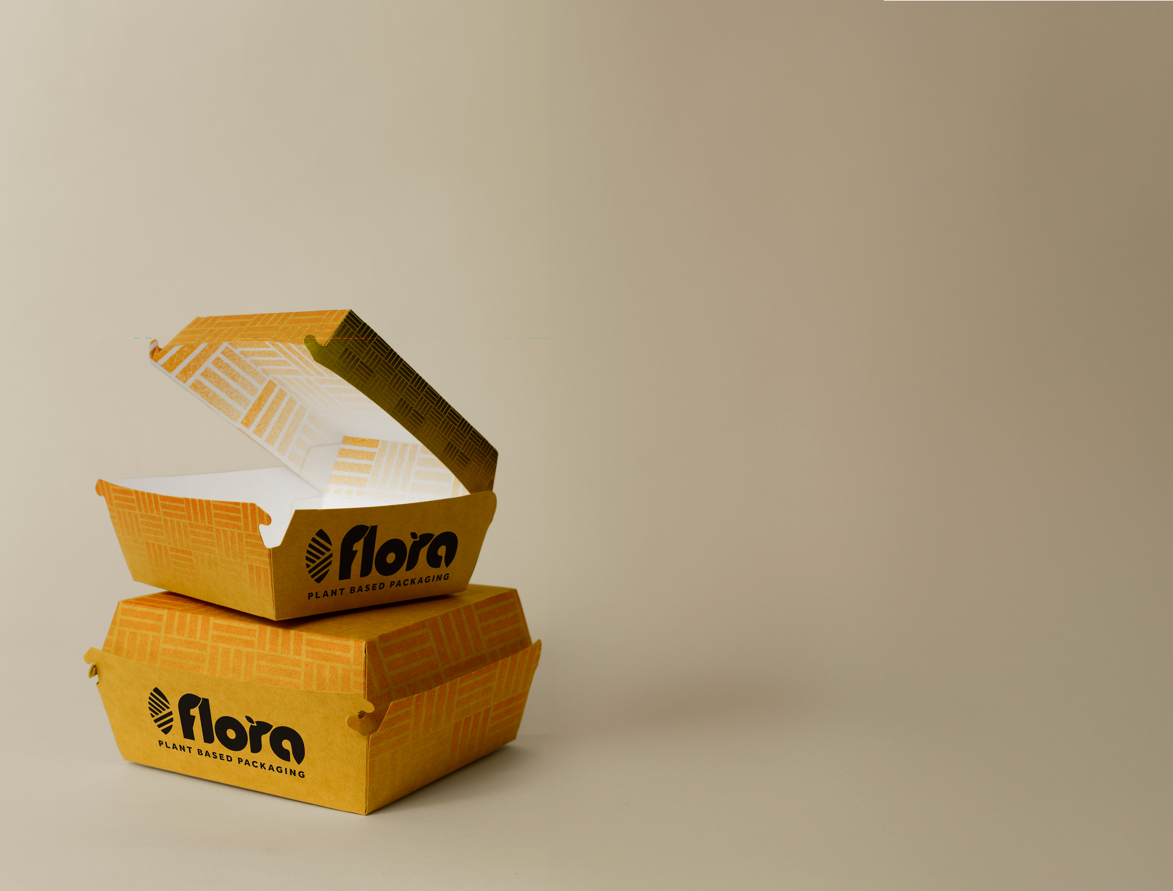
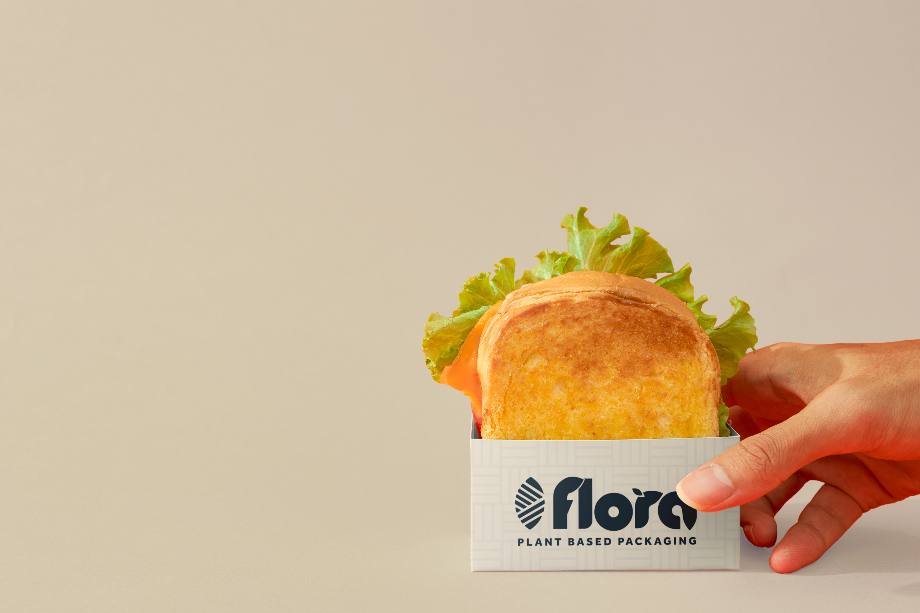
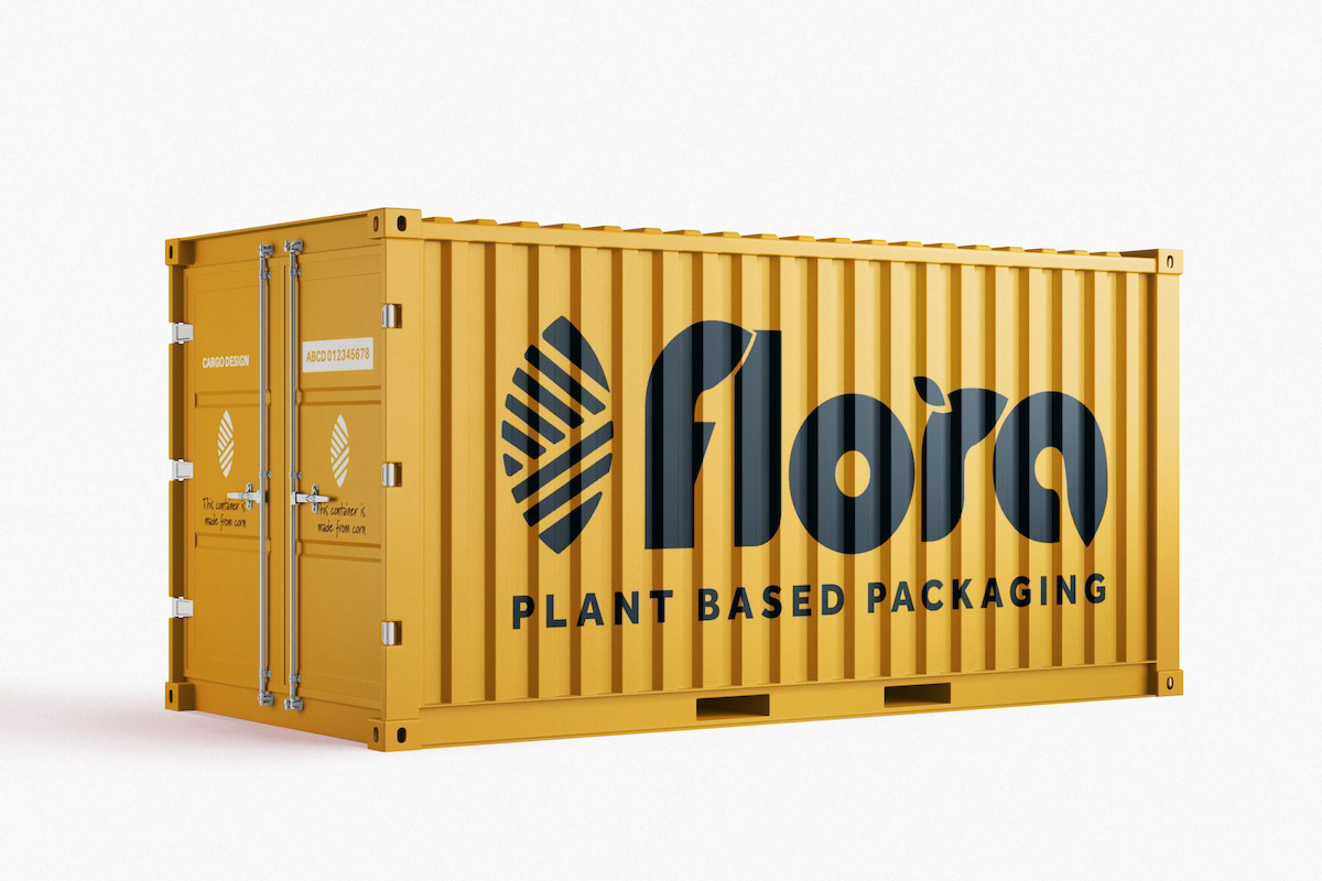
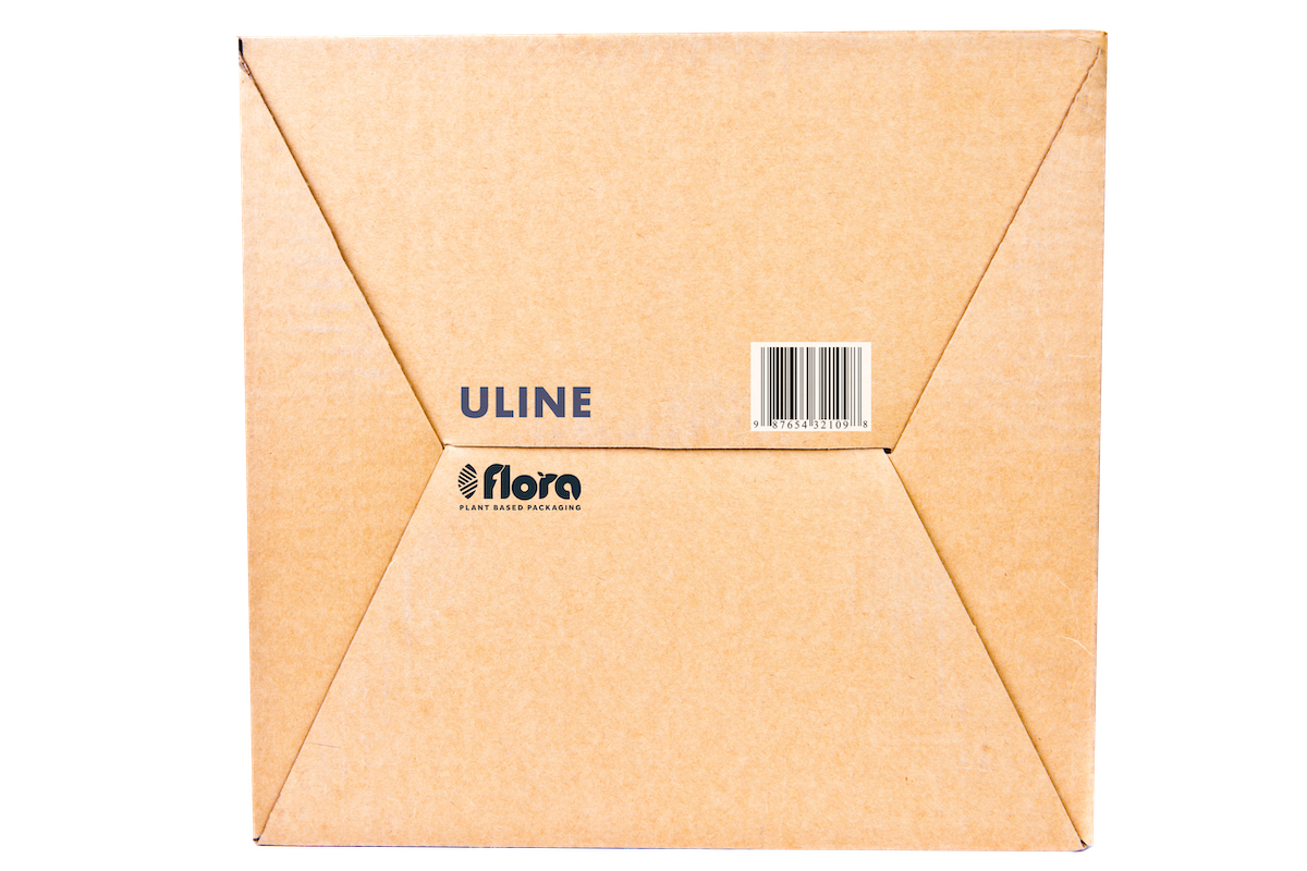
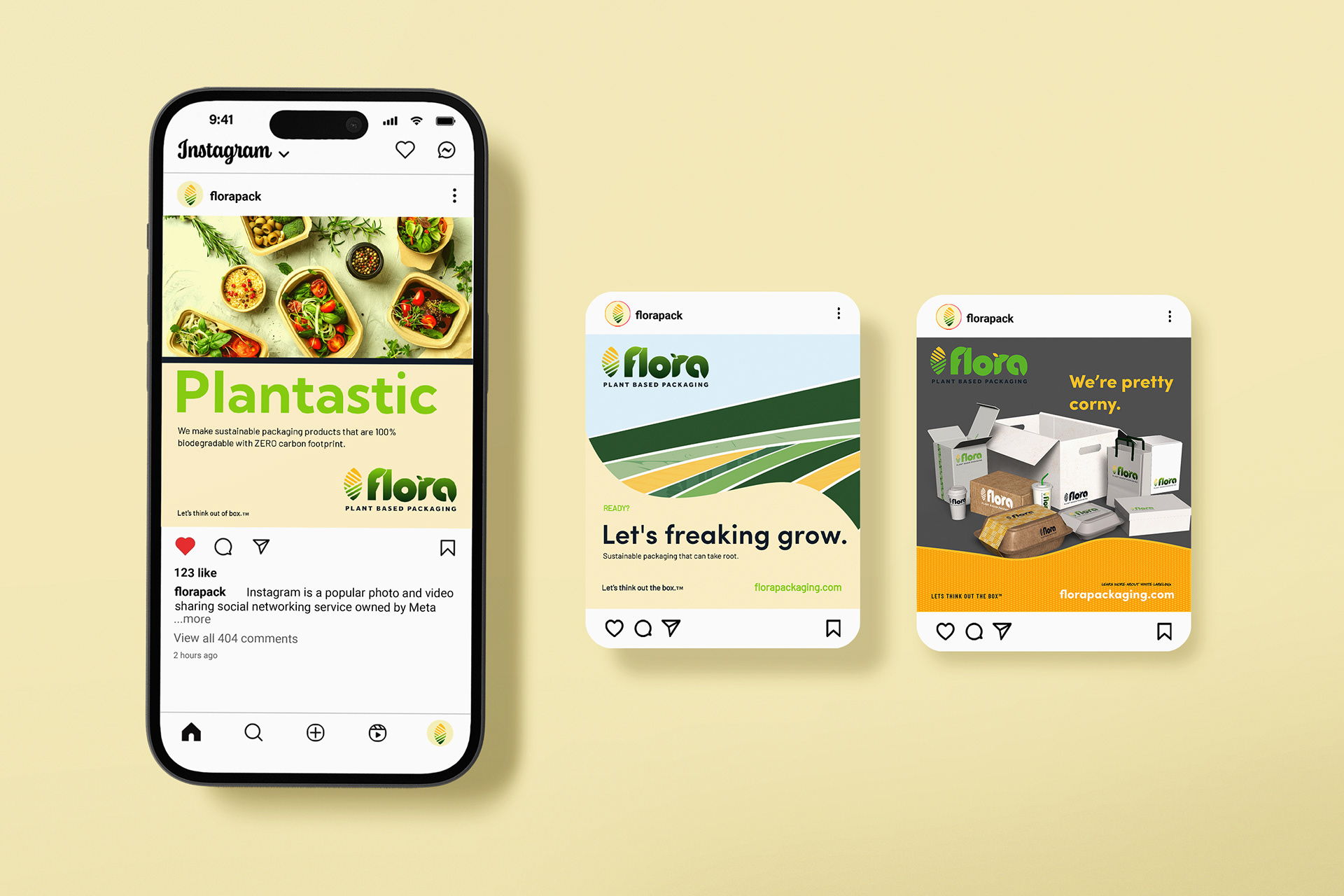
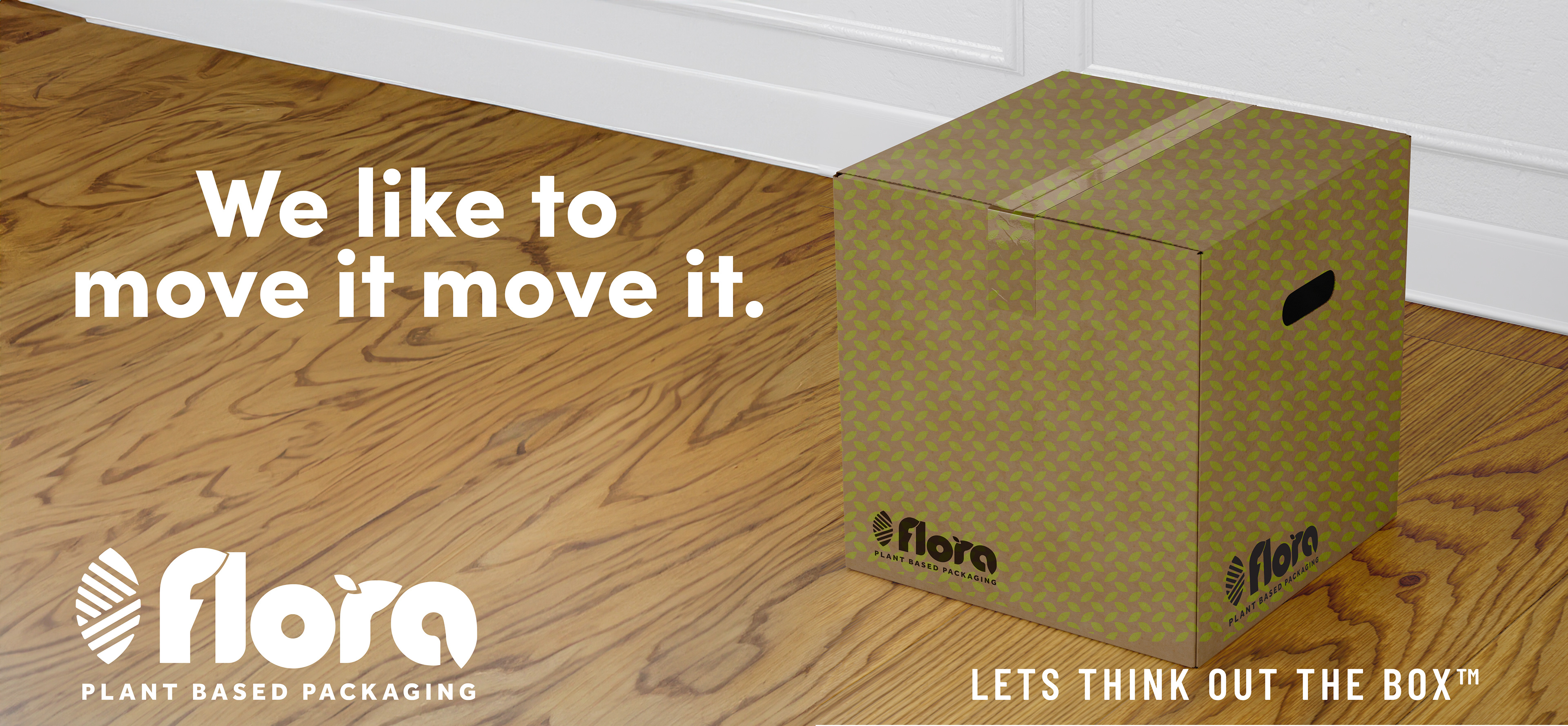
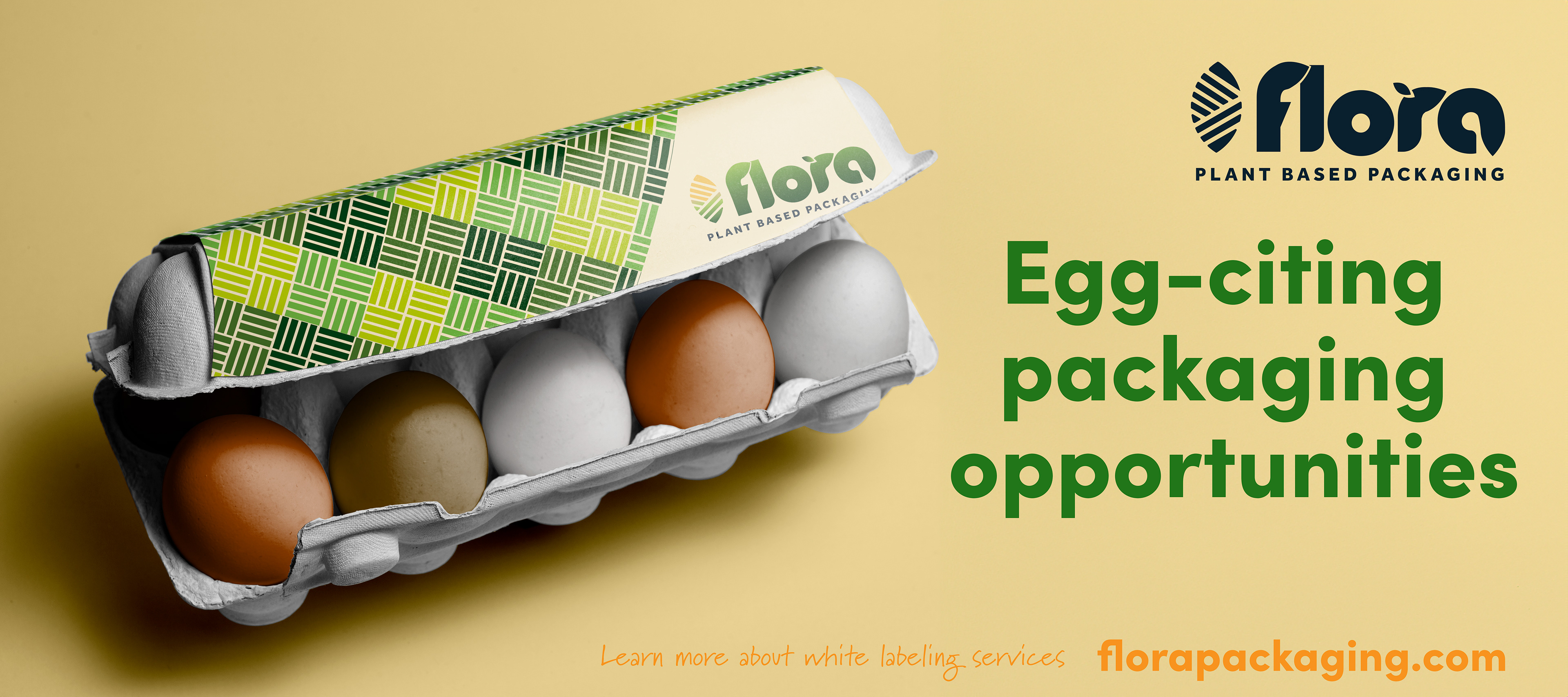
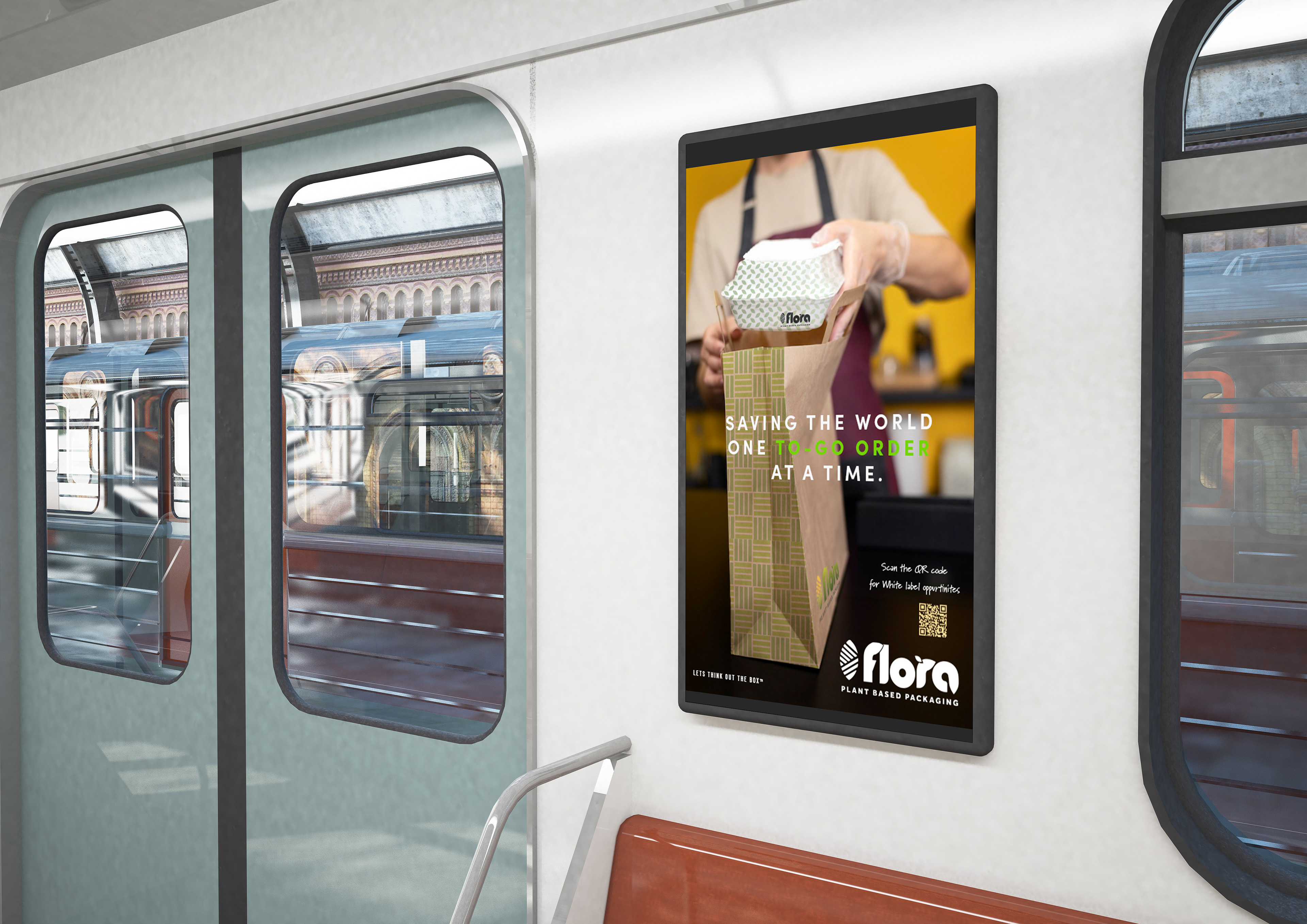
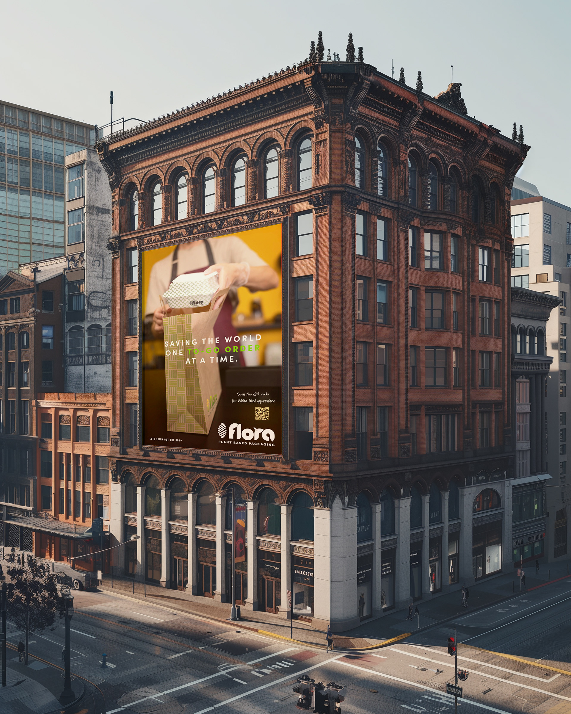
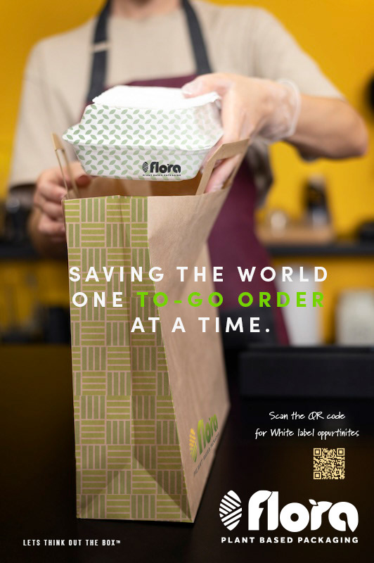
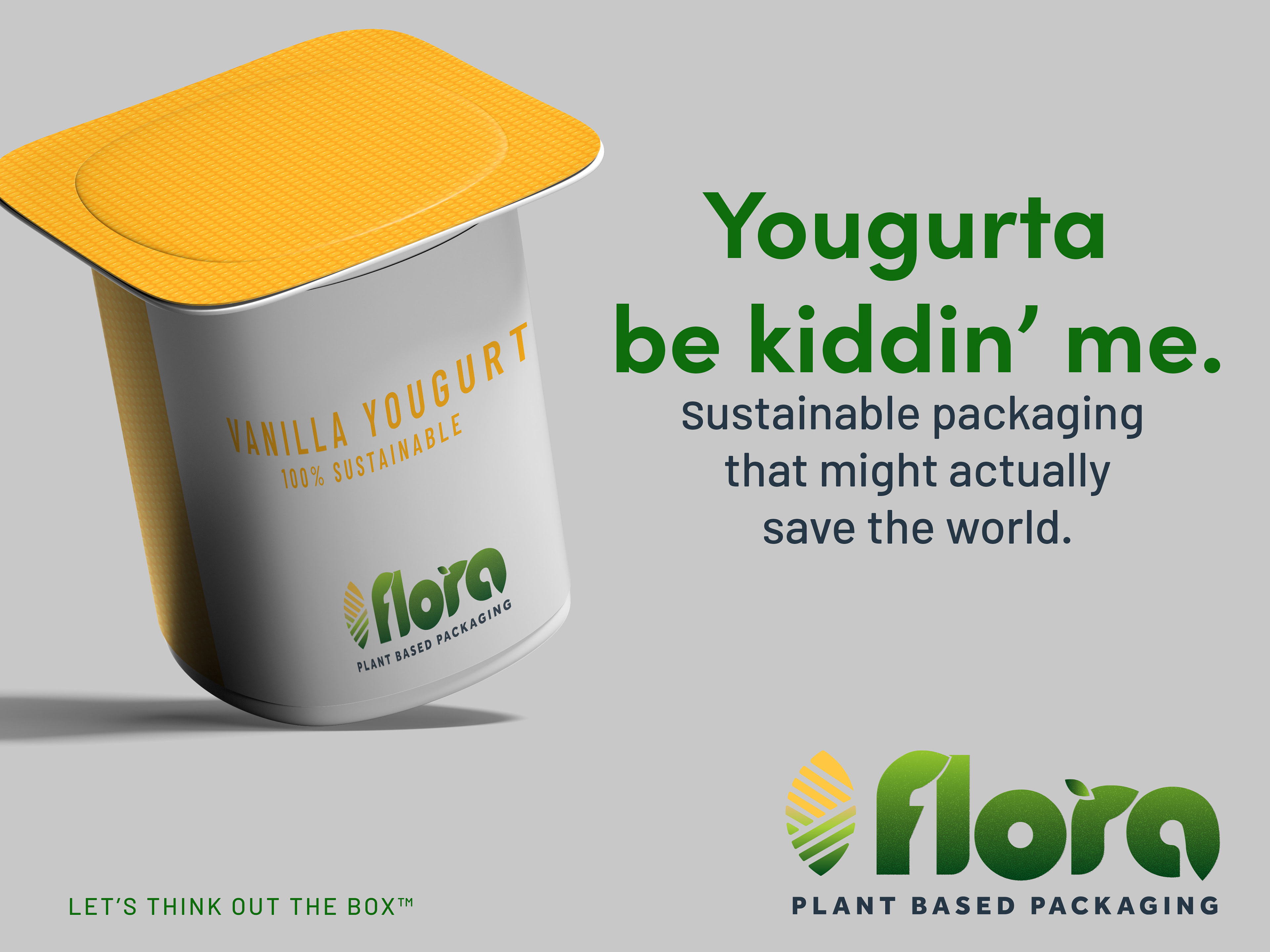
With the foundational system established, the identity was expanded into a complete brand ecosystem.
The Design Outcome
Flora evolved from a brand concept into a fully articulated visual ecosystem.
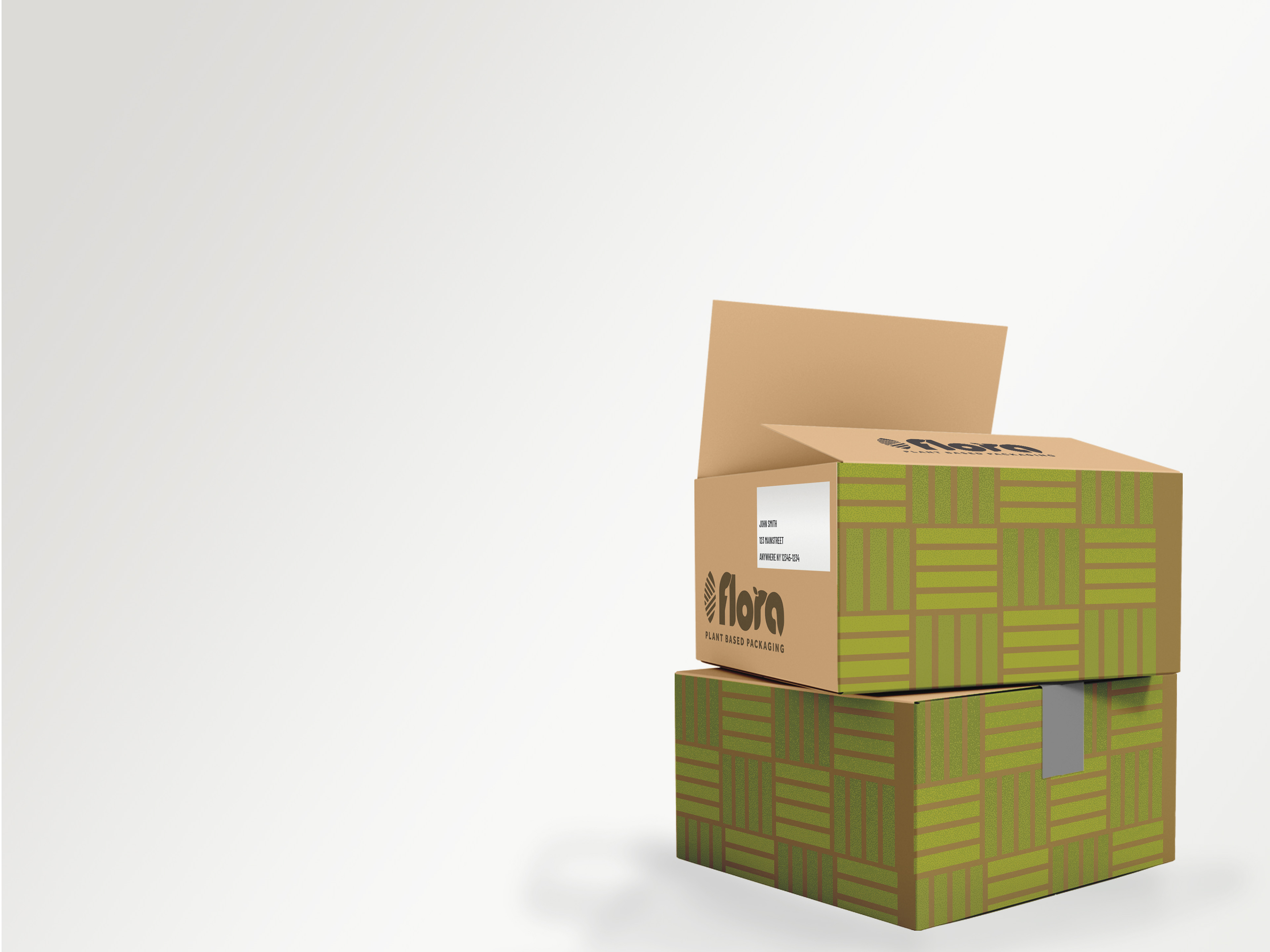
The work demonstrates how a strong identity can function as more than a logo. By establishing the rules for typography, color, imagery, shapes, patterns, layouts and messaging, the brand becomes a scalable creative system that can support both everyday communications and large campaign moments.
Most importantly, the system gives Flora room to be serious about sustainability without taking itself too seriously.
That balance became the defining creative opportunity:
make sustainable packaging feel smart, approachable, memorable—and a little bit fun.
make sustainable packaging feel smart, approachable, memorable—and a little bit fun.
“LET’S THINK OUT THE BOX™”